> ## Documentation Index
> Fetch the complete documentation index at: https://docs.kwebby.com/llms.txt
> Use this file to discover all available pages before exploring further.
# Cake builder
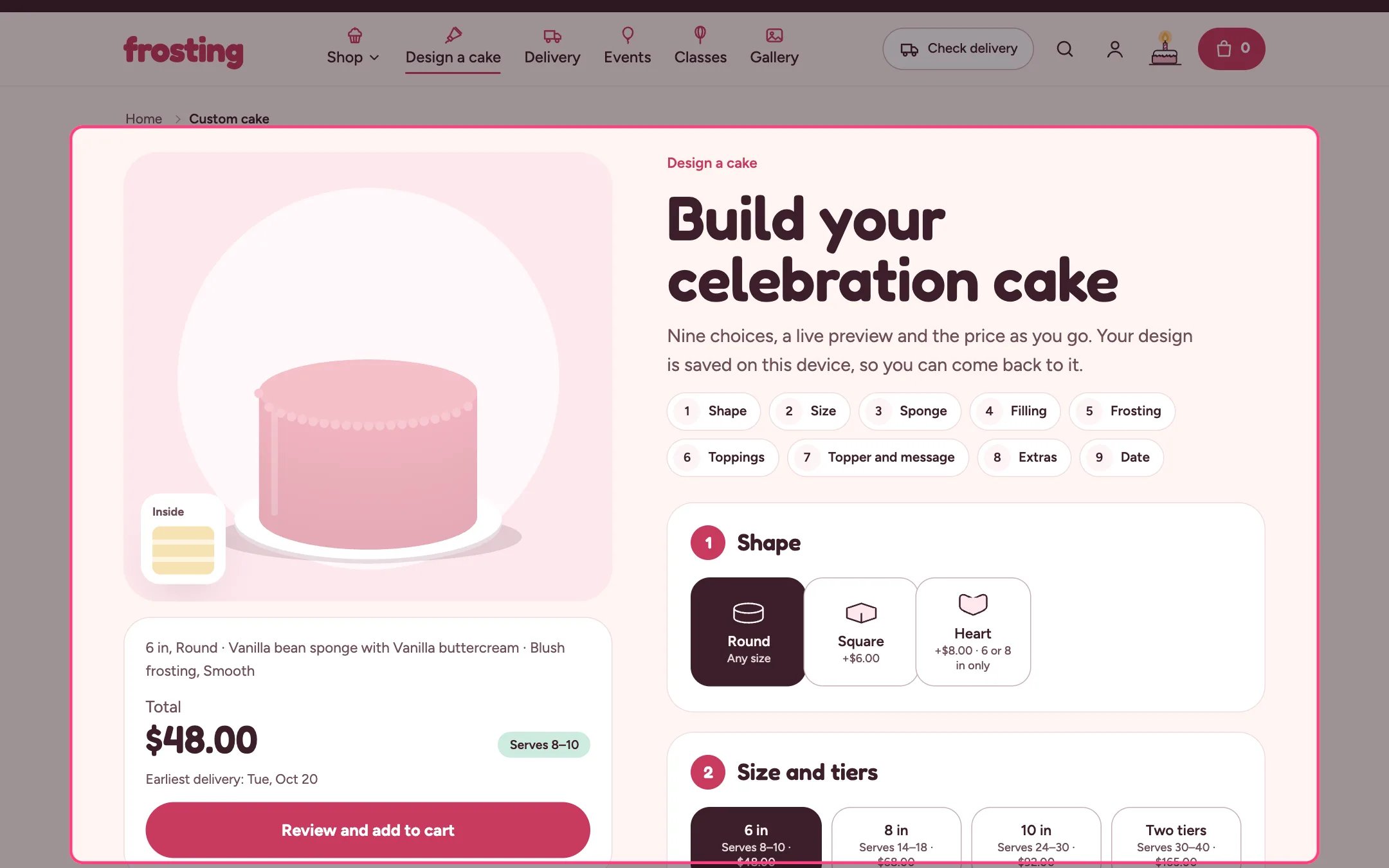
> A step-by-step designer for a custom cake with a live drawing, running price and delivery date, which adds the cake and every paid choice to the cart together.
 ## Where to find it
The product page of the product that uses the cake-builder template. In the theme editor choose Products, then cake-builder in the page selector, and preview it with your Custom cake product.
## How it works
* Up to nine steps: Shape, Size and tiers, Sponge and dietary needs, Filling, Frosting color and finish, Drip and toppings, Topper and message, Extras, and Date. Option steps show only when you have added choices for them, Size shows when the product has sizes, and Topper and message and Date always show.
* Sizes are the product's variants. Servings come from the variant metafield custom.servings and tiers from custom.tiers, or from size names that contain two or three.
* Every other option is a Choice block (up to 50 blocks). A choice with a Paid add-on product adds that product's first variant price to the total and puts it in the cart, grouped under the cake.
* Rules between choices: a shape can be limited to some sizes, a dietary option can be limited to some sponges, and toppings stop at your maximum. Choices that do not fit are greyed out with a reason.
* Toppers can be a sign with your text, a name the shopper types (up to 12 letters), a number priced per digit, or an edible photo print that asks for a photo (PNG, JPG or GIF up to 5 MB).
* The date step offers delivery or pickup, your time windows, and only dates that respect the size's notice, your closed day and closed dates. Delivery asks for a postcode and stops if you do not deliver there.
* The preview is a drawing that changes with every choice, or your own photos when Preview style uses store photos.
* Progress is saved on the shopper's device. Save this design keeps up to 12 designs on that device, listed under Saved designs and in the account hub.
## Where to find it
The product page of the product that uses the cake-builder template. In the theme editor choose Products, then cake-builder in the page selector, and preview it with your Custom cake product.
## How it works
* Up to nine steps: Shape, Size and tiers, Sponge and dietary needs, Filling, Frosting color and finish, Drip and toppings, Topper and message, Extras, and Date. Option steps show only when you have added choices for them, Size shows when the product has sizes, and Topper and message and Date always show.
* Sizes are the product's variants. Servings come from the variant metafield custom.servings and tiers from custom.tiers, or from size names that contain two or three.
* Every other option is a Choice block (up to 50 blocks). A choice with a Paid add-on product adds that product's first variant price to the total and puts it in the cart, grouped under the cake.
* Rules between choices: a shape can be limited to some sizes, a dietary option can be limited to some sponges, and toppings stop at your maximum. Choices that do not fit are greyed out with a reason.
* Toppers can be a sign with your text, a name the shopper types (up to 12 letters), a number priced per digit, or an edible photo print that asks for a photo (PNG, JPG or GIF up to 5 MB).
* The date step offers delivery or pickup, your time windows, and only dates that respect the size's notice, your closed day and closed dates. Delivery asks for a postcode and stops if you do not deliver there.
* The preview is a drawing that changes with every choice, or your own photos when Preview style uses store photos.
* Progress is saved on the shopper's device. Save this design keeps up to 12 designs on that device, listed under Saved designs and in the account hub.
 ## Edit it
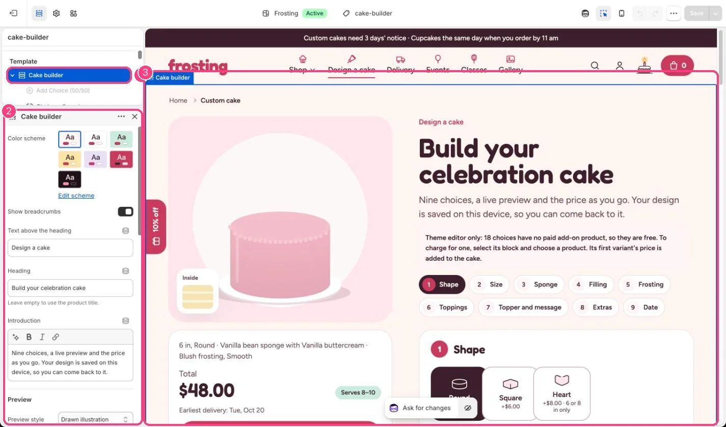
* Add a Choice block per option, set its Step and Label, and add a Photo if you have one.
* Pick a Paid add-on product for any choice that costs extra. Leave it empty to make the choice free.
* For sponge, filling, frosting color and drip choices, set Color in the drawing.
* Set Most toppings per cake (1 to 8) and Longest message on the cake (10 to 60 characters).
* Set the extra notice for tiered cakes under Notice (0 to 30 days).
* Edit the note under the buttons to state your change policy.
* In the theme editor the builder warns you when choices are free because they have no product, and when the product has no sizes.
## Settings
| Setting | What it does |
| - | - |
| **Color scheme** | Color scheme for this area (edit the schemes in Theme settings → Colors). Default: Scheme 1. |
| **Show breadcrumbs** | On or off. Default: on. |
| **Text above the heading** | Text. Default: Design a cake. |
| **Heading** | Text. Leave empty to use the product title. |
| **Introduction** | Formatted text (one line). |
**Preview**
| Setting | What it does |
| - | - |
| **Preview style** | Options: Drawn illustration, Store photos, falling back to the drawing. With store photos, the preview shows the photo of the latest choice that has one. Shoppers can switch back to the drawing. Default: Drawn illustration. |
| **Show photos on the option buttons** | On or off. Default: on. |
**Choices**
Sizes are this product's variants. Servings come from the variant metafield custom.servings. Tiers come from custom.tiers, or from variant names that contain two or three. Add every other option as a Choice block.
| Setting | What it does |
| - | - |
| **Most toppings per cake** | Slider from 1 to 8. Default: 3. |
| **Longest message on the cake** | Slider from 10 to 60. In characters. Default: 30. |
| **Ask for an inspiration photo** | On or off. The photo upload always shows when the edible photo print topper is chosen. Default: on. |
**Notice**
Notice comes from the custom.lead\_days metafield on a variant, then on the product, then from Theme settings, Delivery and pickup. Tiered sizes without a variant metafield never get less notice than the values below. Closed days and time windows also come from Theme settings.
| Setting | What it does |
| - | - |
| **Notice for two tiers (days)** | Slider from 0 to 30. Default: 7. |
| **Notice for three tiers or more (days)** | Slider from 0 to 30. Default: 14. |
**Review**
| Setting | What it does |
| - | - |
| **Note under the buttons** | Formatted text (one line). |
## Blocks
Up to 50 blocks. Add a block with **Add block** under the section in the sidebar; drag blocks to reorder them.
### Choice
| Setting | What it does |
| - | - |
| **Step** | Options: Shape, Sponge, Dietary option, Filling, Frosting color, Finish, Drip, Topping, Topper, Extra. Default: Sponge. |
| **Label** | Text. Leave empty to use the add-on product's title. Default: Vanilla bean. |
| **Note** | Text. Shown under the option, for example Contains walnuts. |
| **Photo** | Image: upload one or choose from Content → Files. Shown on the option and, with store photos on, in the preview. |
| **Paid add-on product** | Choose a product. Its first variant's price is added to the cake, and that variant goes in the cart with the cake. Leave empty to make this choice free. |
| **Color in the drawing** | Color. Default: #F6E3B4. |
| **Drawn as** | Options: Round, Square, Heart. Default: Round. |
| **Sizes it comes in** | Text. Variant names separated by commas, for example 6 in, 8 in. Leave empty for every size. |
| **Sponges it works with** | Text. Sponge labels separated by commas. Leave empty for every sponge. |
| **Drawn as** | Options: Smooth with a piped border, Ruffles, Semi-naked, Ombre. Default: Smooth with a piped border. |
| **Drawn as** | Options: Berries, Macarons, Sprinkles, Chocolate shards, Buttercream flowers, Meringue kisses, Gold leaf, Cherries, Cream dollops. Default: Berries. |
| **Topper type** | Options: Sign with fixed text, Name the shopper types, Number, priced per digit, Edible photo print. A per-digit topper adds one add-on product for each digit. Default: Sign with fixed text. |
| **Text on the sign** | Text. Default: Happy birthday. |
| **Extra type** | Options: Plain, Candles, drawn on the cake, Sparkler, drawn on the cake, Card, asks for a message. Default: Plain. |
When a photo is uploaded, the cake is sent to the cart with a regular page load, so the shopper lands on the cart page instead of the cart drawer.
Emoji are removed from cake messages because they cannot be piped in icing.
Saved designs live in one browser on one device. They are not stored in Shopify.
This documentation is built and hosted on [Mintlify](https://mintlify.com), a developer documentation platform.
## Edit it
* Add a Choice block per option, set its Step and Label, and add a Photo if you have one.
* Pick a Paid add-on product for any choice that costs extra. Leave it empty to make the choice free.
* For sponge, filling, frosting color and drip choices, set Color in the drawing.
* Set Most toppings per cake (1 to 8) and Longest message on the cake (10 to 60 characters).
* Set the extra notice for tiered cakes under Notice (0 to 30 days).
* Edit the note under the buttons to state your change policy.
* In the theme editor the builder warns you when choices are free because they have no product, and when the product has no sizes.
## Settings
| Setting | What it does |
| - | - |
| **Color scheme** | Color scheme for this area (edit the schemes in Theme settings → Colors). Default: Scheme 1. |
| **Show breadcrumbs** | On or off. Default: on. |
| **Text above the heading** | Text. Default: Design a cake. |
| **Heading** | Text. Leave empty to use the product title. |
| **Introduction** | Formatted text (one line). |
**Preview**
| Setting | What it does |
| - | - |
| **Preview style** | Options: Drawn illustration, Store photos, falling back to the drawing. With store photos, the preview shows the photo of the latest choice that has one. Shoppers can switch back to the drawing. Default: Drawn illustration. |
| **Show photos on the option buttons** | On or off. Default: on. |
**Choices**
Sizes are this product's variants. Servings come from the variant metafield custom.servings. Tiers come from custom.tiers, or from variant names that contain two or three. Add every other option as a Choice block.
| Setting | What it does |
| - | - |
| **Most toppings per cake** | Slider from 1 to 8. Default: 3. |
| **Longest message on the cake** | Slider from 10 to 60. In characters. Default: 30. |
| **Ask for an inspiration photo** | On or off. The photo upload always shows when the edible photo print topper is chosen. Default: on. |
**Notice**
Notice comes from the custom.lead\_days metafield on a variant, then on the product, then from Theme settings, Delivery and pickup. Tiered sizes without a variant metafield never get less notice than the values below. Closed days and time windows also come from Theme settings.
| Setting | What it does |
| - | - |
| **Notice for two tiers (days)** | Slider from 0 to 30. Default: 7. |
| **Notice for three tiers or more (days)** | Slider from 0 to 30. Default: 14. |
**Review**
| Setting | What it does |
| - | - |
| **Note under the buttons** | Formatted text (one line). |
## Blocks
Up to 50 blocks. Add a block with **Add block** under the section in the sidebar; drag blocks to reorder them.
### Choice
| Setting | What it does |
| - | - |
| **Step** | Options: Shape, Sponge, Dietary option, Filling, Frosting color, Finish, Drip, Topping, Topper, Extra. Default: Sponge. |
| **Label** | Text. Leave empty to use the add-on product's title. Default: Vanilla bean. |
| **Note** | Text. Shown under the option, for example Contains walnuts. |
| **Photo** | Image: upload one or choose from Content → Files. Shown on the option and, with store photos on, in the preview. |
| **Paid add-on product** | Choose a product. Its first variant's price is added to the cake, and that variant goes in the cart with the cake. Leave empty to make this choice free. |
| **Color in the drawing** | Color. Default: #F6E3B4. |
| **Drawn as** | Options: Round, Square, Heart. Default: Round. |
| **Sizes it comes in** | Text. Variant names separated by commas, for example 6 in, 8 in. Leave empty for every size. |
| **Sponges it works with** | Text. Sponge labels separated by commas. Leave empty for every sponge. |
| **Drawn as** | Options: Smooth with a piped border, Ruffles, Semi-naked, Ombre. Default: Smooth with a piped border. |
| **Drawn as** | Options: Berries, Macarons, Sprinkles, Chocolate shards, Buttercream flowers, Meringue kisses, Gold leaf, Cherries, Cream dollops. Default: Berries. |
| **Topper type** | Options: Sign with fixed text, Name the shopper types, Number, priced per digit, Edible photo print. A per-digit topper adds one add-on product for each digit. Default: Sign with fixed text. |
| **Text on the sign** | Text. Default: Happy birthday. |
| **Extra type** | Options: Plain, Candles, drawn on the cake, Sparkler, drawn on the cake, Card, asks for a message. Default: Plain. |
When a photo is uploaded, the cake is sent to the cart with a regular page load, so the shopper lands on the cart page instead of the cart drawer.
Emoji are removed from cake messages because they cannot be piped in icing.
Saved designs live in one browser on one device. They are not stored in Shopify.
This documentation is built and hosted on [Mintlify](https://mintlify.com), a developer documentation platform.