> ## Documentation Index
> Fetch the complete documentation index at: https://docs.kwebby.com/llms.txt
> Use this file to discover all available pages before exploring further.
# Card grid
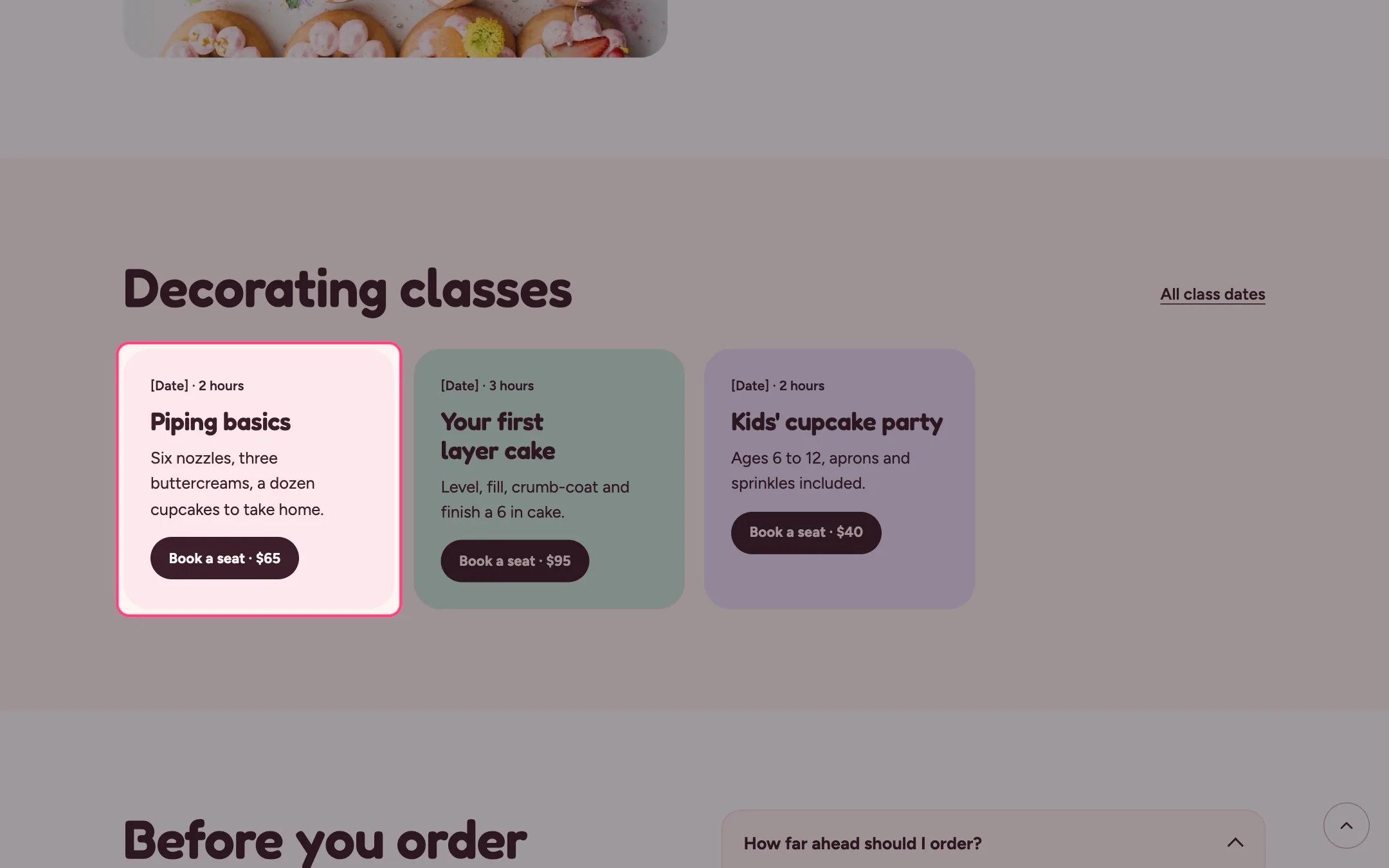
> Colored cards with an optional photo, a short meta line, heading, text and button, for classes, services or team members.
 ## Where to find it
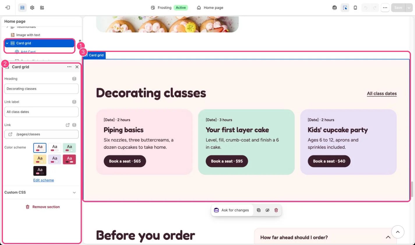
Home page, the about page and the events page. In the theme editor choose Home page, then select the section (default heading Decorating classes). Can be added to any page.
## How it works
* Up to 12 cards in a responsive grid.
* Each card has its own color: blush, mint, lilac, butter or white.
* A photo, when added, runs across the top of the card.
## Where to find it
Home page, the about page and the events page. In the theme editor choose Home page, then select the section (default heading Decorating classes). Can be added to any page.
## How it works
* Up to 12 cards in a responsive grid.
* Each card has its own color: blush, mint, lilac, butter or white.
* A photo, when added, runs across the top of the card.
 ## Edit it
* Use the Meta line for a date and length, such as Sat 12 Oct · 2 hours. Replace the \[Date] placeholder.
* Link each card's button to the class product or booking page.
* Give neighboring cards different Card colors so the grid reads as separate cards.
## Settings
| Setting | What it does |
| - | - |
| **Heading** | Text. Default: Decorating classes. |
| **Link label** | Text. Default: All class dates. |
| **Link** | Link: a page, product, collection or web address. |
| **Color scheme** | Color scheme for this area (edit the schemes in Theme settings → Colors). Default: Scheme 1. |
## Blocks
Up to 12 blocks. Add a block with **Add block** under the section in the sidebar; drag blocks to reorder them.
### Card
| Setting | What it does |
| - | - |
| **Image** | Image: upload one or choose from Content → Files. Optional. Shown across the top of the card. |
| **Meta line** | Text. A short line above the heading, such as a date and length. Default: \[Date] · 2 hours. |
| **Heading** | Text. Default: Piping basics. |
| **Text** | Formatted text (one line). |
| **Button label** | Text. Default: Book a seat · \$65. |
| **Button link** | Link: a page, product, collection or web address. |
| **Card color** | Options: Blush, Mint, Lilac, Butter, White. Default: Blush. |
This documentation is built and hosted on [Mintlify](https://mintlify.com), a developer documentation platform.
## Edit it
* Use the Meta line for a date and length, such as Sat 12 Oct · 2 hours. Replace the \[Date] placeholder.
* Link each card's button to the class product or booking page.
* Give neighboring cards different Card colors so the grid reads as separate cards.
## Settings
| Setting | What it does |
| - | - |
| **Heading** | Text. Default: Decorating classes. |
| **Link label** | Text. Default: All class dates. |
| **Link** | Link: a page, product, collection or web address. |
| **Color scheme** | Color scheme for this area (edit the schemes in Theme settings → Colors). Default: Scheme 1. |
## Blocks
Up to 12 blocks. Add a block with **Add block** under the section in the sidebar; drag blocks to reorder them.
### Card
| Setting | What it does |
| - | - |
| **Image** | Image: upload one or choose from Content → Files. Optional. Shown across the top of the card. |
| **Meta line** | Text. A short line above the heading, such as a date and length. Default: \[Date] · 2 hours. |
| **Heading** | Text. Default: Piping basics. |
| **Text** | Formatted text (one line). |
| **Button label** | Text. Default: Book a seat · \$65. |
| **Button link** | Link: a page, product, collection or web address. |
| **Card color** | Options: Blush, Mint, Lilac, Butter, White. Default: Blush. |
This documentation is built and hosted on [Mintlify](https://mintlify.com), a developer documentation platform.