> ## Documentation Index
> Fetch the complete documentation index at: https://docs.kwebby.com/llms.txt
> Use this file to discover all available pages before exploring further.
# Collections list page
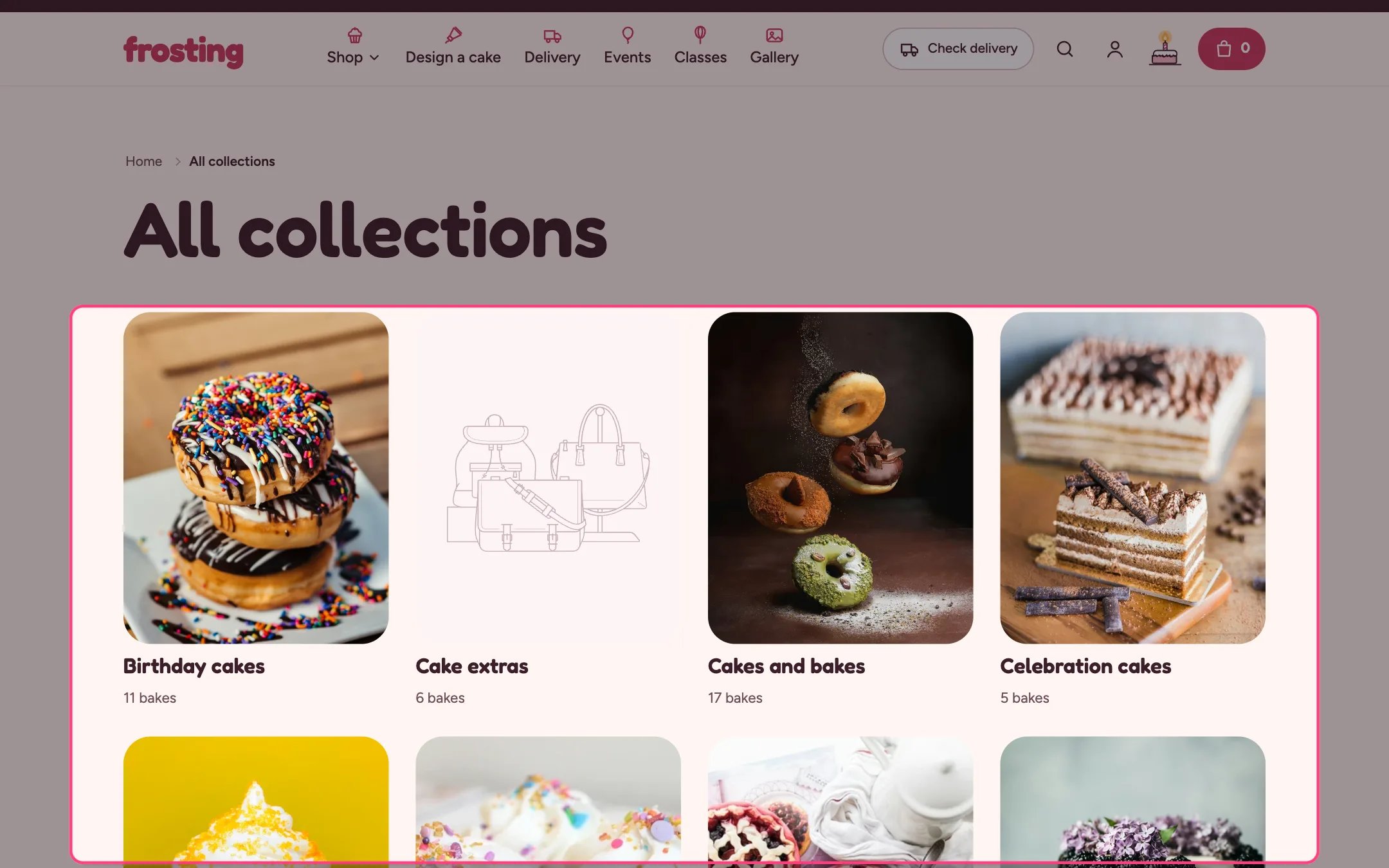
> The page that lists all your collections, as cards or circles.
 ## Where to find it
The all collections page (/collections). In the theme editor choose Collections list in the page selector.
## How it works
* Collections can be sorted alphabetically, by date or by product count.
* Cards can show the number of products in each collection.
* Circles crop each collection image round, like the Occasions row.
## Where to find it
The all collections page (/collections). In the theme editor choose Collections list in the page selector.
## How it works
* Collections can be sorted alphabetically, by date or by product count.
* Cards can show the number of products in each collection.
* Circles crop each collection image round, like the Occasions row.
 ## Edit it
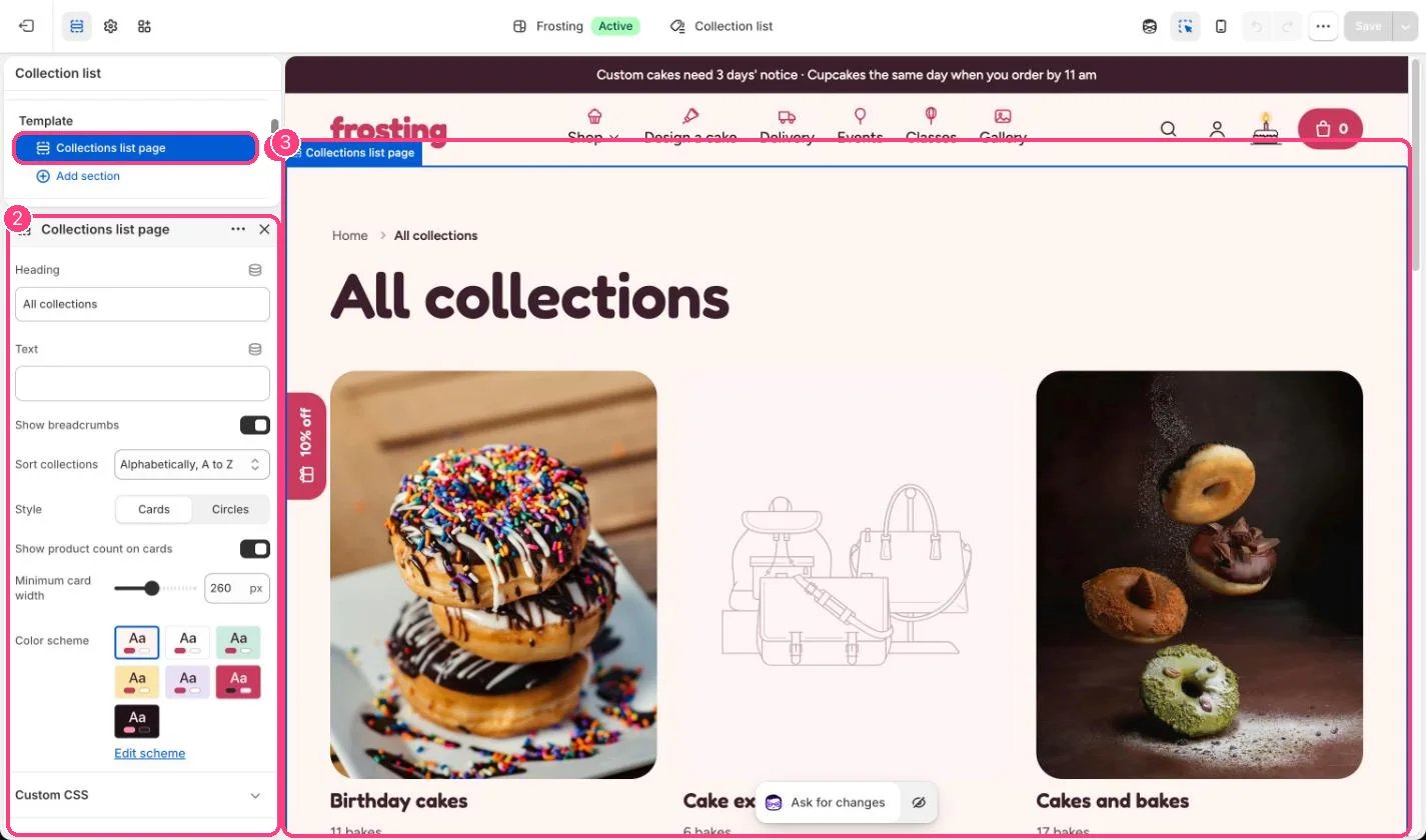
* Choose Style: Cards or Circles.
* Set Sort collections and Minimum card width (180 to 360 px).
* Give each collection an image in Products, Collections so the cards are not blank.
## Settings
| Setting | What it does |
| - | - |
| **Heading** | Text. Default: All collections. |
| **Text** | Text. |
| **Show breadcrumbs** | On or off. Default: on. |
| **Sort collections** | Options: Alphabetically, A to Z, Alphabetically, Z to A, Date, new to old, Date, old to new, Product count, high to low, Product count, low to high. Default: Alphabetically, A to Z. |
| **Style** | Options: Cards, Circles. Default: Cards. |
| **Show product count on cards** | On or off. Default: on. |
| **Minimum card width** | Slider from 180 to 360 px, in steps of 10. Default: 260 px. |
| **Color scheme** | Color scheme for this area (edit the schemes in Theme settings → Colors). Default: Scheme 1. |
This documentation is built and hosted on [Mintlify](https://mintlify.com), a developer documentation platform.
## Edit it
* Choose Style: Cards or Circles.
* Set Sort collections and Minimum card width (180 to 360 px).
* Give each collection an image in Products, Collections so the cards are not blank.
## Settings
| Setting | What it does |
| - | - |
| **Heading** | Text. Default: All collections. |
| **Text** | Text. |
| **Show breadcrumbs** | On or off. Default: on. |
| **Sort collections** | Options: Alphabetically, A to Z, Alphabetically, Z to A, Date, new to old, Date, old to new, Product count, high to low, Product count, low to high. Default: Alphabetically, A to Z. |
| **Style** | Options: Cards, Circles. Default: Cards. |
| **Show product count on cards** | On or off. Default: on. |
| **Minimum card width** | Slider from 180 to 360 px, in steps of 10. Default: 260 px. |
| **Color scheme** | Color scheme for this area (edit the schemes in Theme settings → Colors). Default: Scheme 1. |
This documentation is built and hosted on [Mintlify](https://mintlify.com), a developer documentation platform.