> ## Documentation Index
> Fetch the complete documentation index at: https://docs.kwebby.com/llms.txt
> Use this file to discover all available pages before exploring further.
# Product information
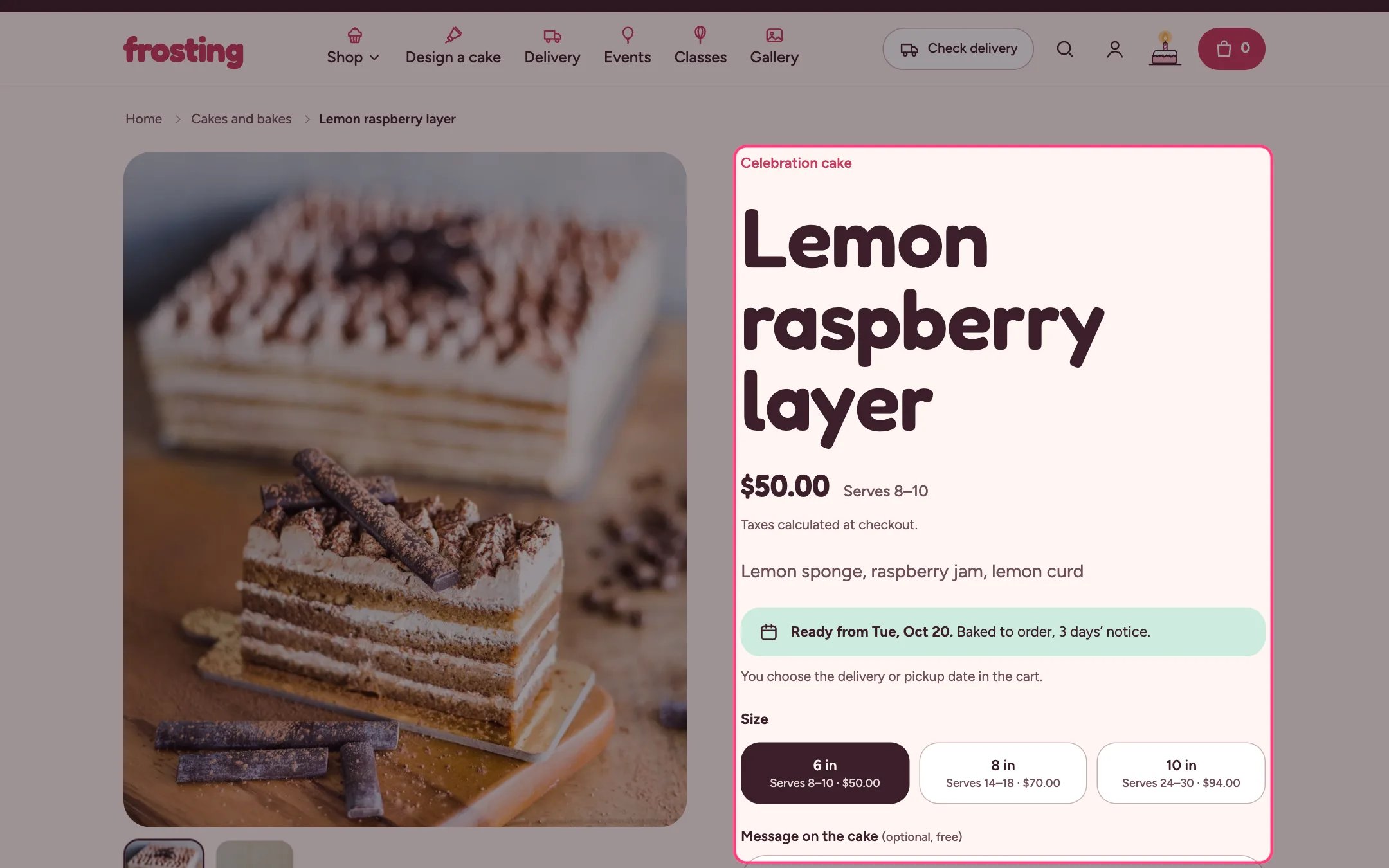
> The product page: photos and videos, price with sale tags and servings, ready-by date, size tiles, cake message, extras, buy buttons and information rows.
 ## Where to find it
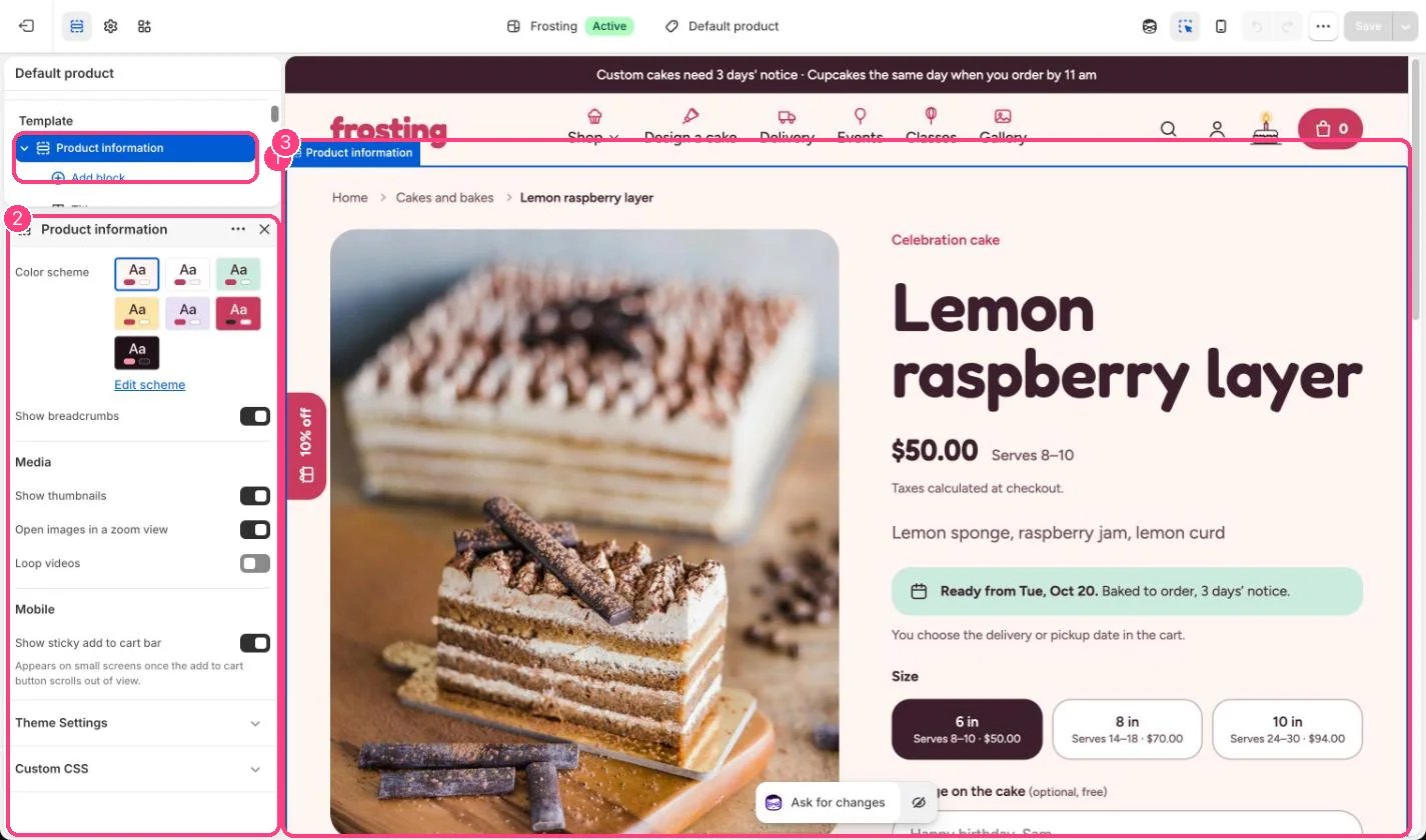
Every product that uses the default product template. In the theme editor choose Products, then Default product, and select Product information.
## How it works
* The gallery supports thumbnails, a zoom view, videos and 3D models, and swipes on phones.
* Price shows the struck compare-at price and the sale tags from Theme settings, Product cards, Sale badge, plus servings for the chosen size.
* Lead time shows the first day the product can be ready, from the product metafield custom.lead\_days or the delivery settings. Same-day bakes say Ready today if you order by your cut-off.
* Variant picker shows the option named in Option shown as tiles with servings (default Size) as tiles with servings and price; other options show as pills or color swatches.
* Cake message adds a text field (limit 10 to 100 characters) whose answer appears in the cart and on the order. Up to 2 message blocks.
* Extras lets shoppers tick add-ons such as candles; they go in the cart with the cake and stay grouped under it, and the button total includes them.
* Collapsible rows show your text, the product description or the content of a page.
* On phones a sticky add to cart bar appears once the main button scrolls out of view.
## Where to find it
Every product that uses the default product template. In the theme editor choose Products, then Default product, and select Product information.
## How it works
* The gallery supports thumbnails, a zoom view, videos and 3D models, and swipes on phones.
* Price shows the struck compare-at price and the sale tags from Theme settings, Product cards, Sale badge, plus servings for the chosen size.
* Lead time shows the first day the product can be ready, from the product metafield custom.lead\_days or the delivery settings. Same-day bakes say Ready today if you order by your cut-off.
* Variant picker shows the option named in Option shown as tiles with servings (default Size) as tiles with servings and price; other options show as pills or color swatches.
* Cake message adds a text field (limit 10 to 100 characters) whose answer appears in the cart and on the order. Up to 2 message blocks.
* Extras lets shoppers tick add-ons such as candles; they go in the cart with the cake and stay grouped under it, and the button total includes them.
* Collapsible rows show your text, the product description or the content of a page.
* On phones a sticky add to cart bar appears once the main button scrolls out of view.
 ## Edit it
* Reorder blocks by dragging. Keep Quantity directly above Buy buttons to show them side by side.
* Use the tag setting on Cake message and Extras to show them only on products with that tag.
* Choose Short in the Description block to show the custom.short\_description metafield, or the start of the description.
* Add a Button block to link to the cake builder, for example Change the colors or toppings.
* Use Collapsible rows with a page for content shared by many products, such as allergens or cake care.
* Add app blocks for reviews or other apps from Add block, Apps.
## Settings
| Setting | What it does |
| - | - |
| **Color scheme** | Color scheme for this area (edit the schemes in Theme settings → Colors). Default: Scheme 1. |
| **Show breadcrumbs** | On or off. Default: on. |
**Media**
| Setting | What it does |
| - | - |
| **Show thumbnails** | On or off. Default: on. |
| **Open images in a zoom view** | On or off. Default: on. |
| **Loop videos** | On or off. Default: off. |
**Mobile**
| Setting | What it does |
| - | - |
| **Show sticky add to cart bar** | On or off. Appears on small screens once the add to cart button scrolls out of view. Default: on. |
## Blocks
Add a block with **Add block** under the section in the sidebar; drag blocks to reorder them.
### App blocks
Blocks from apps you have installed, such as reviews or subscriptions. Click **Add block** and choose one from the Apps tab; its settings come from the app.
### Title (up to 1)
| Setting | What it does |
| - | - |
| **Show product type above the title** | On or off. Default: on. |
| **Show vendor when there is no product type** | On or off. Default: off. |
### Price (up to 1)
| Setting | What it does |
| - | - |
| **Show servings** | On or off. Reads the variant metafield custom.servings, for example 8–10. Default: on. |
| **Show tax and shipping note** | On or off. Default: on. |
### Lead time (up to 1)
Shows the first day this product can be ready, from the product metafield custom.lead\_days or the delivery settings.
| Setting | What it does |
| - | - |
| **Note** | Text. Default: You choose the delivery or pickup date in the cart. |
### Text
| Setting | What it does |
| - | - |
| **Text** | Formatted text (one line). |
| **Style** | Options: Body, Large, Subdued. Default: Body. |
### Description
| Setting | What it does |
| - | - |
| **Show** | Options: Short description, Full description. Short description reads the product metafield custom.short\_description and falls back to the start of the full description. Default: Full description. |
### Variant picker (up to 1)
| Setting | What it does |
| - | - |
| **Option shown as tiles with servings** | Text. Option name, for example Size. Each value shows the variant metafield custom.servings and its price. Default: Size. |
| **Show color swatches when an option has them** | On or off. Default: on. |
### Purchase options (up to 1)
Shows subscription and other selling plans when the product has them.
### Quantity (up to 1)
Follows the variant's quantity rules. Place it directly above the buy buttons to show them side by side.
### Cake message (up to 2)
| Setting | What it does |
| - | - |
| **Label** | Text. Default: Message on the cake. |
| **Note after the label** | Text. Default: (optional, free). |
| **Placeholder** | Text. Default: Happy birthday, Sam. |
| **Character limit** | Slider from 10 to 100, in steps of 5. Default: 30. |
| **Name shown in the cart and order** | Text. Default: Message. |
| **Only show for products with this tag** | Text. Leave empty to show it on every product. |
### Extras (up to 1)
| Setting | What it does |
| - | - |
| **Heading** | Text. Default: Add a little extra. |
| **Products** | Choose products. Ticked extras are added to the cart with the cake and stay grouped under it. |
| **Show images** | On or off. Default: off. |
| **Only show for products with this tag** | Text. Leave empty to show it on every product. |
### Buy buttons (up to 1)
| Setting | What it does |
| - | - |
| **Show the total on the add to cart button** | On or off. Default: on. |
| **Show dynamic checkout buttons** | On or off. Shows the payment methods available in your store, like Shop Pay or Apple Pay. Default: on. |
| **Show recipient form for gift cards** | On or off. Lets shoppers send a gift card to someone else by email. Default: on. |
### Pickup availability (up to 1)
Shows whether the selected variant can be picked up at your locations with local pickup turned on.
### Button
| Setting | What it does |
| - | - |
| **Label** | Text. Default: Change the colors or toppings in the cake builder. |
| **Link** | Link: a page, product, collection or web address. |
| **Style** | Options: Secondary, Primary, Dark, Outline. Default: Secondary. |
### Collapsible row
| Setting | What it does |
| - | - |
| **Heading** | Text. Default: Ingredients and allergens. |
| **Icon** | Options: None, Cake, Leaf, Truck, Store, Gift, Clock, Info. Default: None. |
| **Open by default** | On or off. Default: off. |
| **Show the product description** | On or off. Default: off. |
| **Content** | Formatted text. |
| **Page content** | Choose a page. |
### Custom Liquid
| Setting | What it does |
| - | - |
| **Liquid code** | Liquid code. Add app snippets or other code. |
### Share (up to 1)
| Setting | What it does |
| - | - |
| **Label** | Text. Default: Share. |
Dynamic checkout buttons go straight to checkout, so no delivery date is collected for those orders. Turn them off in Buy buttons if every order needs a date.
This documentation is built and hosted on [Mintlify](https://mintlify.com), a developer documentation platform.
## Edit it
* Reorder blocks by dragging. Keep Quantity directly above Buy buttons to show them side by side.
* Use the tag setting on Cake message and Extras to show them only on products with that tag.
* Choose Short in the Description block to show the custom.short\_description metafield, or the start of the description.
* Add a Button block to link to the cake builder, for example Change the colors or toppings.
* Use Collapsible rows with a page for content shared by many products, such as allergens or cake care.
* Add app blocks for reviews or other apps from Add block, Apps.
## Settings
| Setting | What it does |
| - | - |
| **Color scheme** | Color scheme for this area (edit the schemes in Theme settings → Colors). Default: Scheme 1. |
| **Show breadcrumbs** | On or off. Default: on. |
**Media**
| Setting | What it does |
| - | - |
| **Show thumbnails** | On or off. Default: on. |
| **Open images in a zoom view** | On or off. Default: on. |
| **Loop videos** | On or off. Default: off. |
**Mobile**
| Setting | What it does |
| - | - |
| **Show sticky add to cart bar** | On or off. Appears on small screens once the add to cart button scrolls out of view. Default: on. |
## Blocks
Add a block with **Add block** under the section in the sidebar; drag blocks to reorder them.
### App blocks
Blocks from apps you have installed, such as reviews or subscriptions. Click **Add block** and choose one from the Apps tab; its settings come from the app.
### Title (up to 1)
| Setting | What it does |
| - | - |
| **Show product type above the title** | On or off. Default: on. |
| **Show vendor when there is no product type** | On or off. Default: off. |
### Price (up to 1)
| Setting | What it does |
| - | - |
| **Show servings** | On or off. Reads the variant metafield custom.servings, for example 8–10. Default: on. |
| **Show tax and shipping note** | On or off. Default: on. |
### Lead time (up to 1)
Shows the first day this product can be ready, from the product metafield custom.lead\_days or the delivery settings.
| Setting | What it does |
| - | - |
| **Note** | Text. Default: You choose the delivery or pickup date in the cart. |
### Text
| Setting | What it does |
| - | - |
| **Text** | Formatted text (one line). |
| **Style** | Options: Body, Large, Subdued. Default: Body. |
### Description
| Setting | What it does |
| - | - |
| **Show** | Options: Short description, Full description. Short description reads the product metafield custom.short\_description and falls back to the start of the full description. Default: Full description. |
### Variant picker (up to 1)
| Setting | What it does |
| - | - |
| **Option shown as tiles with servings** | Text. Option name, for example Size. Each value shows the variant metafield custom.servings and its price. Default: Size. |
| **Show color swatches when an option has them** | On or off. Default: on. |
### Purchase options (up to 1)
Shows subscription and other selling plans when the product has them.
### Quantity (up to 1)
Follows the variant's quantity rules. Place it directly above the buy buttons to show them side by side.
### Cake message (up to 2)
| Setting | What it does |
| - | - |
| **Label** | Text. Default: Message on the cake. |
| **Note after the label** | Text. Default: (optional, free). |
| **Placeholder** | Text. Default: Happy birthday, Sam. |
| **Character limit** | Slider from 10 to 100, in steps of 5. Default: 30. |
| **Name shown in the cart and order** | Text. Default: Message. |
| **Only show for products with this tag** | Text. Leave empty to show it on every product. |
### Extras (up to 1)
| Setting | What it does |
| - | - |
| **Heading** | Text. Default: Add a little extra. |
| **Products** | Choose products. Ticked extras are added to the cart with the cake and stay grouped under it. |
| **Show images** | On or off. Default: off. |
| **Only show for products with this tag** | Text. Leave empty to show it on every product. |
### Buy buttons (up to 1)
| Setting | What it does |
| - | - |
| **Show the total on the add to cart button** | On or off. Default: on. |
| **Show dynamic checkout buttons** | On or off. Shows the payment methods available in your store, like Shop Pay or Apple Pay. Default: on. |
| **Show recipient form for gift cards** | On or off. Lets shoppers send a gift card to someone else by email. Default: on. |
### Pickup availability (up to 1)
Shows whether the selected variant can be picked up at your locations with local pickup turned on.
### Button
| Setting | What it does |
| - | - |
| **Label** | Text. Default: Change the colors or toppings in the cake builder. |
| **Link** | Link: a page, product, collection or web address. |
| **Style** | Options: Secondary, Primary, Dark, Outline. Default: Secondary. |
### Collapsible row
| Setting | What it does |
| - | - |
| **Heading** | Text. Default: Ingredients and allergens. |
| **Icon** | Options: None, Cake, Leaf, Truck, Store, Gift, Clock, Info. Default: None. |
| **Open by default** | On or off. Default: off. |
| **Show the product description** | On or off. Default: off. |
| **Content** | Formatted text. |
| **Page content** | Choose a page. |
### Custom Liquid
| Setting | What it does |
| - | - |
| **Liquid code** | Liquid code. Add app snippets or other code. |
### Share (up to 1)
| Setting | What it does |
| - | - |
| **Label** | Text. Default: Share. |
Dynamic checkout buttons go straight to checkout, so no delivery date is collected for those orders. Turn them off in Buy buttons if every order needs a date.
This documentation is built and hosted on [Mintlify](https://mintlify.com), a developer documentation platform.