> ## Documentation Index
> Fetch the complete documentation index at: https://docs.kwebby.com/llms.txt
> Use this file to discover all available pages before exploring further.
# Product recommendations
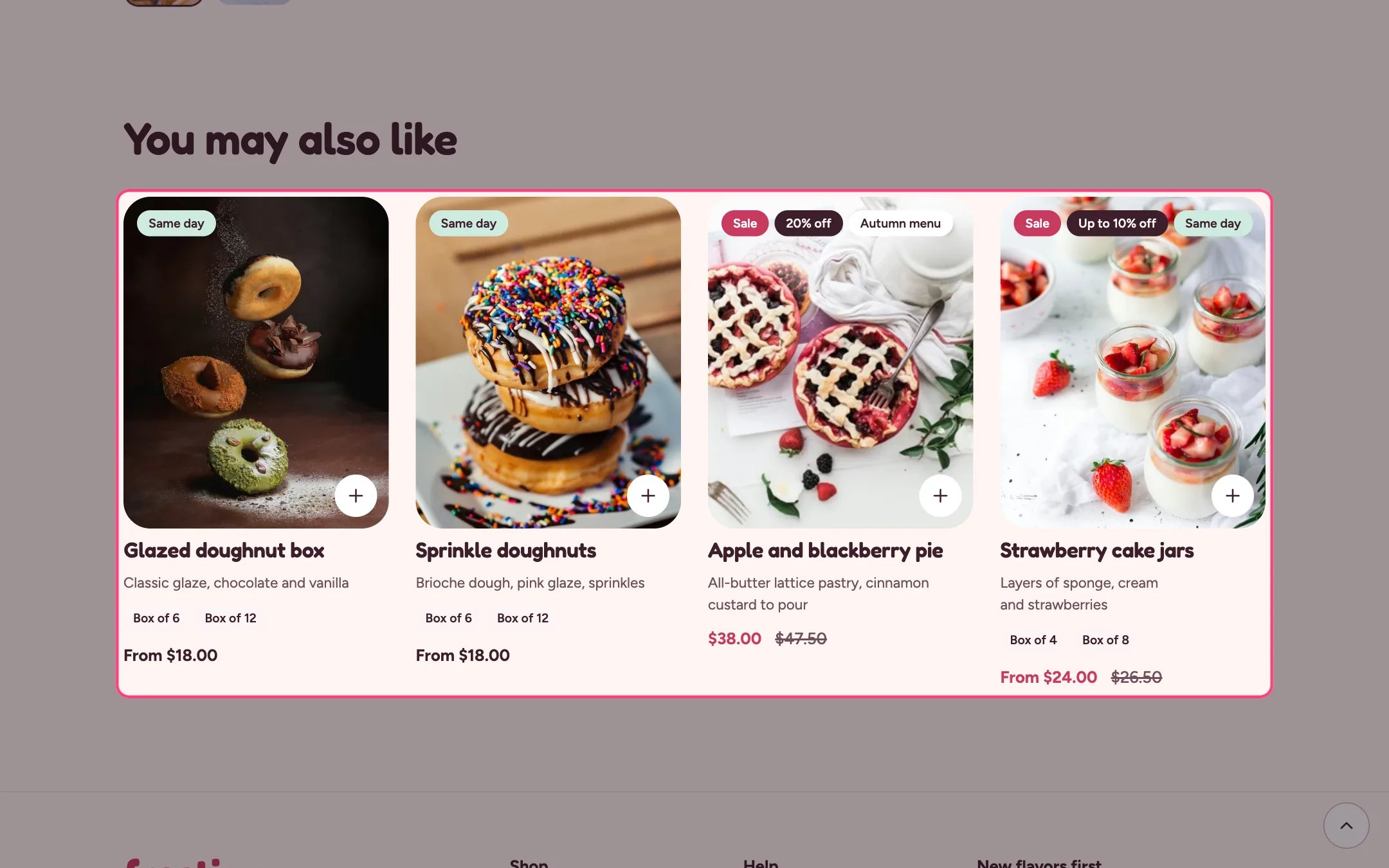
> A row of related or complementary product cards under the product, chosen by Shopify.
 ## Where to find it
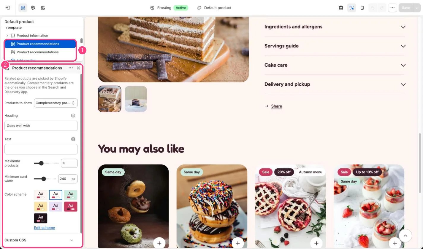
Product pages, twice on the default template (Goes well with and You may also like). In the theme editor choose Products, then Default product. It can only be added to product templates.
## How it works
* Related products are picked by Shopify automatically.
* Complementary products are the ones you choose in the Search and Discovery app.
* The row loads as the shopper scrolls near it and stays hidden when Shopify has nothing to suggest.
* Shows 2 to 10 products as standard product cards.
## Where to find it
Product pages, twice on the default template (Goes well with and You may also like). In the theme editor choose Products, then Default product. It can only be added to product templates.
## How it works
* Related products are picked by Shopify automatically.
* Complementary products are the ones you choose in the Search and Discovery app.
* The row loads as the shopper scrolls near it and stays hidden when Shopify has nothing to suggest.
* Shows 2 to 10 products as standard product cards.
 ## Edit it
* Set Products to show to Related or Complementary.
* Add complementary products per product in the Search and Discovery app.
* Adjust Maximum products and Minimum card width.
## Settings
Related products are picked by Shopify automatically. Complementary products are the ones you choose in the Search and Discovery app.
| Setting | What it does |
| - | - |
| **Products to show** | Options: Related products, Complementary products. Default: Related products. |
| **Heading** | Text. Default: You may also like. |
| **Text** | Text. |
| **Maximum products** | Slider from 2 to 10. Default: 4. |
| **Minimum card width** | Slider from 180 to 320 px, in steps of 10. Default: 240 px. |
| **Color scheme** | Color scheme for this area (edit the schemes in Theme settings → Colors). Default: Scheme 2. |
This documentation is built and hosted on [Mintlify](https://mintlify.com), a developer documentation platform.
## Edit it
* Set Products to show to Related or Complementary.
* Add complementary products per product in the Search and Discovery app.
* Adjust Maximum products and Minimum card width.
## Settings
Related products are picked by Shopify automatically. Complementary products are the ones you choose in the Search and Discovery app.
| Setting | What it does |
| - | - |
| **Products to show** | Options: Related products, Complementary products. Default: Related products. |
| **Heading** | Text. Default: You may also like. |
| **Text** | Text. |
| **Maximum products** | Slider from 2 to 10. Default: 4. |
| **Minimum card width** | Slider from 180 to 320 px, in steps of 10. Default: 240 px. |
| **Color scheme** | Color scheme for this area (edit the schemes in Theme settings → Colors). Default: Scheme 2. |
This documentation is built and hosted on [Mintlify](https://mintlify.com), a developer documentation platform.