> ## Documentation Index
> Fetch the complete documentation index at: https://docs.kwebby.com/llms.txt
> Use this file to discover all available pages before exploring further.
# Collection products
> The collection page: title, description, filters, sorting, product grid, promo tiles, collection navigation and pagination.
 ## Where to find it
Collection pages. In the theme editor, choose Collections > Default collection in the top page selector, then select Collection products.
## How it works
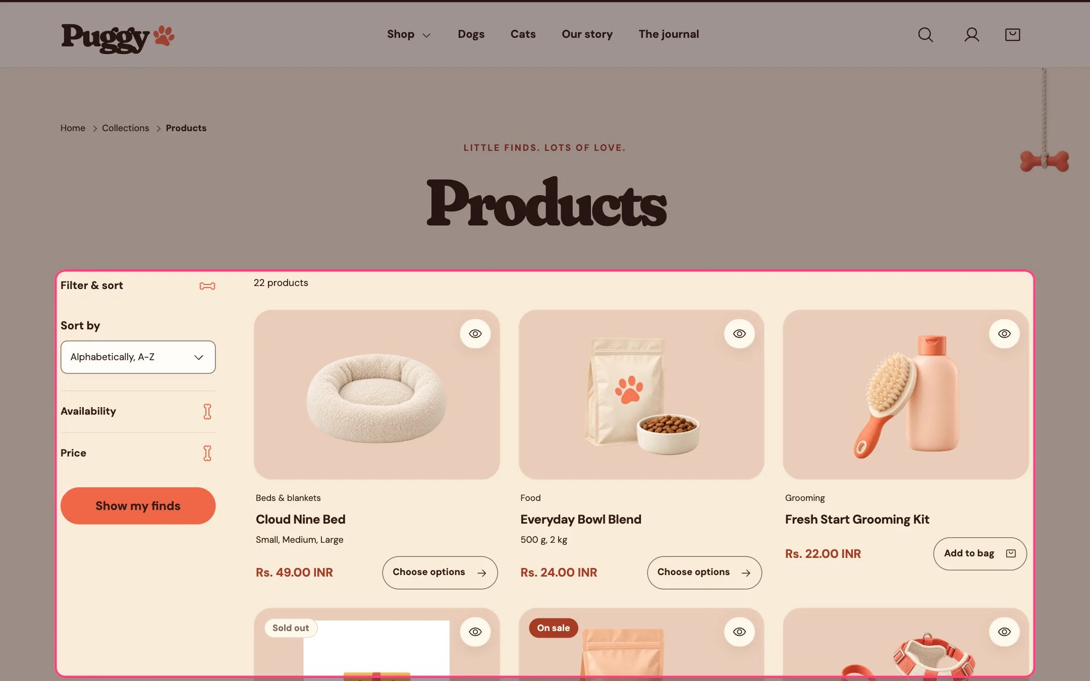
* Shows breadcrumbs, the collection title, its description and optionally its image, then the number of products.
* Filters and sorting sit in a Filter & sort panel beside the products on desktop and above them on phones. Shoppers tick filters, then select Show my finds. Active filters appear as removable chips with a Clear all filters link.
* Filter values with no matching products are grayed out, and color filters can show swatches.
* Pagination can be page numbers, a Load more button or infinite scroll. Infinite scroll loads up to four more pages on its own, then shows Load more so the footer stays reachable. A Showing X of Y count sits above the button.
* Promo tiles appear between products on the first page only, at the position you set.
* Collection navigation lists the links of a menu you choose, in the sidebar or above the products, with the current collection marked.
* When filters match nothing, a message and a Clear all filters button appear.
## Where to find it
Collection pages. In the theme editor, choose Collections > Default collection in the top page selector, then select Collection products.
## How it works
* Shows breadcrumbs, the collection title, its description and optionally its image, then the number of products.
* Filters and sorting sit in a Filter & sort panel beside the products on desktop and above them on phones. Shoppers tick filters, then select Show my finds. Active filters appear as removable chips with a Clear all filters link.
* Filter values with no matching products are grayed out, and color filters can show swatches.
* Pagination can be page numbers, a Load more button or infinite scroll. Infinite scroll loads up to four more pages on its own, then shows Load more so the footer stays reachable. A Showing X of Y count sits above the button.
* Promo tiles appear between products on the first page only, at the position you set.
* Collection navigation lists the links of a menu you choose, in the sidebar or above the products, with the current collection marked.
* When filters match nothing, a message and a Clear all filters button appear.
 ## Edit it
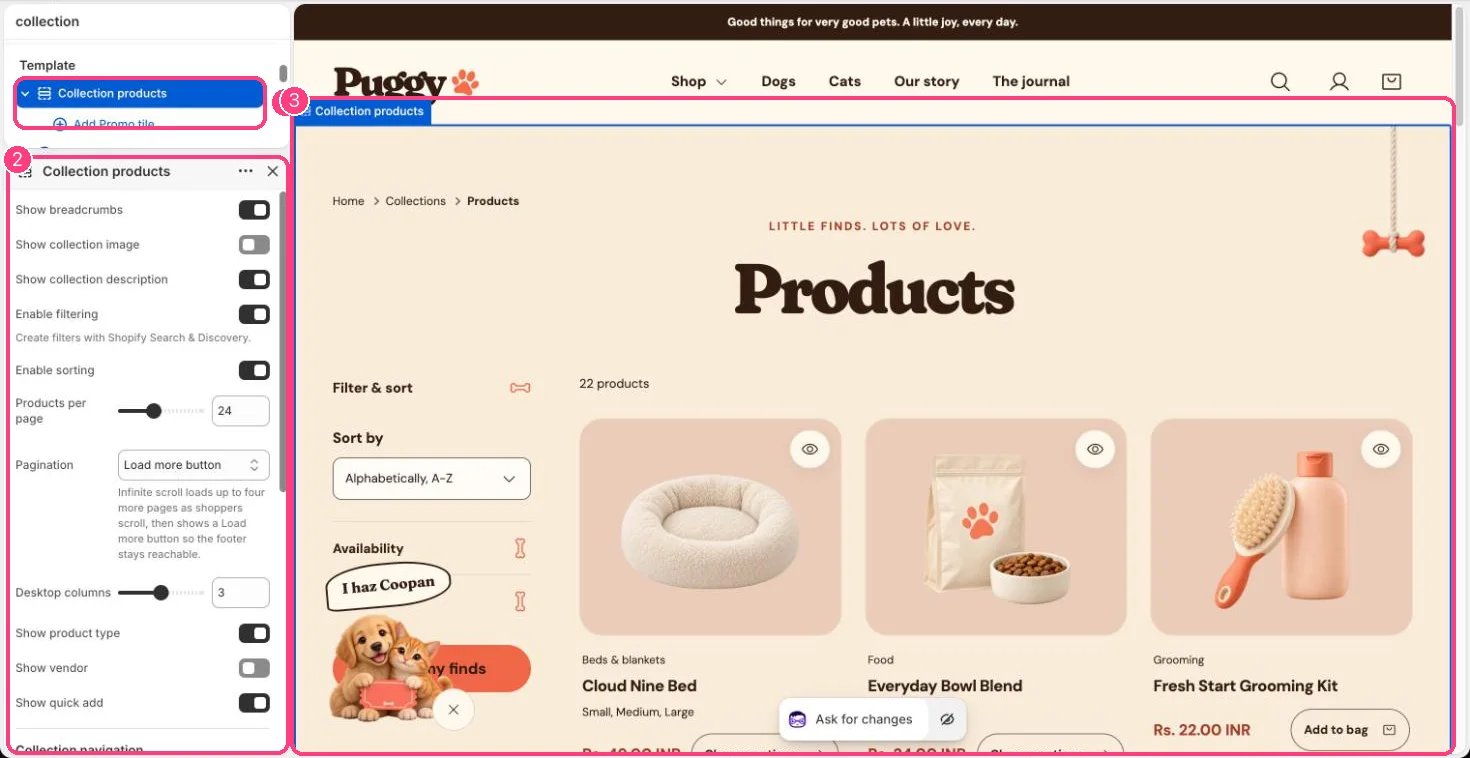
* Set Products per page (8 to 48), Desktop columns (2 to 4) and Pagination.
* Turn Enable filtering and Enable sorting on or off. Create and order filters in the Shopify Search & Discovery app.
* Click Add block > Promo tile (up to 6). Set Position in grid (1 to 24), Span two columns, image, text and color scheme. Its button shows only when both Button label and Button link are set.
* For collection navigation, choose a Menu, such as a Dogs menu with Food, Toys and Beds, and a Menu position (Sidebar or Above products).
* Turn Show collection image, Show collection description, Show breadcrumbs, Show product type, Show vendor and Show quick add on or off.
* Edit collection titles, descriptions and images in Shopify admin under Products > Collections.
## Settings
| Setting | What it does |
| - | - |
| **Show breadcrumbs** | On or off. Default: on. |
| **Show collection image** | On or off. Default: off. |
| **Show collection description** | On or off. Default: on. |
| **Enable filtering** | On or off. Create filters with Shopify Search & Discovery. Default: on. |
| **Enable sorting** | On or off. Default: on. |
| **Products per page** | Slider from 8 to 48, in steps of 4. Default: 24. |
| **Pagination** | Options: Page numbers, Load more button, Infinite scroll. Infinite scroll loads up to four more pages as shoppers scroll, then shows a Load more button so the footer stays reachable. Default: Load more button. |
| **Desktop columns** | Slider from 2 to 4. Default: 3. |
| **Show product type** | On or off. Default: on. |
| **Show vendor** | On or off. Default: off. |
| **Show quick add** | On or off. Default: on. |
**Collection navigation**
| Setting | What it does |
| - | - |
| **Menu** | Choose a menu. Shows links to related collections, such as a Dogs menu with Food, Toys and Beds. |
| **Menu position** | Options: Sidebar, Above products. Default: Sidebar. |
| **Color scheme** | Color scheme for this area (edit the schemes in Theme settings → Colors). Default: Scheme 1. |
| **Top padding** | Slider from 0 to 120, in steps of 4. Default: 48. |
| **Bottom padding** | Slider from 0 to 120, in steps of 4. Default: 80. |
## Blocks
Add a block with **Add block** under the section in the sidebar; drag blocks to reorder them.
### Promo tile (up to 6)
Promo tiles appear between products on the first page.
| Setting | What it does |
| - | - |
| **Position in grid** | Slider from 1 to 24. Default: 3. |
| **Span two columns** | On or off. Default: off. |
| **Image** | Image: upload one or choose from Content → Files. |
| **Eyebrow** | Text. |
| **Heading** | Text. Default: Treat week. |
| **Text** | Formatted text. |
| **Button label** | Text. Default: Shop now. |
| **Button link** | Link: a page, product, collection or web address. |
| **Color scheme** | Color scheme for this area (edit the schemes in Theme settings → Colors). Default: Scheme 2. |
Filters come from the Search & Discovery app and your product data. The theme can't show a filter your catalog has no data for.
This documentation is built and hosted on [Mintlify](https://mintlify.com), a developer documentation platform.
## Edit it
* Set Products per page (8 to 48), Desktop columns (2 to 4) and Pagination.
* Turn Enable filtering and Enable sorting on or off. Create and order filters in the Shopify Search & Discovery app.
* Click Add block > Promo tile (up to 6). Set Position in grid (1 to 24), Span two columns, image, text and color scheme. Its button shows only when both Button label and Button link are set.
* For collection navigation, choose a Menu, such as a Dogs menu with Food, Toys and Beds, and a Menu position (Sidebar or Above products).
* Turn Show collection image, Show collection description, Show breadcrumbs, Show product type, Show vendor and Show quick add on or off.
* Edit collection titles, descriptions and images in Shopify admin under Products > Collections.
## Settings
| Setting | What it does |
| - | - |
| **Show breadcrumbs** | On or off. Default: on. |
| **Show collection image** | On or off. Default: off. |
| **Show collection description** | On or off. Default: on. |
| **Enable filtering** | On or off. Create filters with Shopify Search & Discovery. Default: on. |
| **Enable sorting** | On or off. Default: on. |
| **Products per page** | Slider from 8 to 48, in steps of 4. Default: 24. |
| **Pagination** | Options: Page numbers, Load more button, Infinite scroll. Infinite scroll loads up to four more pages as shoppers scroll, then shows a Load more button so the footer stays reachable. Default: Load more button. |
| **Desktop columns** | Slider from 2 to 4. Default: 3. |
| **Show product type** | On or off. Default: on. |
| **Show vendor** | On or off. Default: off. |
| **Show quick add** | On or off. Default: on. |
**Collection navigation**
| Setting | What it does |
| - | - |
| **Menu** | Choose a menu. Shows links to related collections, such as a Dogs menu with Food, Toys and Beds. |
| **Menu position** | Options: Sidebar, Above products. Default: Sidebar. |
| **Color scheme** | Color scheme for this area (edit the schemes in Theme settings → Colors). Default: Scheme 1. |
| **Top padding** | Slider from 0 to 120, in steps of 4. Default: 48. |
| **Bottom padding** | Slider from 0 to 120, in steps of 4. Default: 80. |
## Blocks
Add a block with **Add block** under the section in the sidebar; drag blocks to reorder them.
### Promo tile (up to 6)
Promo tiles appear between products on the first page.
| Setting | What it does |
| - | - |
| **Position in grid** | Slider from 1 to 24. Default: 3. |
| **Span two columns** | On or off. Default: off. |
| **Image** | Image: upload one or choose from Content → Files. |
| **Eyebrow** | Text. |
| **Heading** | Text. Default: Treat week. |
| **Text** | Formatted text. |
| **Button label** | Text. Default: Shop now. |
| **Button link** | Link: a page, product, collection or web address. |
| **Color scheme** | Color scheme for this area (edit the schemes in Theme settings → Colors). Default: Scheme 2. |
Filters come from the Search & Discovery app and your product data. The theme can't show a filter your catalog has no data for.
This documentation is built and hosted on [Mintlify](https://mintlify.com), a developer documentation platform.