> ## Documentation Index
> Fetch the complete documentation index at: https://docs.kwebby.com/llms.txt
> Use this file to discover all available pages before exploring further.
# Featured collection
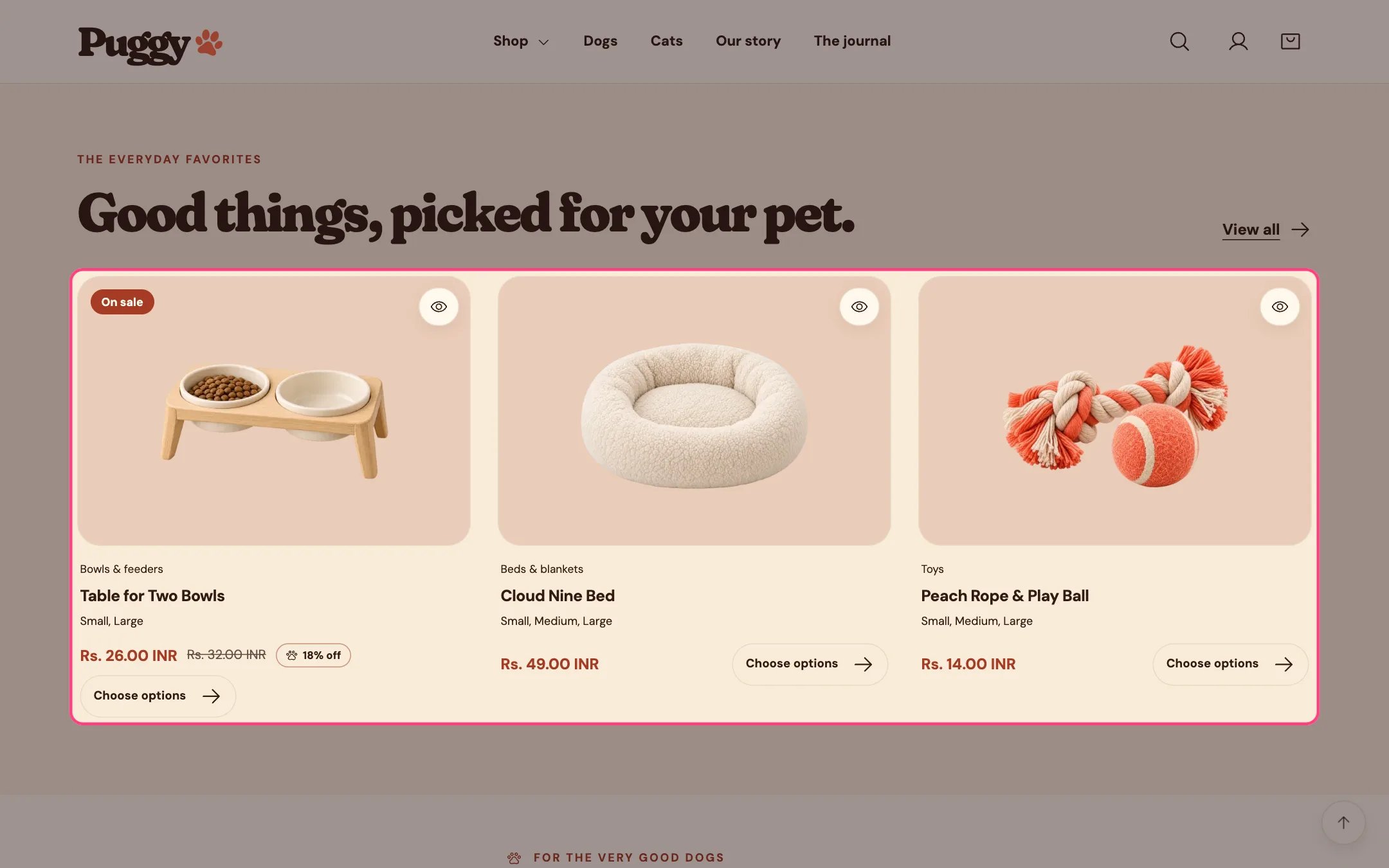
> A grid of products from one collection, such as best sellers or new arrivals, with a View all link.
 ## Where to find it
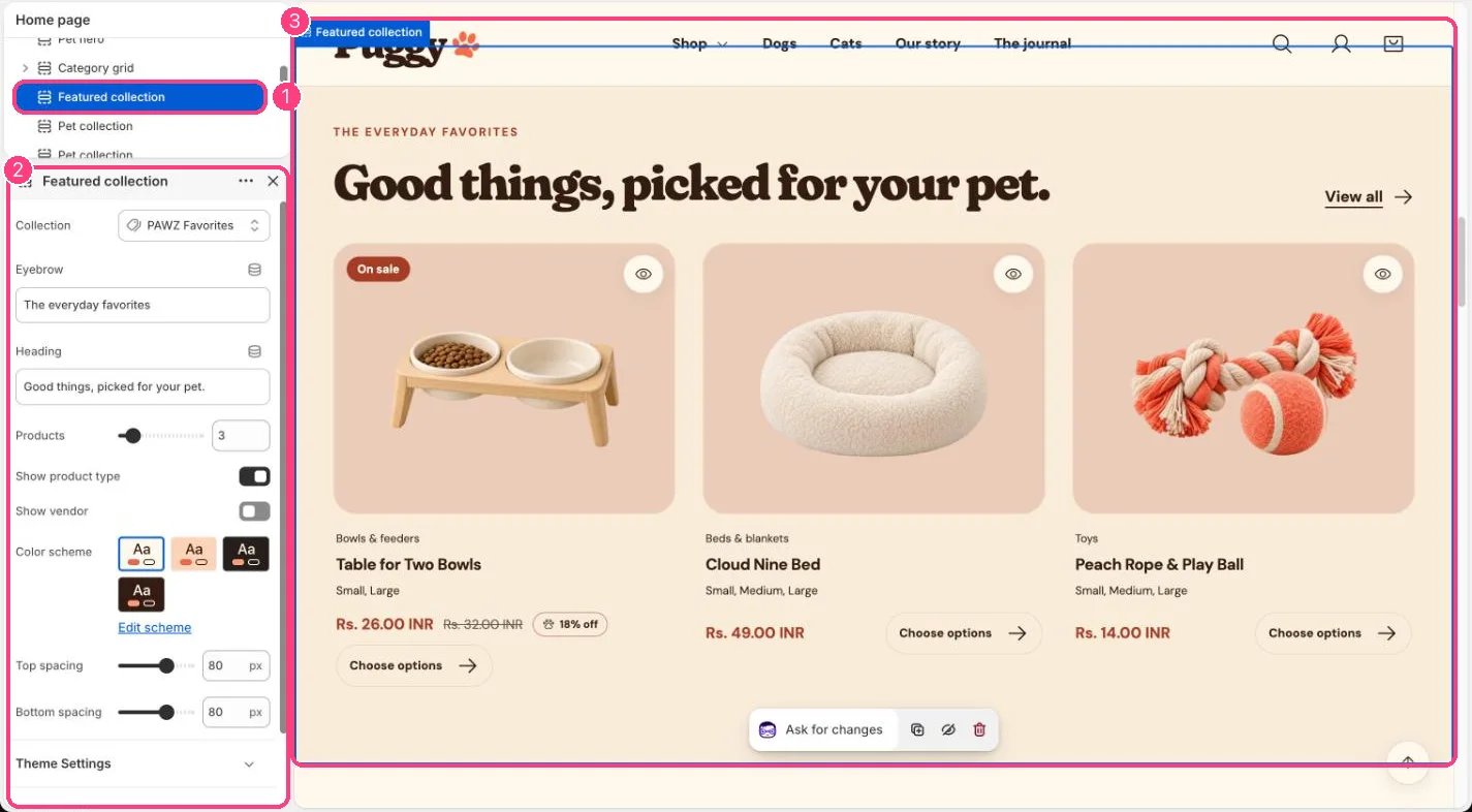
Home page. Choose Home page in the top page selector, then select Featured collection. Add it to other pages with Add section > Featured collection.
## How it works
* Shows 2 to 12 products from the chosen collection as product cards with price, badges and quick view.
* With no collection chosen, it shows products from your whole catalog.
* Products with a single variant show an Add to bag button; products with options show Choose options, which opens the product page.
* The heading falls back to the collection title when blank, and View all links to the collection.
* Cards sit three across on large screens and two across on phones. The section background uses the color scheme's Surface color.
* If the chosen collection has no products, the theme editor shows a reminder and the storefront grid stays empty.
## Where to find it
Home page. Choose Home page in the top page selector, then select Featured collection. Add it to other pages with Add section > Featured collection.
## How it works
* Shows 2 to 12 products from the chosen collection as product cards with price, badges and quick view.
* With no collection chosen, it shows products from your whole catalog.
* Products with a single variant show an Add to bag button; products with options show Choose options, which opens the product page.
* The heading falls back to the collection title when blank, and View all links to the collection.
* Cards sit three across on large screens and two across on phones. The section background uses the color scheme's Surface color.
* If the chosen collection has no products, the theme editor shows a reminder and the storefront grid stays empty.
 ## Edit it
* Choose a Collection and set Products (2 to 12).
* Edit Eyebrow and Heading.
* Turn Show product type and Show vendor on or off.
* The card look (hover image, swatches, option values, quick view) is set in Theme settings > Product cards.
## Settings
| Setting | What it does |
| - | - |
| **Collection** | Choose a collection. |
| **Eyebrow** | Text. Default: The everyday happy makers. |
| **Heading** | Text. Default: Good things, picked with love. |
| **Products** | Slider from 2 to 12. Default: 4. |
| **Show product type** | On or off. Default: on. |
| **Show vendor** | On or off. Default: off. |
| **Color scheme** | Color scheme for this area (edit the schemes in Theme settings → Colors). Default: Scheme 1. |
| **Top spacing** | Slider from 0 to 120 px, in steps of 4. Default: 64 px. |
| **Bottom spacing** | Slider from 0 to 120 px, in steps of 4. Default: 64 px. |
This documentation is built and hosted on [Mintlify](https://mintlify.com), a developer documentation platform.
## Edit it
* Choose a Collection and set Products (2 to 12).
* Edit Eyebrow and Heading.
* Turn Show product type and Show vendor on or off.
* The card look (hover image, swatches, option values, quick view) is set in Theme settings > Product cards.
## Settings
| Setting | What it does |
| - | - |
| **Collection** | Choose a collection. |
| **Eyebrow** | Text. Default: The everyday happy makers. |
| **Heading** | Text. Default: Good things, picked with love. |
| **Products** | Slider from 2 to 12. Default: 4. |
| **Show product type** | On or off. Default: on. |
| **Show vendor** | On or off. Default: off. |
| **Color scheme** | Color scheme for this area (edit the schemes in Theme settings → Colors). Default: Scheme 1. |
| **Top spacing** | Slider from 0 to 120 px, in steps of 4. Default: 64 px. |
| **Bottom spacing** | Slider from 0 to 120 px, in steps of 4. Default: 64 px. |
This documentation is built and hosted on [Mintlify](https://mintlify.com), a developer documentation platform.