> ## Documentation Index
> Fetch the complete documentation index at: https://docs.kwebby.com/llms.txt
> Use this file to discover all available pages before exploring further.
# Featured product
> One product with its gallery, price, options and buy buttons, placed on any page.
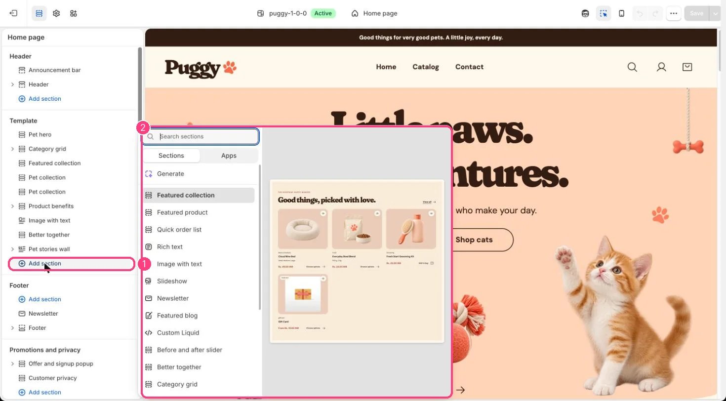 ## Where to find it
Not on a default template. Add it to the home page or any page with Add section > Featured product, then choose a Product.
## How it works
* Uses the same building blocks as the product page: Title, Vendor, Price, Description, Variant picker, Quantity, Inventory, Buy buttons, Pickup availability, Collapsible row, Custom Liquid, Complementary products and app blocks. Up to 30 blocks.
* Choosing options updates the price, images and buttons in place without changing the page address.
* The gallery has thumbnails, arrows and a zoom lightbox, and plays videos and 3D models.
* A See all the little details link goes to the full product page.
* Adding to the bag opens the cart drawer.
* Nothing shows on the storefront until a product is chosen.
## Edit it
* Choose the Product, then add and reorder blocks. The preset starts with Title, Price, Variant picker, Quantity, Buy buttons and Description.
* Set Media position on desktop, Keep product information in view and the spacing.
* Under Product gallery, choose Main image fit, Thumbnail size (56 to 96 px) and whether to show image arrows.
## Settings
| Setting | What it does |
| - | - |
| **Product** | Choose a product. |
| **Color scheme** | Color scheme for this area (edit the schemes in Theme settings → Colors). Default: Scheme 1. |
| **Media position on desktop** | Options: Left, Right. Default: Left. |
| **Keep product information in view** | On or off. Default: off. |
| **Top spacing** | Slider from 0 to 120 px, in steps of 4. Default: 40 px. |
| **Bottom spacing** | Slider from 0 to 120 px, in steps of 4. Default: 64 px. |
**Product gallery**
| Setting | What it does |
| - | - |
| **Main image fit** | Options: Show the whole image, Fill the image area. Default: Show the whole image. |
| **Thumbnail size** | Slider from 56 to 96 px, in steps of 4. Default: 76 px. |
| **Show previous and next image buttons** | On or off. Default: on. |
## Blocks
Up to 30 blocks. Add a block with **Add block** under the section in the sidebar; drag blocks to reorder them.
### App blocks
Blocks from apps you have installed, such as reviews or subscriptions. Click **Add block** and choose one from the Apps tab; its settings come from the app.
### Title (up to 1)
No settings: add or remove it, and drag it into place.
### Vendor (up to 1)
No settings: add or remove it, and drag it into place.
### Price (up to 1)
No settings: add or remove it, and drag it into place.
### Description (up to 1)
No settings: add or remove it, and drag it into place.
### Variant picker (up to 1)
| Setting | What it does |
| - | - |
| **Option style** | Options: Dropdown, Buttons. Options with native color or image swatches always show swatches. Default: Dropdown. |
### Quantity (up to 1)
| Setting | What it does |
| - | - |
| **Show quantity buttons** | On or off. Default: on. |
### Inventory (up to 1)
| Setting | What it does |
| - | - |
| **Low stock threshold** | Slider from 1 to 30. Default: 5. |
### Buy buttons (up to 1)
| Setting | What it does |
| - | - |
| **Show accelerated checkout** | On or off. Default: on. |
| **Gift card recipient fields** | On or off. Default: on. |
### Pickup availability (up to 1)
No settings: add or remove it, and drag it into place.
### Collapsible row
| Setting | What it does |
| - | - |
| **Heading** | Text. Default: The little details. |
| **Content** | Formatted text. |
| **Page content** | Choose a page. |
### Custom Liquid
| Setting | What it does |
| - | - |
| **Custom Liquid** | Liquid code. |
### Complementary products (up to 1)
| Setting | What it does |
| - | - |
| **Heading** | Text. Default: Lovely together. |
| **Products to show** | Slider from 2 to 8. Default: 4. |
Product badges, size chart, back in stock and trust badge blocks are only available in the main Product information section.
This documentation is built and hosted on [Mintlify](https://mintlify.com), a developer documentation platform.
## Where to find it
Not on a default template. Add it to the home page or any page with Add section > Featured product, then choose a Product.
## How it works
* Uses the same building blocks as the product page: Title, Vendor, Price, Description, Variant picker, Quantity, Inventory, Buy buttons, Pickup availability, Collapsible row, Custom Liquid, Complementary products and app blocks. Up to 30 blocks.
* Choosing options updates the price, images and buttons in place without changing the page address.
* The gallery has thumbnails, arrows and a zoom lightbox, and plays videos and 3D models.
* A See all the little details link goes to the full product page.
* Adding to the bag opens the cart drawer.
* Nothing shows on the storefront until a product is chosen.
## Edit it
* Choose the Product, then add and reorder blocks. The preset starts with Title, Price, Variant picker, Quantity, Buy buttons and Description.
* Set Media position on desktop, Keep product information in view and the spacing.
* Under Product gallery, choose Main image fit, Thumbnail size (56 to 96 px) and whether to show image arrows.
## Settings
| Setting | What it does |
| - | - |
| **Product** | Choose a product. |
| **Color scheme** | Color scheme for this area (edit the schemes in Theme settings → Colors). Default: Scheme 1. |
| **Media position on desktop** | Options: Left, Right. Default: Left. |
| **Keep product information in view** | On or off. Default: off. |
| **Top spacing** | Slider from 0 to 120 px, in steps of 4. Default: 40 px. |
| **Bottom spacing** | Slider from 0 to 120 px, in steps of 4. Default: 64 px. |
**Product gallery**
| Setting | What it does |
| - | - |
| **Main image fit** | Options: Show the whole image, Fill the image area. Default: Show the whole image. |
| **Thumbnail size** | Slider from 56 to 96 px, in steps of 4. Default: 76 px. |
| **Show previous and next image buttons** | On or off. Default: on. |
## Blocks
Up to 30 blocks. Add a block with **Add block** under the section in the sidebar; drag blocks to reorder them.
### App blocks
Blocks from apps you have installed, such as reviews or subscriptions. Click **Add block** and choose one from the Apps tab; its settings come from the app.
### Title (up to 1)
No settings: add or remove it, and drag it into place.
### Vendor (up to 1)
No settings: add or remove it, and drag it into place.
### Price (up to 1)
No settings: add or remove it, and drag it into place.
### Description (up to 1)
No settings: add or remove it, and drag it into place.
### Variant picker (up to 1)
| Setting | What it does |
| - | - |
| **Option style** | Options: Dropdown, Buttons. Options with native color or image swatches always show swatches. Default: Dropdown. |
### Quantity (up to 1)
| Setting | What it does |
| - | - |
| **Show quantity buttons** | On or off. Default: on. |
### Inventory (up to 1)
| Setting | What it does |
| - | - |
| **Low stock threshold** | Slider from 1 to 30. Default: 5. |
### Buy buttons (up to 1)
| Setting | What it does |
| - | - |
| **Show accelerated checkout** | On or off. Default: on. |
| **Gift card recipient fields** | On or off. Default: on. |
### Pickup availability (up to 1)
No settings: add or remove it, and drag it into place.
### Collapsible row
| Setting | What it does |
| - | - |
| **Heading** | Text. Default: The little details. |
| **Content** | Formatted text. |
| **Page content** | Choose a page. |
### Custom Liquid
| Setting | What it does |
| - | - |
| **Custom Liquid** | Liquid code. |
### Complementary products (up to 1)
| Setting | What it does |
| - | - |
| **Heading** | Text. Default: Lovely together. |
| **Products to show** | Slider from 2 to 8. Default: 4. |
Product badges, size chart, back in stock and trust badge blocks are only available in the main Product information section.
This documentation is built and hosted on [Mintlify](https://mintlify.com), a developer documentation platform.