> ## Documentation Index
> Fetch the complete documentation index at: https://docs.kwebby.com/llms.txt
> Use this file to discover all available pages before exploring further.
# Header
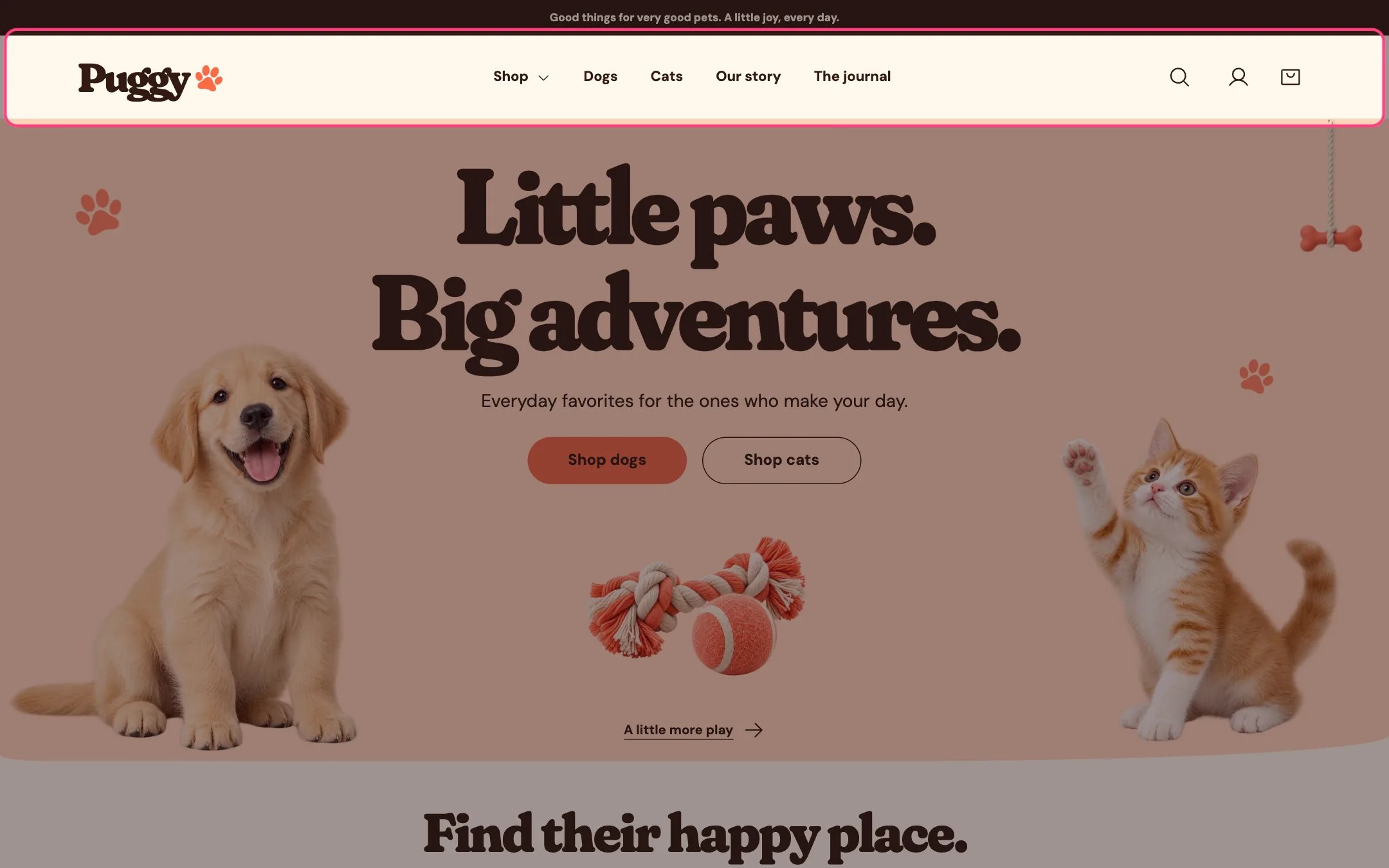
> The top bar with your logo, main menu, search, account and bag icons. It holds the dropdown or mega menu, menu promos and instant search suggestions.
 ## Where to find it
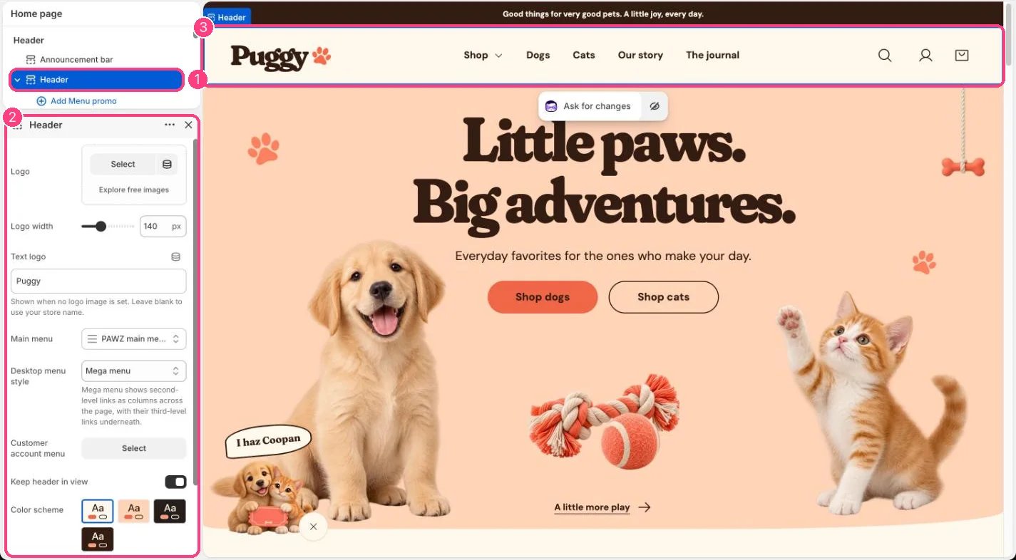
Every page. In the theme editor, select Header in the Header area of the sidebar.
## How it works
* Shows your logo image at the width you choose. Without an image it shows the Text logo, or your store name when that is blank, with the small brand mark beside it (set in Theme settings > Layout > Brand mark).
* The main menu supports three levels. On desktop, a top-level item with links under it opens a Dropdown or a full-width Mega menu when selected. Escape or a click elsewhere closes it.
* On screens up to 760 px wide, the menu moves behind a menu button that lists all three levels, plus any menu promos.
* The search icon opens a search box. After two characters it suggests up to four products, collections, articles and pages; arrow keys move through the suggestions and Enter opens the full search page.
* The account icon appears when customer accounts are turned on in your Shopify admin. Shopify supplies the sign-in and the account menu.
* The bag icon shows how many items are in the bag. With Cart type set to Drawer, it opens the cart drawer instead of leaving the page.
* With Keep header in view on, the header stays at the top of the screen while shoppers scroll.
* If no menu is chosen, the header shows Shop and All categories links so the store stays browsable.
## Where to find it
Every page. In the theme editor, select Header in the Header area of the sidebar.
## How it works
* Shows your logo image at the width you choose. Without an image it shows the Text logo, or your store name when that is blank, with the small brand mark beside it (set in Theme settings > Layout > Brand mark).
* The main menu supports three levels. On desktop, a top-level item with links under it opens a Dropdown or a full-width Mega menu when selected. Escape or a click elsewhere closes it.
* On screens up to 760 px wide, the menu moves behind a menu button that lists all three levels, plus any menu promos.
* The search icon opens a search box. After two characters it suggests up to four products, collections, articles and pages; arrow keys move through the suggestions and Enter opens the full search page.
* The account icon appears when customer accounts are turned on in your Shopify admin. Shopify supplies the sign-in and the account menu.
* The bag icon shows how many items are in the bag. With Cart type set to Drawer, it opens the cart drawer instead of leaving the page.
* With Keep header in view on, the header stays at the top of the screen while shoppers scroll.
* If no menu is chosen, the header shows Shop and All categories links so the store stays browsable.
 ## Edit it
* Upload a Logo and set Logo width (60 to 300 px). Leave the logo empty to use the text logo.
* Choose your Main menu. Build it in Shopify admin under Content > Menus, and nest links to create the second and third levels.
* Pick a Desktop menu style: Dropdown, or Mega menu to show second-level links as columns with their third-level links underneath.
* To put an image card inside a menu, click Add block > Menu promo and type the exact title of the top-level menu item in Menu item. Up to 4 menu promos.
* Choose a Customer account menu to add your own links to the account menu that Shopify shows.
* Turn off Keep header in view if you prefer the header to scroll away with the page.
## Settings
| Setting | What it does |
| - | - |
| **Logo** | Image: upload one or choose from Content → Files. |
| **Logo width** | Slider from 60 to 300 px, in steps of 5. Default: 140 px. |
| **Text logo** | Text. Shown when no logo image is set. Leave blank to use your store name. |
| **Main menu** | Choose a menu. Default: main-menu. |
| **Desktop menu style** | Options: Dropdown, Mega menu. Mega menu shows second-level links as columns across the page, with their third-level links underneath. Default: Dropdown. |
| **Customer account menu** | Choose a menu. |
| **Keep header in view** | On or off. Default: on. |
| **Color scheme** | Color scheme for this area (edit the schemes in Theme settings → Colors). Default: Scheme 1. |
## Blocks
Add a block with **Add block** under the section in the sidebar; drag blocks to reorder them.
### Menu promo (up to 4)
| Setting | What it does |
| - | - |
| **Menu item** | Text. The title of a top-level menu item that has links under it. The promo appears in its dropdown and in the mobile menu. Default: Shop. |
| **Image** | Image: upload one or choose from Content → Files. |
| **Heading** | Text. Default: New this week. |
| **Text** | Text. Default: Fresh picks for curious paws. |
| **Link label** | Text. Default: Shop now. |
| **Link** | Link: a page, product, collection or web address. |
| **Color scheme** | Color scheme for this area (edit the schemes in Theme settings → Colors). Default: Scheme 2. |
Country and language selectors live in the footer, not the header.
The account icon only appears when customer accounts are turned on in Settings > Customer accounts.
This documentation is built and hosted on [Mintlify](https://mintlify.com), a developer documentation platform.
## Edit it
* Upload a Logo and set Logo width (60 to 300 px). Leave the logo empty to use the text logo.
* Choose your Main menu. Build it in Shopify admin under Content > Menus, and nest links to create the second and third levels.
* Pick a Desktop menu style: Dropdown, or Mega menu to show second-level links as columns with their third-level links underneath.
* To put an image card inside a menu, click Add block > Menu promo and type the exact title of the top-level menu item in Menu item. Up to 4 menu promos.
* Choose a Customer account menu to add your own links to the account menu that Shopify shows.
* Turn off Keep header in view if you prefer the header to scroll away with the page.
## Settings
| Setting | What it does |
| - | - |
| **Logo** | Image: upload one or choose from Content → Files. |
| **Logo width** | Slider from 60 to 300 px, in steps of 5. Default: 140 px. |
| **Text logo** | Text. Shown when no logo image is set. Leave blank to use your store name. |
| **Main menu** | Choose a menu. Default: main-menu. |
| **Desktop menu style** | Options: Dropdown, Mega menu. Mega menu shows second-level links as columns across the page, with their third-level links underneath. Default: Dropdown. |
| **Customer account menu** | Choose a menu. |
| **Keep header in view** | On or off. Default: on. |
| **Color scheme** | Color scheme for this area (edit the schemes in Theme settings → Colors). Default: Scheme 1. |
## Blocks
Add a block with **Add block** under the section in the sidebar; drag blocks to reorder them.
### Menu promo (up to 4)
| Setting | What it does |
| - | - |
| **Menu item** | Text. The title of a top-level menu item that has links under it. The promo appears in its dropdown and in the mobile menu. Default: Shop. |
| **Image** | Image: upload one or choose from Content → Files. |
| **Heading** | Text. Default: New this week. |
| **Text** | Text. Default: Fresh picks for curious paws. |
| **Link label** | Text. Default: Shop now. |
| **Link** | Link: a page, product, collection or web address. |
| **Color scheme** | Color scheme for this area (edit the schemes in Theme settings → Colors). Default: Scheme 2. |
Country and language selectors live in the footer, not the header.
The account icon only appears when customer accounts are turned on in Settings > Customer accounts.
This documentation is built and hosted on [Mintlify](https://mintlify.com), a developer documentation platform.