> ## Documentation Index
> Fetch the complete documentation index at: https://docs.kwebby.com/llms.txt
> Use this file to discover all available pages before exploring further.
# Image with hotspots
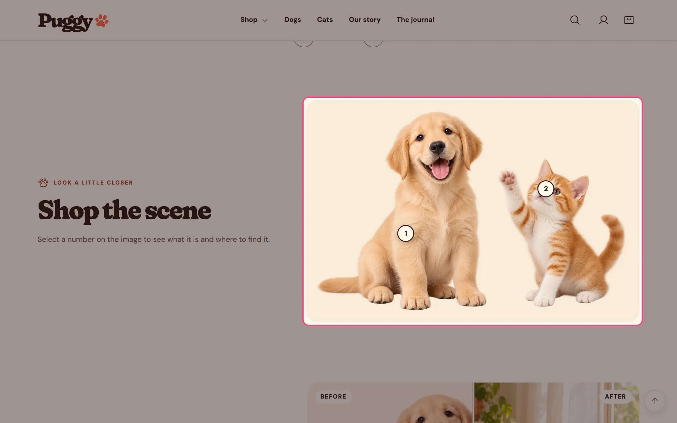
> An image with numbered markers. Each marker opens a card that shows a product or a short note.
 ## Where to find it
Not on a default template. Add it to any page with Add section > Image with hotspots.
## How it works
* Markers are placed by percentage, so they stay on the same spot at every screen size.
* Selecting a marker opens one card at a time: a product's image, title, price and link, or your own heading, text and link.
* On larger screens the card pops up over the image; on phones it appears under the image.
* Markers pulse gently until the first one is opened, unless the shopper prefers reduced motion.
* Escape, the close button or a click elsewhere closes the card.
* Up to 8 hotspots. Without an image, built-in pet artwork appears.
## Where to find it
Not on a default template. Add it to any page with Add section > Image with hotspots.
## How it works
* Markers are placed by percentage, so they stay on the same spot at every screen size.
* Selecting a marker opens one card at a time: a product's image, title, price and link, or your own heading, text and link.
* On larger screens the card pops up over the image; on phones it appears under the image.
* Markers pulse gently until the first one is opened, unless the shopper prefers reduced motion.
* Escape, the close button or a click elsewhere closes the card.
* Up to 8 hotspots. Without an image, built-in pet artwork appears.
 ## Edit it
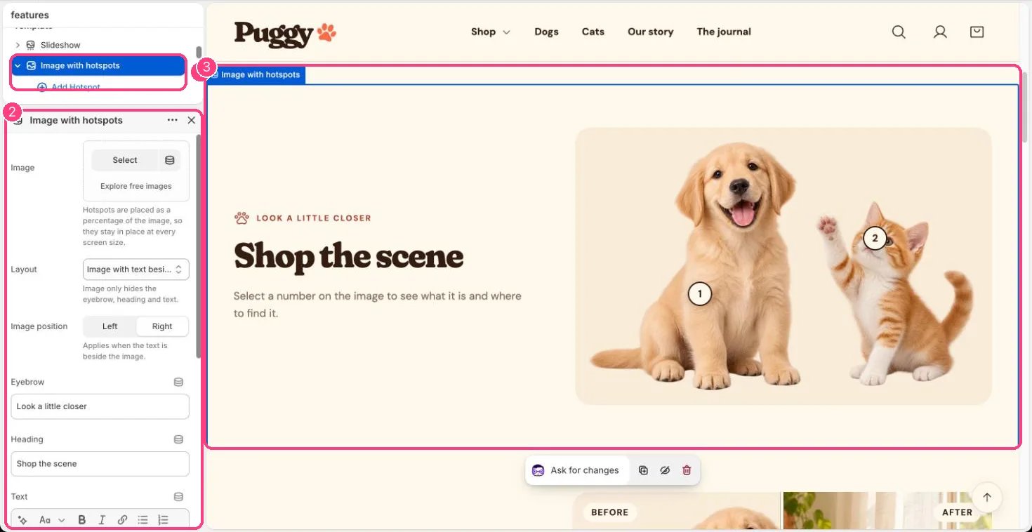
* Choose the Image, then click Add block > Hotspot.
* Move each hotspot with Horizontal position and Vertical position (0 to 100 percent).
* Choose a Product, or leave it empty and fill Heading, Text, Link label and Link. A link without a label reads Learn more.
* Pick a Layout (Image only, or Image with text beside) and an Image position.
## Settings
| Setting | What it does |
| - | - |
| **Image** | Image: upload one or choose from Content → Files. Hotspots are placed as a percentage of the image, so they stay in place at every screen size. |
| **Layout** | Options: Image only, Image with text beside. Image only hides the eyebrow, heading and text. Default: Image with text beside. |
| **Image position** | Options: Left, Right. Applies when the text is beside the image. Default: Right. |
| **Eyebrow** | Text. Default: Look a little closer. |
| **Heading** | Text. Default: Every detail, tagged. |
| **Text** | Formatted text. |
| **Color scheme** | Color scheme for this area (edit the schemes in Theme settings → Colors). Default: Scheme 1. |
| **Top spacing** | Slider from 0 to 120 px, in steps of 4. Default: 64 px. |
| **Bottom spacing** | Slider from 0 to 120 px, in steps of 4. Default: 64 px. |
## Blocks
Up to 8 blocks. Add a block with **Add block** under the section in the sidebar; drag blocks to reorder them.
### Hotspot
| Setting | What it does |
| - | - |
| **Horizontal position** | Slider from 0 to 100 %. Default: 50 %. |
| **Vertical position** | Slider from 0 to 100 %. Default: 50 %. |
| **Product** | Choose a product. Shows the product image, title, price and a link. Leave empty to use the heading, text and link below. |
**Without a product**
| Setting | What it does |
| - | - |
| **Heading** | Text. Default: Point out a detail. |
| **Text** | Formatted text. |
| **Link label** | Text. Shows "Learn more" when a link is set and this is empty. |
| **Link** | Link: a page, product, collection or web address. |
This documentation is built and hosted on [Mintlify](https://mintlify.com), a developer documentation platform.
## Edit it
* Choose the Image, then click Add block > Hotspot.
* Move each hotspot with Horizontal position and Vertical position (0 to 100 percent).
* Choose a Product, or leave it empty and fill Heading, Text, Link label and Link. A link without a label reads Learn more.
* Pick a Layout (Image only, or Image with text beside) and an Image position.
## Settings
| Setting | What it does |
| - | - |
| **Image** | Image: upload one or choose from Content → Files. Hotspots are placed as a percentage of the image, so they stay in place at every screen size. |
| **Layout** | Options: Image only, Image with text beside. Image only hides the eyebrow, heading and text. Default: Image with text beside. |
| **Image position** | Options: Left, Right. Applies when the text is beside the image. Default: Right. |
| **Eyebrow** | Text. Default: Look a little closer. |
| **Heading** | Text. Default: Every detail, tagged. |
| **Text** | Formatted text. |
| **Color scheme** | Color scheme for this area (edit the schemes in Theme settings → Colors). Default: Scheme 1. |
| **Top spacing** | Slider from 0 to 120 px, in steps of 4. Default: 64 px. |
| **Bottom spacing** | Slider from 0 to 120 px, in steps of 4. Default: 64 px. |
## Blocks
Up to 8 blocks. Add a block with **Add block** under the section in the sidebar; drag blocks to reorder them.
### Hotspot
| Setting | What it does |
| - | - |
| **Horizontal position** | Slider from 0 to 100 %. Default: 50 %. |
| **Vertical position** | Slider from 0 to 100 %. Default: 50 %. |
| **Product** | Choose a product. Shows the product image, title, price and a link. Leave empty to use the heading, text and link below. |
**Without a product**
| Setting | What it does |
| - | - |
| **Heading** | Text. Default: Point out a detail. |
| **Text** | Formatted text. |
| **Link label** | Text. Shows "Learn more" when a link is set and this is empty. |
| **Link** | Link: a page, product, collection or web address. |
This documentation is built and hosted on [Mintlify](https://mintlify.com), a developer documentation platform.