> ## Documentation Index
> Fetch the complete documentation index at: https://docs.kwebby.com/llms.txt
> Use this file to discover all available pages before exploring further.
# Lookbook
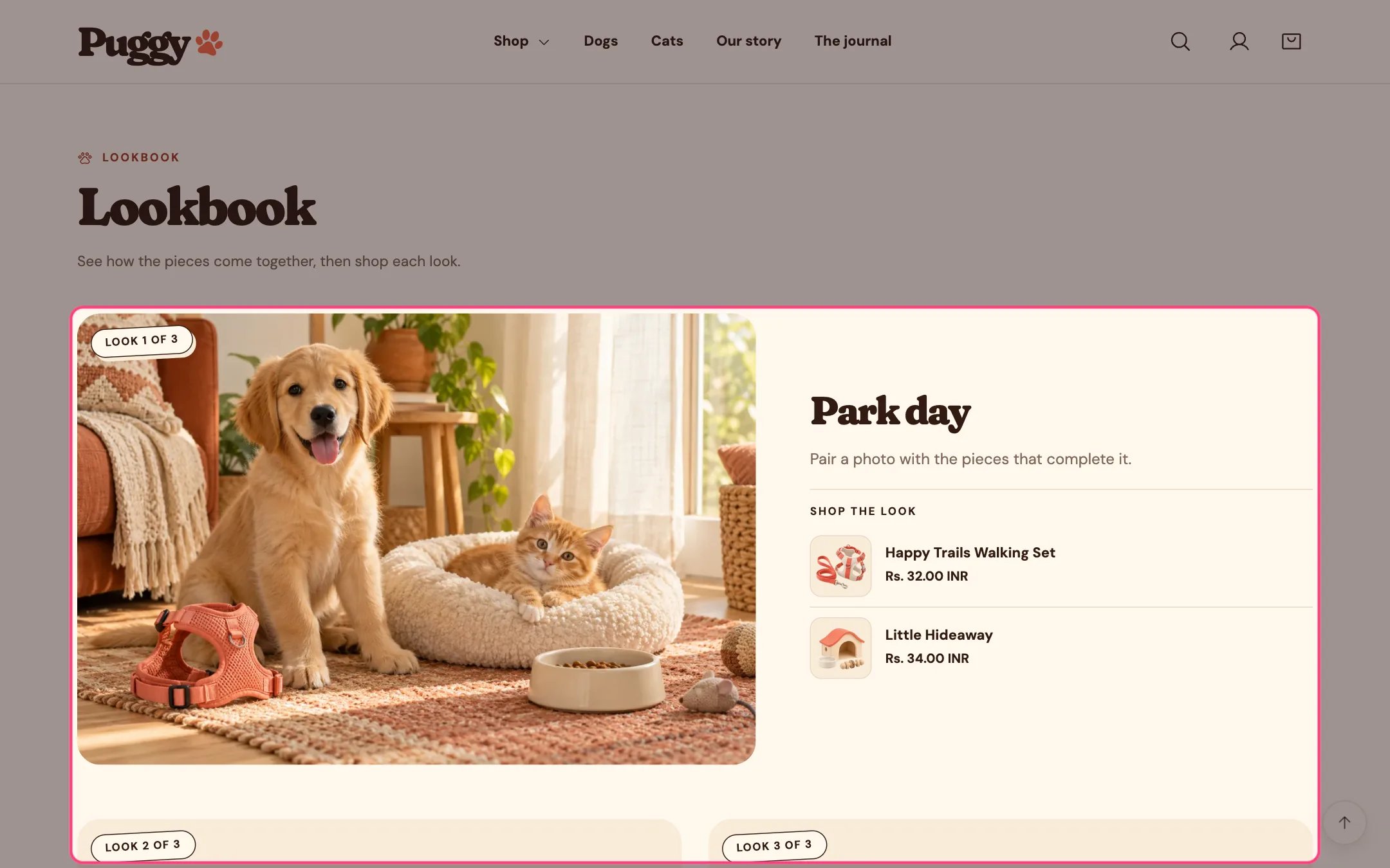
> A set of styled photos, called looks, each with a title, text and up to three products to shop.
 ## Where to find it
Not on a default template. Add it to any page with Add section > Lookbook.
## How it works
* Editorial grid shows the first look large with the others beside or below it. Horizontal scroller places looks side by side with previous and next buttons.
* Each look lists up to three products with image, title, price and a sold out note when needed. Titles link to the product.
* Looks without products show only their title and text.
* A sample photo shows until you choose an image.
* An optional link to a collection appears with the looks.
* Up to 12 looks.
## Where to find it
Not on a default template. Add it to any page with Add section > Lookbook.
## How it works
* Editorial grid shows the first look large with the others beside or below it. Horizontal scroller places looks side by side with previous and next buttons.
* Each look lists up to three products with image, title, price and a sold out note when needed. Titles link to the product.
* Looks without products show only their title and text.
* A sample photo shows until you choose an image.
* An optional link to a collection appears with the looks.
* Up to 12 looks.
 ## Edit it
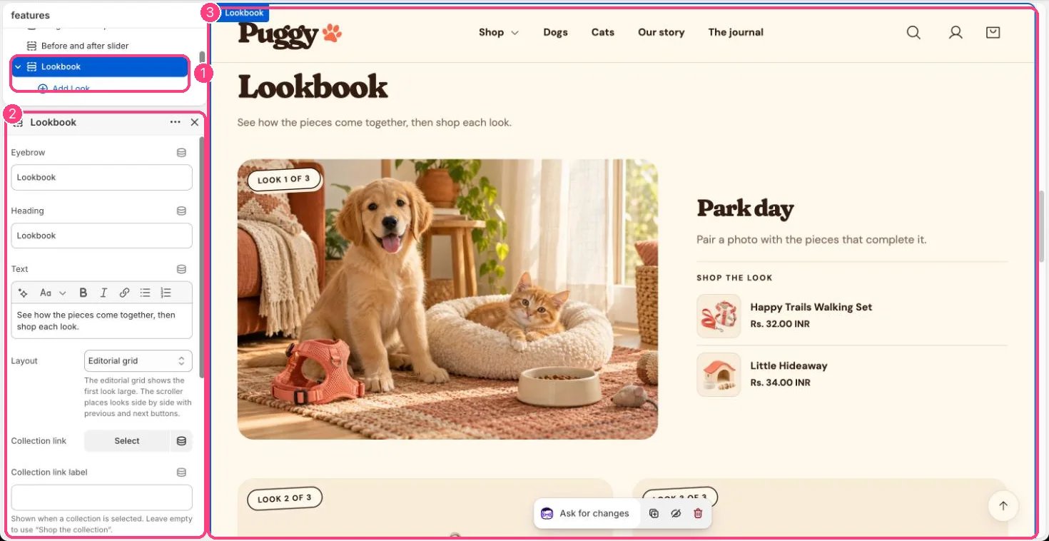
* Click Add block > Look, add an Image, Image description, Title and Text, then choose Product 1 to Product 3.
* Choose a Layout: Editorial grid or Horizontal scroller.
* Pick a Collection link and, if you like, a Collection link label (the default is Shop the collection).
## Settings
| Setting | What it does |
| - | - |
| **Eyebrow** | Text. Default: Lookbook. |
| **Heading** | Text. Default: Little looks for big days. |
| **Text** | Formatted text. |
| **Layout** | Options: Editorial grid, Horizontal scroller. The editorial grid shows the first look large. The scroller places looks side by side with previous and next buttons. Default: Editorial grid. |
| **Collection link** | Choose a collection. |
| **Collection link label** | Text. Shown when a collection is selected. Leave empty to use “Shop the collection”. |
| **Color scheme** | Color scheme for this area (edit the schemes in Theme settings → Colors). Default: Scheme 1. |
| **Top spacing** | Slider from 0 to 120 px, in steps of 4. Default: 64 px. |
| **Bottom spacing** | Slider from 0 to 120 px, in steps of 4. Default: 64 px. |
## Blocks
Up to 12 blocks. Add a block with **Add block** under the section in the sidebar; drag blocks to reorder them.
### Look
| Setting | What it does |
| - | - |
| **Image** | Image: upload one or choose from Content → Files. A sample photo is shown until you choose an image. |
| **Image description** | Text. Describe the photo for shoppers who use screen readers. Leave empty to use the image alt text. |
| **Title** | Text. Default: A favorite pairing. |
| **Text** | Formatted text. |
**Shop the look**
Choose up to three products. When none are chosen, only the title and text are shown.
| Setting | What it does |
| - | - |
| **Product 1** | Choose a product. |
| **Product 2** | Choose a product. |
| **Product 3** | Choose a product. |
This documentation is built and hosted on [Mintlify](https://mintlify.com), a developer documentation platform.
## Edit it
* Click Add block > Look, add an Image, Image description, Title and Text, then choose Product 1 to Product 3.
* Choose a Layout: Editorial grid or Horizontal scroller.
* Pick a Collection link and, if you like, a Collection link label (the default is Shop the collection).
## Settings
| Setting | What it does |
| - | - |
| **Eyebrow** | Text. Default: Lookbook. |
| **Heading** | Text. Default: Little looks for big days. |
| **Text** | Formatted text. |
| **Layout** | Options: Editorial grid, Horizontal scroller. The editorial grid shows the first look large. The scroller places looks side by side with previous and next buttons. Default: Editorial grid. |
| **Collection link** | Choose a collection. |
| **Collection link label** | Text. Shown when a collection is selected. Leave empty to use “Shop the collection”. |
| **Color scheme** | Color scheme for this area (edit the schemes in Theme settings → Colors). Default: Scheme 1. |
| **Top spacing** | Slider from 0 to 120 px, in steps of 4. Default: 64 px. |
| **Bottom spacing** | Slider from 0 to 120 px, in steps of 4. Default: 64 px. |
## Blocks
Up to 12 blocks. Add a block with **Add block** under the section in the sidebar; drag blocks to reorder them.
### Look
| Setting | What it does |
| - | - |
| **Image** | Image: upload one or choose from Content → Files. A sample photo is shown until you choose an image. |
| **Image description** | Text. Describe the photo for shoppers who use screen readers. Leave empty to use the image alt text. |
| **Title** | Text. Default: A favorite pairing. |
| **Text** | Formatted text. |
**Shop the look**
Choose up to three products. When none are chosen, only the title and text are shown.
| Setting | What it does |
| - | - |
| **Product 1** | Choose a product. |
| **Product 2** | Choose a product. |
| **Product 3** | Choose a product. |
This documentation is built and hosted on [Mintlify](https://mintlify.com), a developer documentation platform.