> ## Documentation Index
> Fetch the complete documentation index at: https://docs.kwebby.com/llms.txt
> Use this file to discover all available pages before exploring further.
# Slideshow
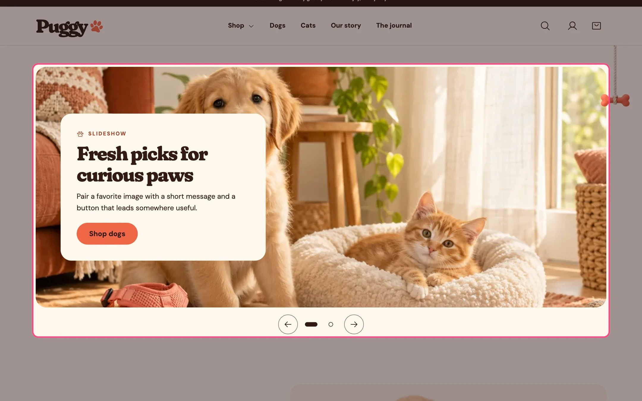
> A wide slideshow of up to six slides, each with an image, text and a button.
 ## Where to find it
Not on a default template. Add it to the home page or any page with Add section > Slideshow. It can't be added to the header or footer.
## How it works
* Shoppers move between slides with the arrows, the dots, by swiping, or with the arrow, Home and End keys.
* Auto-rotate is off by default. When on, slides change every 3 to 10 seconds and pause while shoppers hover, focus or swipe, and while the slideshow is off screen. A pause button is always shown, and rotation never runs for shoppers who prefer reduced motion.
* Each slide can have a separate mobile image for screens up to 760 px wide.
* Text sits on a panel or on the image with a tint for readability. On phones, panel text moves below the image.
* On phones, slideshows with more than three slides show a slide counter instead of dots.
* Slides without an image show built-in pet artwork.
## Where to find it
Not on a default template. Add it to the home page or any page with Add section > Slideshow. It can't be added to the header or footer.
## How it works
* Shoppers move between slides with the arrows, the dots, by swiping, or with the arrow, Home and End keys.
* Auto-rotate is off by default. When on, slides change every 3 to 10 seconds and pause while shoppers hover, focus or swipe, and while the slideshow is off screen. A pause button is always shown, and rotation never runs for shoppers who prefer reduced motion.
* Each slide can have a separate mobile image for screens up to 760 px wide.
* Text sits on a panel or on the image with a tint for readability. On phones, panel text moves below the image.
* On phones, slideshows with more than three slides show a slide counter instead of dots.
* Slides without an image show built-in pet artwork.
 ## Edit it
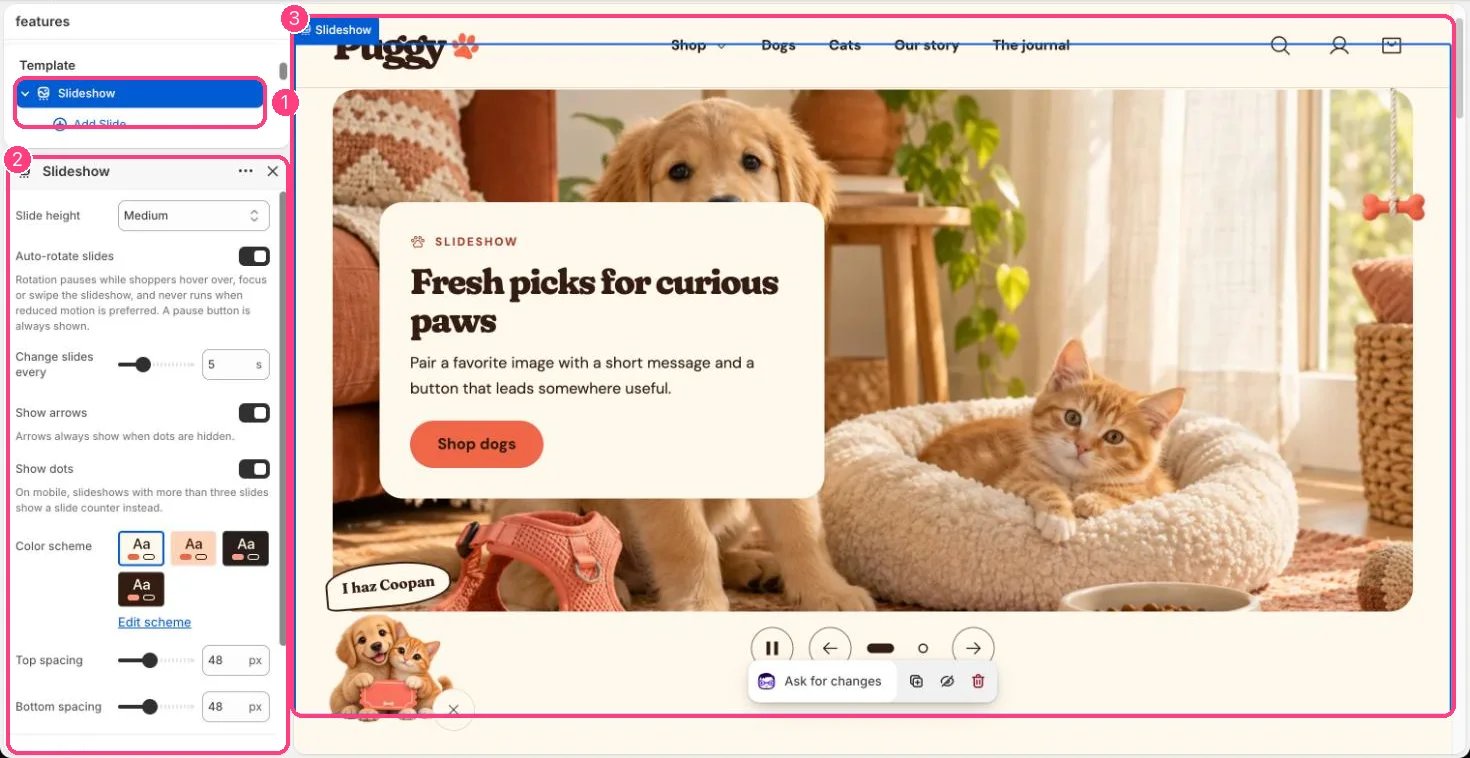
* Click Add block > Slide, then add an Image (landscape images at least 3000 px wide stay sharp), an optional Mobile image, Eyebrow, Heading, Text, Button label and Button link. A blank Button link goes to all products.
* Set Text position (nine spots), Text alignment, Text background (Panel or Image overlay), Text color scheme and Image overlay opacity.
* Choose Slide height: Adapt to first image, Small, Medium or Large.
* Turn on Auto-rotate slides and set Change slides every. Turn Show arrows and Show dots on or off; arrows always show when dots are hidden.
## Settings
| Setting | What it does |
| - | - |
| **Slide height** | Options: Adapt to first image, Small, Medium, Large. Default: Medium. |
| **Auto-rotate slides** | On or off. Rotation pauses while shoppers hover over, focus or swipe the slideshow, and never runs when reduced motion is preferred. A pause button is always shown. Default: off. |
| **Change slides every** | Slider from 3 to 10 s. Default: 5 s. |
| **Show arrows** | On or off. Arrows always show when dots are hidden. Default: on. |
| **Show dots** | On or off. On mobile, slideshows with more than three slides show a slide counter instead. Default: on. |
| **Color scheme** | Color scheme for this area (edit the schemes in Theme settings → Colors). Default: Scheme 1. |
| **Top spacing** | Slider from 0 to 120 px, in steps of 4. Default: 48 px. |
| **Bottom spacing** | Slider from 0 to 120 px, in steps of 4. Default: 48 px. |
## Blocks
Up to 6 blocks. Add a block with **Add block** under the section in the sidebar; drag blocks to reorder them.
### Slide
| Setting | What it does |
| - | - |
| **Image** | Image: upload one or choose from Content → Files. Landscape images at least 3000 px wide stay sharp on large screens. |
| **Mobile image** | Image: upload one or choose from Content → Files. Optional. Shown on screens up to 760 px wide. |
| **Eyebrow** | Text. Default: Little everyday joys. |
| **Heading** | Text. Default: Share what makes your shop special. |
| **Text** | Formatted text. |
| **Button label** | Text. Default: Shop now. |
| **Button link** | Link: a page, product, collection or web address. Leave empty to link to all products. |
**Text layout**
| Setting | What it does |
| - | - |
| **Text position** | Options: Top left, Top center, Top right, Middle left, Middle center, Middle right, Bottom left, Bottom center, Bottom right. Left and right swap in right-to-left languages. Default: Middle left. |
| **Text alignment** | Text alignment. Default: left. |
| **Text background** | Options: Panel, Image overlay. On mobile, panel text sits below the image. Default: Panel. |
| **Text color scheme** | Color scheme for this area (edit the schemes in Theme settings → Colors). Default: Scheme 1. |
| **Image overlay opacity** | Slider from 0 to 90 %, in steps of 5. Used with the image overlay background. Tints the image with the text color scheme background so the text stays readable. Default: 40 %. |
This documentation is built and hosted on [Mintlify](https://mintlify.com), a developer documentation platform.
## Edit it
* Click Add block > Slide, then add an Image (landscape images at least 3000 px wide stay sharp), an optional Mobile image, Eyebrow, Heading, Text, Button label and Button link. A blank Button link goes to all products.
* Set Text position (nine spots), Text alignment, Text background (Panel or Image overlay), Text color scheme and Image overlay opacity.
* Choose Slide height: Adapt to first image, Small, Medium or Large.
* Turn on Auto-rotate slides and set Change slides every. Turn Show arrows and Show dots on or off; arrows always show when dots are hidden.
## Settings
| Setting | What it does |
| - | - |
| **Slide height** | Options: Adapt to first image, Small, Medium, Large. Default: Medium. |
| **Auto-rotate slides** | On or off. Rotation pauses while shoppers hover over, focus or swipe the slideshow, and never runs when reduced motion is preferred. A pause button is always shown. Default: off. |
| **Change slides every** | Slider from 3 to 10 s. Default: 5 s. |
| **Show arrows** | On or off. Arrows always show when dots are hidden. Default: on. |
| **Show dots** | On or off. On mobile, slideshows with more than three slides show a slide counter instead. Default: on. |
| **Color scheme** | Color scheme for this area (edit the schemes in Theme settings → Colors). Default: Scheme 1. |
| **Top spacing** | Slider from 0 to 120 px, in steps of 4. Default: 48 px. |
| **Bottom spacing** | Slider from 0 to 120 px, in steps of 4. Default: 48 px. |
## Blocks
Up to 6 blocks. Add a block with **Add block** under the section in the sidebar; drag blocks to reorder them.
### Slide
| Setting | What it does |
| - | - |
| **Image** | Image: upload one or choose from Content → Files. Landscape images at least 3000 px wide stay sharp on large screens. |
| **Mobile image** | Image: upload one or choose from Content → Files. Optional. Shown on screens up to 760 px wide. |
| **Eyebrow** | Text. Default: Little everyday joys. |
| **Heading** | Text. Default: Share what makes your shop special. |
| **Text** | Formatted text. |
| **Button label** | Text. Default: Shop now. |
| **Button link** | Link: a page, product, collection or web address. Leave empty to link to all products. |
**Text layout**
| Setting | What it does |
| - | - |
| **Text position** | Options: Top left, Top center, Top right, Middle left, Middle center, Middle right, Bottom left, Bottom center, Bottom right. Left and right swap in right-to-left languages. Default: Middle left. |
| **Text alignment** | Text alignment. Default: left. |
| **Text background** | Options: Panel, Image overlay. On mobile, panel text sits below the image. Default: Panel. |
| **Text color scheme** | Color scheme for this area (edit the schemes in Theme settings → Colors). Default: Scheme 1. |
| **Image overlay opacity** | Slider from 0 to 90 %, in steps of 5. Used with the image overlay background. Tints the image with the text color scheme background so the text stays readable. Default: 40 %. |
This documentation is built and hosted on [Mintlify](https://mintlify.com), a developer documentation platform.