> ## Documentation Index
> Fetch the complete documentation index at: https://docs.kwebby.com/llms.txt
> Use this file to discover all available pages before exploring further.
# Store benefits
> A simple row of icons with headings and text for store promises such as delivery, packaging or support.
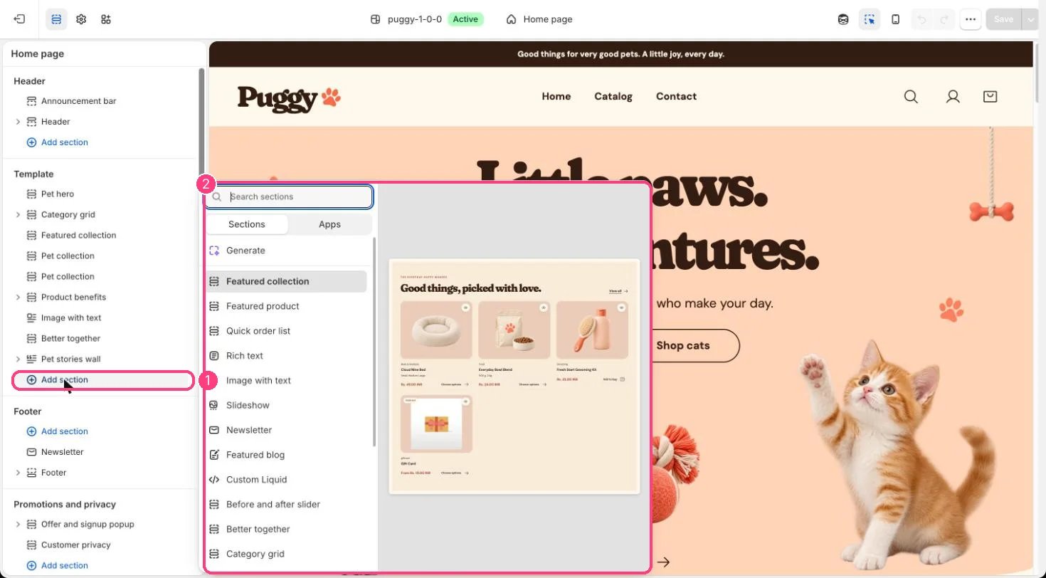 ## Where to find it
Not on a default template. Add it to any page with Add section > Store benefits.
## How it works
* Each Benefit block shows an icon (Paw, Package, Heart, Truck or Bone), a heading and text.
* Benefits sit three per row on larger screens and stack on phones.
## Edit it
* Click Add block > Benefit, choose an Icon and write the Heading and Text. The preset starts with three benefits.
* Set the Color scheme and spacing.
## Settings
| Setting | What it does |
| - | - |
| **Color scheme** | Color scheme for this area (edit the schemes in Theme settings → Colors). Default: Scheme 1. |
| **Top spacing** | Slider from 0 to 120 px, in steps of 4. Default: 64 px. |
| **Bottom spacing** | Slider from 0 to 120 px, in steps of 4. Default: 64 px. |
## Blocks
Add a block with **Add block** under the section in the sidebar; drag blocks to reorder them.
### Benefit
| Setting | What it does |
| - | - |
| **Icon** | Options: Paw, Package, Heart, Truck, Bone. Default: Paw. |
| **Heading** | Text. Default: A little thoughtful touch. |
| **Text** | Formatted text. |
Only promise what you really offer, such as delivery thresholds or return windows that match your policies.
This documentation is built and hosted on [Mintlify](https://mintlify.com), a developer documentation platform.
## Where to find it
Not on a default template. Add it to any page with Add section > Store benefits.
## How it works
* Each Benefit block shows an icon (Paw, Package, Heart, Truck or Bone), a heading and text.
* Benefits sit three per row on larger screens and stack on phones.
## Edit it
* Click Add block > Benefit, choose an Icon and write the Heading and Text. The preset starts with three benefits.
* Set the Color scheme and spacing.
## Settings
| Setting | What it does |
| - | - |
| **Color scheme** | Color scheme for this area (edit the schemes in Theme settings → Colors). Default: Scheme 1. |
| **Top spacing** | Slider from 0 to 120 px, in steps of 4. Default: 64 px. |
| **Bottom spacing** | Slider from 0 to 120 px, in steps of 4. Default: 64 px. |
## Blocks
Add a block with **Add block** under the section in the sidebar; drag blocks to reorder them.
### Benefit
| Setting | What it does |
| - | - |
| **Icon** | Options: Paw, Package, Heart, Truck, Bone. Default: Paw. |
| **Heading** | Text. Default: A little thoughtful touch. |
| **Text** | Formatted text. |
Only promise what you really offer, such as delivery thresholds or return windows that match your policies.
This documentation is built and hosted on [Mintlify](https://mintlify.com), a developer documentation platform.