> ## Documentation Index
> Fetch the complete documentation index at: https://docs.kwebby.com/llms.txt
> Use this file to discover all available pages before exploring further.
# Product cards
> Quick view, the hover image, color swatches and option values on every product card.
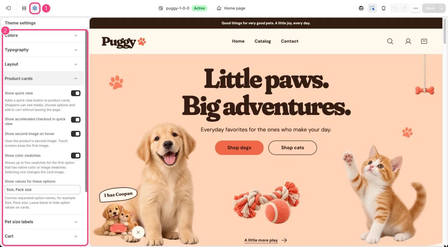
**Where:** in the theme editor, open **Theme settings** (the gear icon at the top of the left sidebar) and choose **Product cards**.
 ## How it works
* Show quick view adds an eye button to each card that opens the product in a pop-up.
* Show accelerated checkout in quick view adds Buy it now and other express buttons inside quick view.
* Show second image on hover switches to the product's second image on devices with a mouse. Touch screens keep the first image.
* Show color swatches shows up to five swatches for the first option that has color or image swatches, plus a +N more note. Selecting a swatch changes the card image and links to that variant.
* Show values for these options lists up to four values (such as sizes) of the first matching option, then +N more.
* When a section has quick add on, cards for single-variant products show Add to bag and other cards show Choose options.
## Edit it
* Add color or image swatches to option values in Shopify admin on the product.
* Type option names separated by commas in Show values for these options, for example Size, Pack size. Leave it blank to hide option values.
## Settings
| Setting | What it does |
| - | - |
| **Show quick view** | On or off. Adds a quick view button to product cards. Shoppers can see media, choose options and add to cart without leaving the page. Default: on. |
| **Show accelerated checkout in quick view** | On or off. Default: on. |
| **Show second image on hover** | On or off. Uses the product's second image. Touch screens keep the first image. Default: on. |
| **Show color swatches** | On or off. Shows up to five swatches for the first option that has native color or image swatches. Selecting one changes the card image. Default: on. |
| **Show values for these options** | Text. Comma-separated option names, for example Size, Pack size. Leave blank to hide option values on cards. Default: Size, Pack size. |
This documentation is built and hosted on [Mintlify](https://mintlify.com), a developer documentation platform.
## How it works
* Show quick view adds an eye button to each card that opens the product in a pop-up.
* Show accelerated checkout in quick view adds Buy it now and other express buttons inside quick view.
* Show second image on hover switches to the product's second image on devices with a mouse. Touch screens keep the first image.
* Show color swatches shows up to five swatches for the first option that has color or image swatches, plus a +N more note. Selecting a swatch changes the card image and links to that variant.
* Show values for these options lists up to four values (such as sizes) of the first matching option, then +N more.
* When a section has quick add on, cards for single-variant products show Add to bag and other cards show Choose options.
## Edit it
* Add color or image swatches to option values in Shopify admin on the product.
* Type option names separated by commas in Show values for these options, for example Size, Pack size. Leave it blank to hide option values.
## Settings
| Setting | What it does |
| - | - |
| **Show quick view** | On or off. Adds a quick view button to product cards. Shoppers can see media, choose options and add to cart without leaving the page. Default: on. |
| **Show accelerated checkout in quick view** | On or off. Default: on. |
| **Show second image on hover** | On or off. Uses the product's second image. Touch screens keep the first image. Default: on. |
| **Show color swatches** | On or off. Shows up to five swatches for the first option that has native color or image swatches. Selecting one changes the card image. Default: on. |
| **Show values for these options** | Text. Comma-separated option names, for example Size, Pack size. Leave blank to hide option values on cards. Default: Size, Pack size. |
This documentation is built and hosted on [Mintlify](https://mintlify.com), a developer documentation platform.