
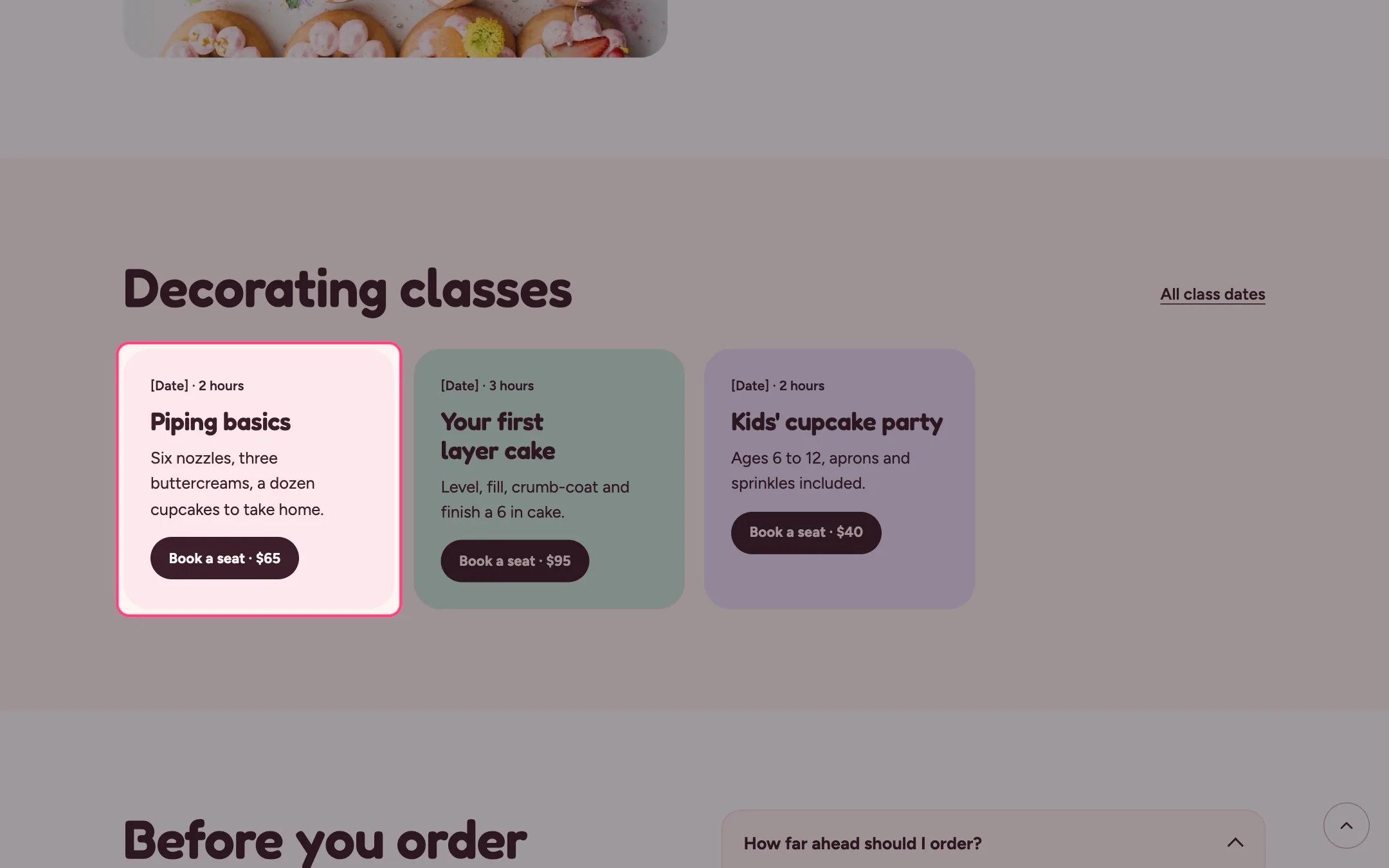
Card grid, highlighted on the demo store
Where to find it
Home page, the about page and the events page. In the theme editor choose Home page, then select the section (default heading Decorating classes). Can be added to any page.How it works
- Up to 12 cards in a responsive grid.
- Each card has its own color: blush, mint, lilac, butter or white.
- A photo, when added, runs across the top of the card.
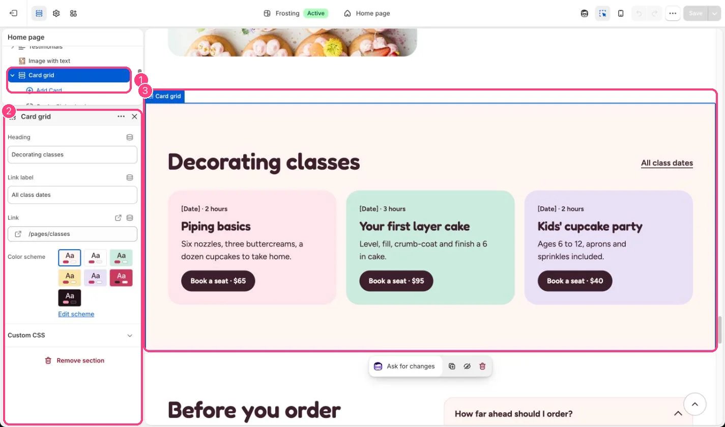
In the theme editor: 1 the section in the sidebar · 2 its settings · 3 the section in the preview
Edit it
- Use the Meta line for a date and length, such as Sat 12 Oct · 2 hours. Replace the [Date] placeholder.
- Link each card’s button to the class product or booking page.
- Give neighboring cards different Card colors so the grid reads as separate cards.