
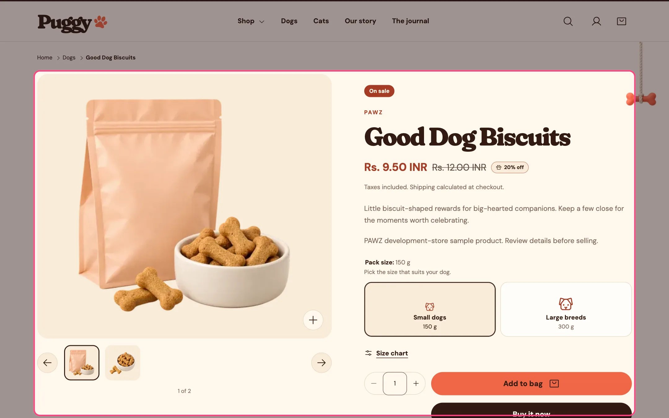
Product information, highlighted on the demo store
Where to find it
Product pages. In the theme editor, choose Products > Default product in the top page selector, then select Product information.How it works
- Every part is a block you can reorder: Title, Vendor, Price, Description, Variant picker, Quantity, Inventory, Buy buttons, Pickup availability, Back in stock alert, Size chart, Product badges, Trust badges, Collapsible row, Custom Liquid, Complementary products and app blocks.
- Choosing an option updates the price, images, stock note, badges and buttons without reloading, and updates the page address so a shared link opens that variant.
- Gallery: on desktop choose a slider with thumbnails, stacked, a two-column grid or a mosaic; phones always use the slider. Videos, YouTube, Vimeo and 3D models play in the gallery, and 3D models offer View in your space on supported devices.
- Image zoom opens a full-screen lightbox where shoppers click or tap to zoom and move to look around, or opens the full image in a new tab.
- The sticky add to cart bar shows the product, variant, price and button once shoppers scroll past the buy buttons. By default it appears on phones only.
- The buy button reads Pre-order for pre-order products and Sold out for unavailable variants. Shopify’s express checkout buttons and the Shop Pay Installments message appear when available.
- Quantity rules and volume pricing from B2B catalogs show under the quantity field.
- Subscription products show a Purchase option menu, and gift card products can show recipient fields.
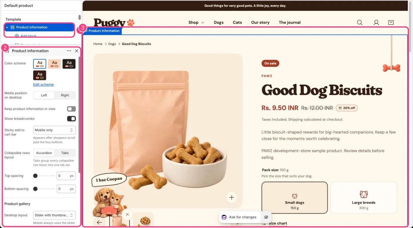
In the theme editor: 1 the section in the sidebar · 2 its settings · 3 the section in the preview
Edit it
- Click Add block and drag blocks into order. Most blocks can be used once; Collapsible row and Custom Liquid can repeat. Up to 30 blocks.
- Pick Collapsible rows layout: Accordion, or Tabs to group every collapsible row into one tab set.
- Set Media position on desktop, Keep product information in view and Show breadcrumbs.
- Under Product gallery, choose Desktop layout, Image zoom, Main image fit, Thumbnail size (56 to 96 px) and whether to show image arrows.
- Set Sticky add to cart bar to Off, Mobile only or Mobile and desktop.
- In the Variant picker block, Option style chooses Dropdown or Buttons. Options with color or image swatches always show swatches.
- In the Inventory block, set Low stock threshold (1 to 30). A short note such as 3 available shows when a tracked variant has that many or fewer left.
- Add photos, videos and 3D models in Shopify admin under Products > your product > Media.
Settings
Product gallery
Blocks
Up to 30 blocks. Add a block with Add block under the section in the sidebar; drag blocks to reorder them.App blocks
Blocks from apps you have installed, such as reviews or subscriptions. Click Add block and choose one from the Apps tab; its settings come from the app.Title (up to 1)
No settings: add or remove it, and drag it into place.Vendor (up to 1)
No settings: add or remove it, and drag it into place.Price (up to 1)
No settings: add or remove it, and drag it into place.Description (up to 1)
No settings: add or remove it, and drag it into place.Variant picker (up to 1)
Quantity (up to 1)
Inventory (up to 1)
Buy buttons (up to 1)
Pickup availability (up to 1)
No settings: add or remove it, and drag it into place.Back in stock alert (up to 1)
Size chart (up to 1)
Product badges (up to 1)
Trust badges (up to 1)
Collapsible row
Custom Liquid
Complementary products (up to 1)
Settings here apply to every product that uses this template. Create an alternate product template for products that need a different layout.The Size chart block only appears when it has content or a page, and the product has an option named in Show for these options.Breadcrumbs show Home, then the collection the shopper came from (or the product’s first collection), then the product.