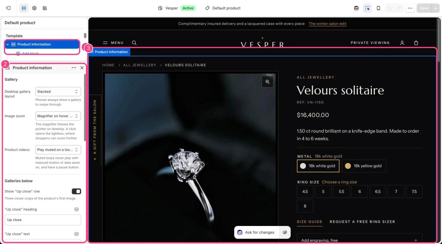
Options named Ring size or Size show as a grid of size boxes with a Size guide link beside them. 1. Add the option. Add Ring size as the second option, after Metal, with one value per size, for example 4, 4.5, 5 and so on. 2. Ask for a size. With Ask shoppers to choose a size on (the default, in the Variant picker block), no size is preselected. Add to bag stops with a message under the sizes until the shopper picks one, so nobody orders a default size by accident. Untick it to preselect the first available size. 3. The size guide. The Size guide link opens a drawer from the side. It shows, in this order of preference:
  • the page in the product metafield custom.size_chart (a page reference), for pieces with their own sizing;
  • the Size guide page chosen in the Variant picker block, for your store-wide guide;
  • the built-in ring size table, with US, UK and EU sizes, inside circumference and diameter, and three measuring steps.
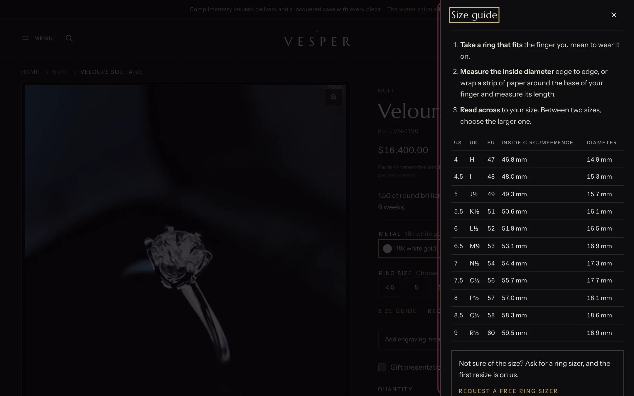
The size guide drawer

The size guide drawer with the built-in ring size table

4. A ring sizer. Fill in Ring sizer link (for example a page or form where shoppers ask for a free sizer) and its label. It shows inside the size guide. 5. Other size options. List other option names in Size options, for example Ring size, Size, Length, to show them as size boxes too. Cards and filters. Cards summarize sizes, for example Ring size 4 to 9, for the options named in Theme settings, Product cards, Options to summarize on cards. In collection filters, the names listed in Filters shown as size boxes (default Ring size, Size) show as boxes, with an optional Size guide link under them.

In the theme editor

Product information in the theme editor

Ring sizes and the size guide link are set on the Variant picker block of 1 Product information · 2 its settings · 3 the preview