
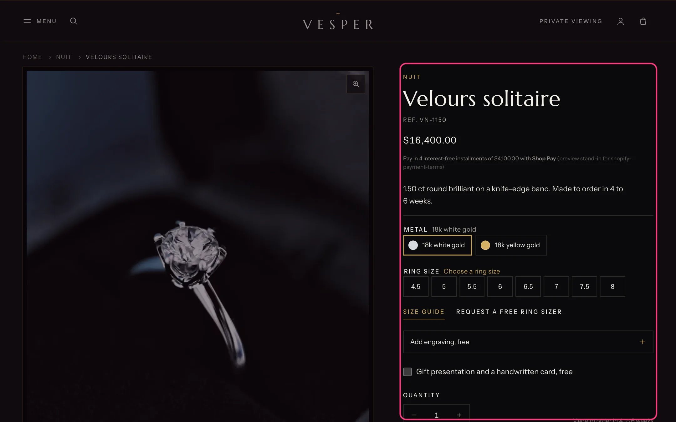
Product information, highlighted with the demo content
Where to find it
Every product that uses the default product template. In the theme editor choose Products, then Default product, and select Product information.How it works
- Desktop gallery layout can be Stacked, Two-column grid, Mosaic or Carousel with thumbnails. Phones always get a gallery to swipe through. The selected variant’s image comes first.
- Image zoom gives a magnifier that follows the pointer and a lightbox where shoppers zoom further, or the lightbox only, or no zoom.
- Product videos play muted on a loop while visible, or with player controls. YouTube and Vimeo films load only after a click; 3D models get Shopify’s viewer and View in your space.
- Up close shows three closer crops of the first image under the buy box. The worn gallery shows the images in the product metafield custom.worn.
- Changing a metal or size updates the price, stock line, buttons, pickup and images without reloading the page, keeps what the shopper typed, and updates the address bar.
- With Ask shoppers to choose a size on, no size is preselected and Add to bag asks for one.
- Pre-order products show a Pre-order button and their ship date note. Price on request products hide the price and show an enquiry button.
- The sticky add to bag bar appears once the main button scrolls out of view, on phones or on phones and desktop. The page makes room for it, so it never covers content.
- Up to one each of most blocks; add as many Text, Collapsible row and Custom Liquid blocks as you need.
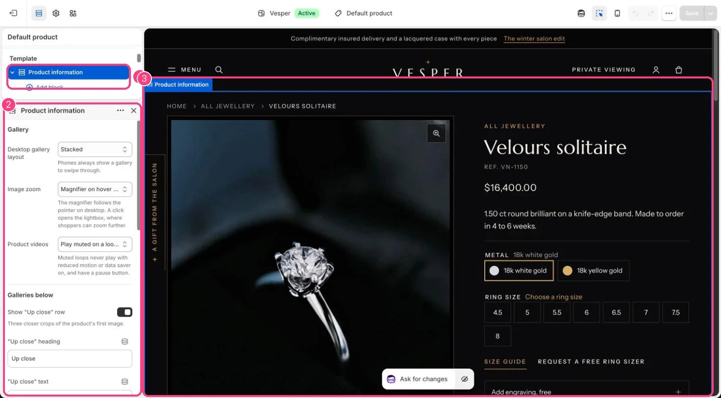
In the theme editor: 1 the section in the sidebar · 2 its settings · 3 the section in the preview
Edit it
- Drag blocks to reorder them. Keep Quantity directly above Buy buttons.
- In Variant picker, list your size option names under Size options (default Ring size, Size) and your metal option names under Metal options.
- Set a Size guide page, or fill the product metafield custom.size_chart, to replace the built-in ring size table. Add a Ring sizer link if you send sizers.
- In Engraving choose Products marked engravable or All products, and set the Character limit.
- In Buy buttons choose the Enquiry page for price on request pieces (default: your contact page), and add an Extra link such as a private viewing page.
- In Product details turn rows on or off and rename them. Rows fill from product metafields and hide themselves when empty.
- Add app blocks for reviews or other apps from Add block, Apps.
Settings
Gallery
Galleries below
Details and page
Blocks
Add a block with Add block under the section in the sidebar; drag blocks to reorder them.App blocks
Blocks from apps you have installed, such as reviews or subscriptions. Click Add block and choose one from the Apps tab; its settings come from the app.Title (up to 1)
Price (up to 1)
Sale countdown
Text
Variant picker (up to 1)
Size guide
Quantity (up to 1)
Engraving (up to 1)
Gift options (up to 1)
Buy buttons (up to 1)
Price on request
Extra link
Back in stock alert (up to 1)
Pickup availability (up to 1)
Trust badges (up to 2)
Product details (up to 1)
Collapsible row
Share buttons (up to 1)
Custom Liquid
Most rows and lines come from product metafields. See Set up your products and the Metafields reference.