
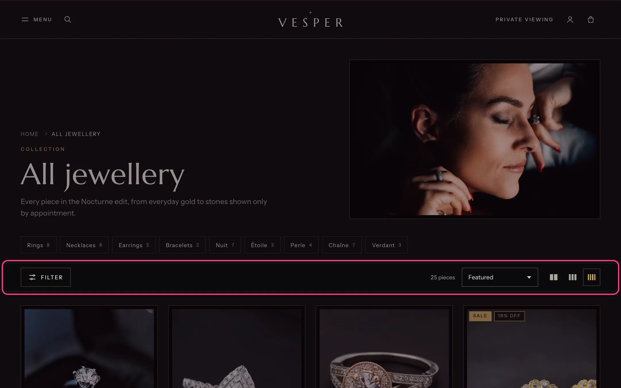
Collection, highlighted with the demo content
Where to find it
Every collection that uses the default collection template. In the theme editor choose Collections, then Default collection, and select Collection.How it works
- The toolbar holds the Filter button with the number of active filters, the active filters as chips, the result count, sorting and the grid density buttons. It stays in view while scrolling.
- Filters come from the Search & Discovery app. They show in a drawer, or in a sidebar on desktop. In the drawer, results update when the shopper presses View; in the sidebar they update at once.
- Metal filters show as swatches, stones as small gem chips, and the filters named in Filters shown as size boxes as boxes.
- Collection navigation shows a menu of collection links with product counts under the heading.
- Promo tile blocks show inside the grid on the first page, unless the shopper filters or sorts.
- Pagination is a Load more button, infinite scroll (four pages, then the button) or page numbers.
- Shoppers choose 2, 3 or 4 columns on desktop with the density buttons, and the choice is remembered on their device.
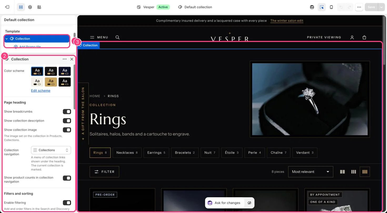
In the theme editor: 1 the section in the sidebar · 2 its settings · 3 the section in the preview
Edit it
- Set up filters in the Search & Discovery app. See Search and Discovery filters.
- Choose a Collection navigation menu, for example one with links to your main collections.
- Choose Filter layout on desktop, Filter groups open at first and Price shortcuts.
- Set Columns on desktop, Products per page and Pagination.
- Add a Promo tile block (up to 4), choose its position (Show after product) and width, and link it, for example to a private viewing page.
- Set a Client advisor link to add Ask a client advisor when no pieces match.
Settings
Page heading
Filters and sorting
Product grid
Empty results