

Gallery mosaic, highlighted with the demo content
Where to find it
Home page. In the theme editor choose Home page, then select Gallery mosaic.How it works
- Images fill a four-column grid on desktop and two columns on phones.
- Tall images take two rows and wide images two columns. The grid fills the gaps by itself.
- A caption shows over the bottom of the image.
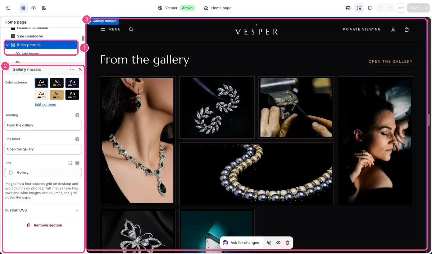
In the theme editor: 1 the section in the sidebar · 2 its settings · 3 the section in the preview
Edit it
- Add an Image block per photograph and choose its Size: Regular, Tall or Wide.
- Add a Link to a product, collection or story, and a Caption if you like.
- Edit Heading, Link label and Link, for example Open the gallery to your gallery page.