
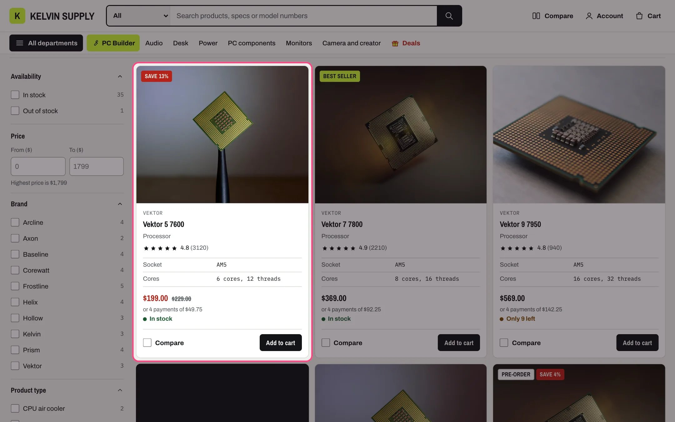
A product card: vendor, title, type, rating, spec rows, price, stock, color dots and the Compare box
Options and color swatches
- Give products with colors an option named Color. Cards show a dot per color (up to six), and the product page shows swatches.
- For exact swatch colors, link the Color option to the Color category metafield in the product editor (Shopify’s swatches). A swatch can be a color or an image, such as a fabric or a finish, and cards show the image in the dot. Cards use the first option that has Shopify swatches, else the option named Color (or Colour). Without swatches, the dot uses the color name when the browser knows it, such as Black or Silver.
- Turn the dots on or off with Theme settings → Product cards → Show color swatches.
Prices
When a product’s variants have different prices, cards show the lowest and highest price, such as $49 – $89. To show From and the lowest price instead, change Theme settings → Product cards → Products with variant prices that differ. The setting also applies to the hero and its deals rail, the deal countdown, Shop the setup and vertical films. The product page, featured product and quick view show the price of the selected variant.Spec metafields
Specs live in product metafields in the namespacespecs, as Single line text. Create the definitions once in Settings → Custom data → Products → Add definition (turn on storefront access), then fill them in on each product under Metafields.
Which specs appear on cards and in the compare table is set in Theme settings → Product cards → Spec rows: one key | Label per line. Cards show the first four that a product has (Spec rows on cards); the compare table shows all of them. See Spec rows.
The product page reads a few more specs metafields:
PC parts also carry the PC Builder’s own
specs keys, such as socket, form_factor or psu_w. They are listed per part type in the PC Builder guide, and every metafield Kelvin reads is in the Metafields reference.
Tags
Badges and stock
- Sale: set a Compare-at price higher than the price. Cards show the sale badge chosen in Theme settings → Badges → Sale badge, with a short shine.
- New: set New badge for products added in the last to a number of days. It is off (0) on install.
- Low stock: cards say how many are left when a tracked variant’s real inventory is at or below Show low stock at or below (10 on install; 0 turns the line off).
- Pre-order: use the pre-order tag, or track the variant’s inventory and allow selling when out of stock. See Badges and pre-order.
Photographs, films and 3D
- Use the same shape for every product photograph. A square or 4:3 product shot on a plain background suits the cards best. The product page shows the whole photo in a square frame on install (Photo fit in the Product information section), so other shapes are not cropped there. The second image shows when a shopper hovers a card (Show second image on hover).
- Product videos (uploaded, YouTube or Vimeo) and 3D models go in the product’s media like photographs. YouTube and Vimeo players load only after a click; 3D models get Shopify’s viewer.
Ratings and reviews
- Star ratings on cards read the
reviews.ratingandreviews.rating_countmetafields that a reviews app writes. Without them, cards show no stars. - Kelvin can also show reviews you publish yourself, with a Verified purchase badge. See Product reviews and Verified purchase.
Care+ plans
To offer protection plans with a product, create the plans as products and list them in the product metafieldcustom.protection_plans. See Care+ protection plans.