
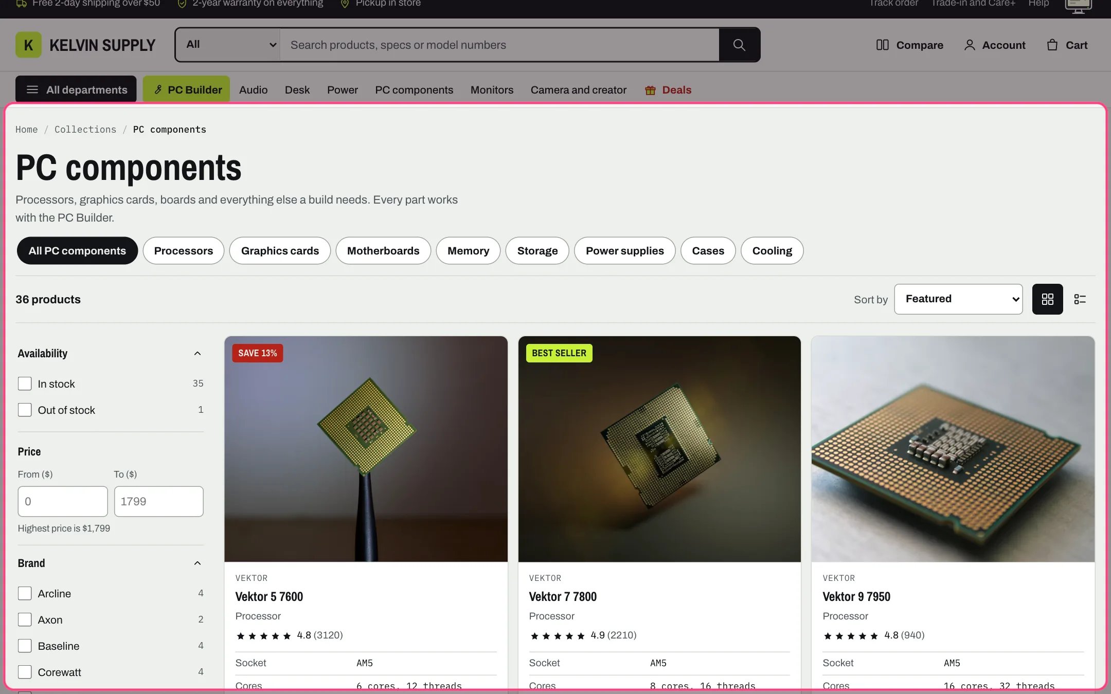
Collection, highlighted with the demo content
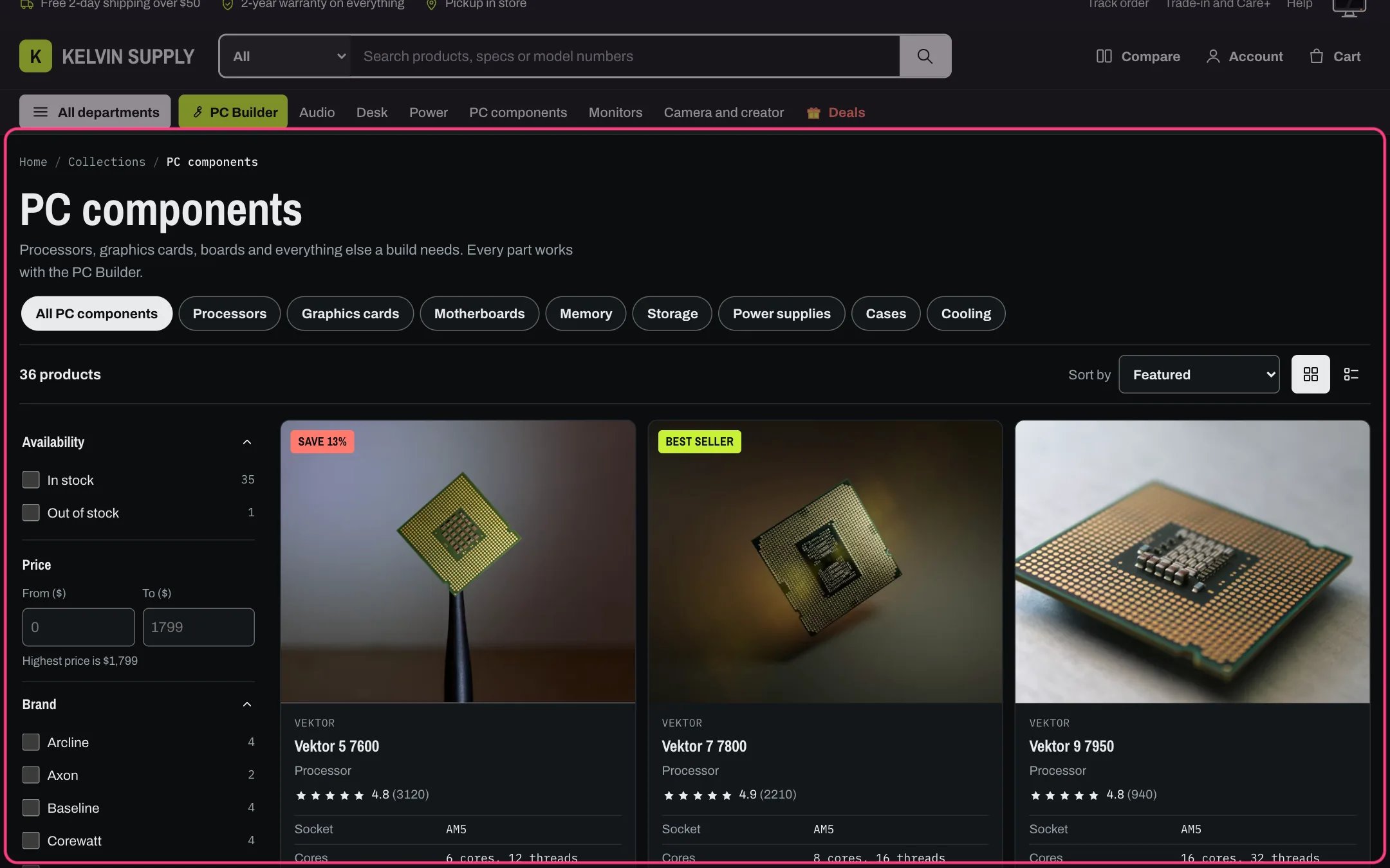
Collection in dark mode
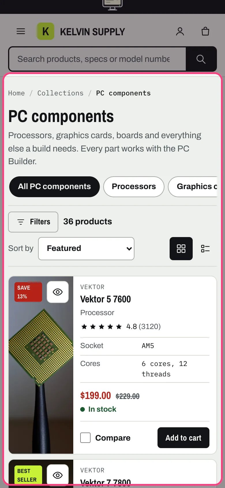
Collection on a phone
Where to find it
Every collection that uses the default collection template, with the Recently viewed section below it on a fresh install. In the theme editor choose Collections in the page selector, then Default collection, and select Collection.How it works
- The top shows breadcrumbs, the collection title and its description. With Show collection image on, the collection’s image (or the Fallback image) sits beside the title, cropped to 16:9 around the image’s focal point and up to 420 px wide; on screens 900 px wide or narrower it drops under the title.
- Collection navigation shows chips under the title. On a department (a top-level menu link with collections nested under it) or one of its collections, the chips are that department: All PC components first, then its collections, with the current one filled in. Anywhere else they are the menu’s top-level links. Chips that do not fit scroll sideways.
- The toolbar shows the product count, Sort by and the grid and list buttons. The filters come from the Search & Discovery app: in a sidebar that stays in view while the grid scrolls on wider screens, and behind a Filters button with the number of active filters on screens 900 px wide or narrower, which opens a filter drawer with Clear all and Show 12 products.
- Price shows as From and To boxes with the highest price noted under them. Every other filter is a list of checkboxes with product counts, with color dots or small images when the filter is set to swatches. Values with no matching products are greyed out and cannot be ticked.
- A change updates the count, the products and the filters in place, without reloading. Active filters show as chips above the products (Socket: AM5, Price: $100 to $300), each removing one filter, plus Clear all. The page address follows each change, so a filtered page can be bookmarked or shared; the browser’s Back button returns to the previous page rather than undoing a filter.
- The new count is announced to screen readers, and focus stays on the checkbox or box that changed. If a request fails, the page simply loads the filtered address.
- List view turns each product into a wide row with its spec rows, price and buttons side by side. A shopper’s choice is remembered on their device. Desktop shows 2 to 4 columns, two at 1100 px and narrower; under 750 px products are compact rows with a small image in either view.
- Pagination is a Load more button with Showing 24 of 51 and a progress bar, infinite scroll (four pages load as the shopper nears the end, then the button), or page numbers. Load more moves focus to the first new product. The numbered links stay in the page for search engines and when scripts are off.
- An empty collection says This collection is empty with a Shop all products button. When filters leave nothing, it says No products match these filters with Clear all filters.
- Without scripts every control still works as a plain link or form: an Apply filters button and a Sort button appear, and on narrow screens the filters show above the products.
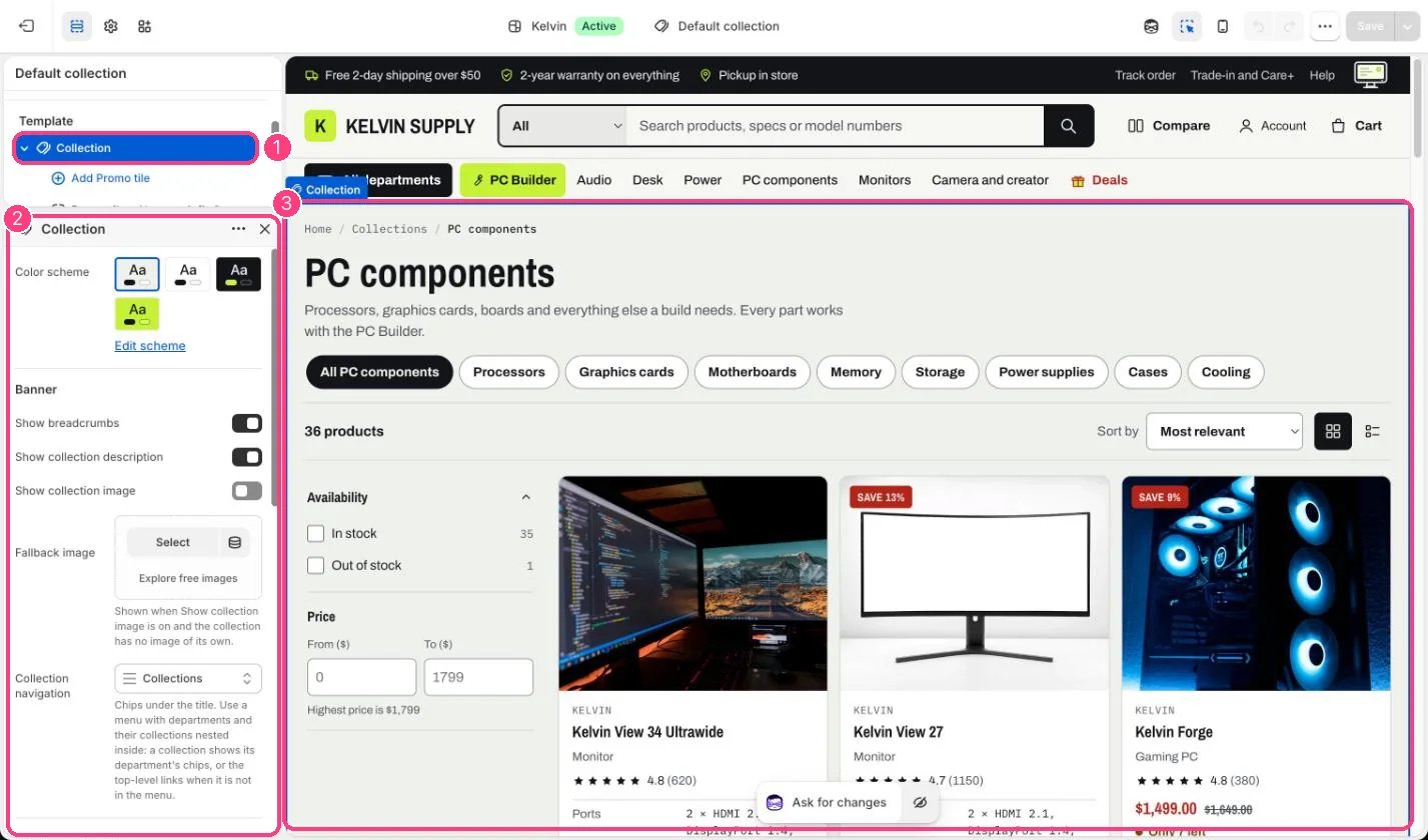
In the theme editor: 1 the section in the sidebar · 2 its settings · 3 the section in the preview
Edit it
- Set up the filters in the Search & Discovery app first: see Filters with Search & Discovery.
- For chips under the title, build a menu in Online Store, Navigation with departments as top-level links and their collections nested under them, then choose it as Collection navigation.
- Set Filter groups open on load (0 to 10, default 3). Price is always shown, and a group with an active filter always opens.
- Choose Columns on desktop, Products per page (8 to 48) and Pagination. Load more button is the default; Infinite scroll suits long, browsable collections.
- Turn off Show grid and list view toggle to keep one layout, and pick it in Default view. A shopper’s saved choice wins over Default view on their device.
- To add a promo tile, select Add block, then Promo tile (up to 3). Set Grid position (the tile takes that place in the grid), Kicker, Heading, Text, Link and Link label. The Image shows at the top of the tile in a 1.6:1 frame, cropped around its focal point; use at least 800 x 500 px.
- Tick Mark as a deal for the sale-red and lime flowing border. With Animate the deal border on, it turns twice when the tile comes into view and keeps turning while a shopper points at or focuses the tile; with it off, the border stays still.
- For Show collection image, use a landscape image of at least 1000 x 563 px and set its focal point so the crop keeps the subject. Fallback image covers collections without an image of their own.
Settings
Banner
Filtering and sorting
Products
Blocks
Add a block with Add block under the section in the sidebar; drag blocks to reorder them.Promo tile (up to 3)
On install Collection navigation is empty, there are no promo tiles, Mark as a deal is off and Show collection image is off.Promo tiles show on the first page of the grid view only, and are hidden in list view. A Grid position beyond the products on the page puts the tile at the end. Tiles take a grid cell each, so a row can hold fewer products, but Products per page is unchanged.Theme settings, Deals, Flowing border on deal sections turns the border motion off everywhere, and it never moves for shoppers who prefer reduced motion.When Enable filtering is off, or Shopify returns no filters for a collection, the sidebar and the Filters button are hidden and the grid takes the full width.Promo tiles apply to every collection that uses this template. For a tile on one collection only, create an alternate collection template in the theme editor and assign it to that collection in Products, Collections.