
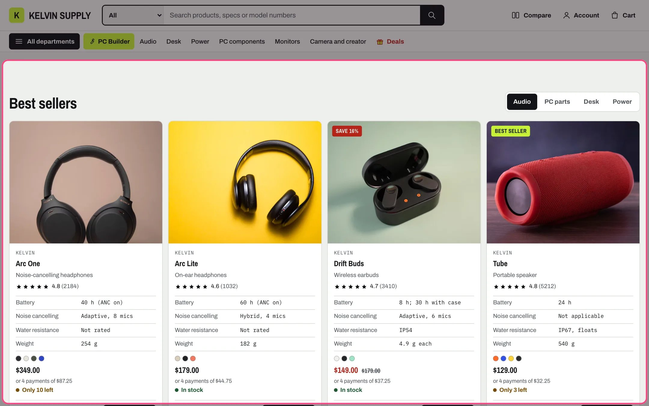
Collection tabs, highlighted with the demo content
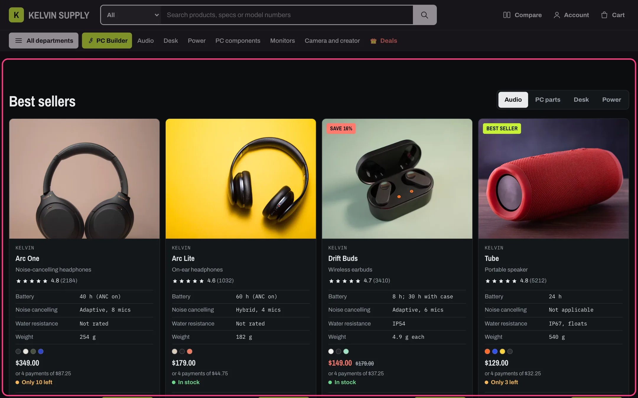
Collection tabs in dark mode
Where to find it
Fifth section of the Home page template, headed Best sellers on install. In the theme editor choose Home page in the page selector, then select Collection tabs. Add it to other pages with Add section.How it works
- Each Tab block adds a tab named by its Tab label (or the collection title) with a grid of the collection’s first products, up to Products per tab (2 to 12, default 8).
- With a single tab no tab buttons show: it is a plain product grid.
- The tabs work from the keyboard: the arrow keys move between tabs, Home and End jump to the first and last.
- Without JavaScript the tabs become links to their collections.
- The cards are Kelvin’s product cards, with the options set in Theme settings → Product cards. Four per row, two below 1000 px, and one per row on phones with the photo beside the details.
- A tab whose collection is empty says Nothing here yet with a link to the collection. A tab without a collection shows four example cards.
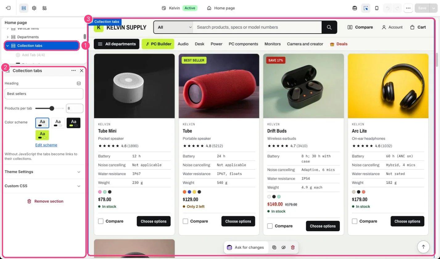
In the theme editor: 1 the section in the sidebar · 2 its settings · 3 the section in the preview
Edit it
- Add up to four Tab blocks and choose a Collection for each.
- Keep Tab labels to one or two words so the tabs fit on one line on phones.
- Set Products per tab to 4 or 8 so the desktop rows are full.
- The order of each tab is the collection’s own sort order, set in Products → Collections → the collection → Sort, such as Best selling.
Settings
Blocks
Up to 4 blocks. Add a block with Add block under the section in the sidebar; drag blocks to reorder them.Tab
On install the four tabs (Audio, PC parts, Desk, Power) have no collections and show example cards until you choose them.