
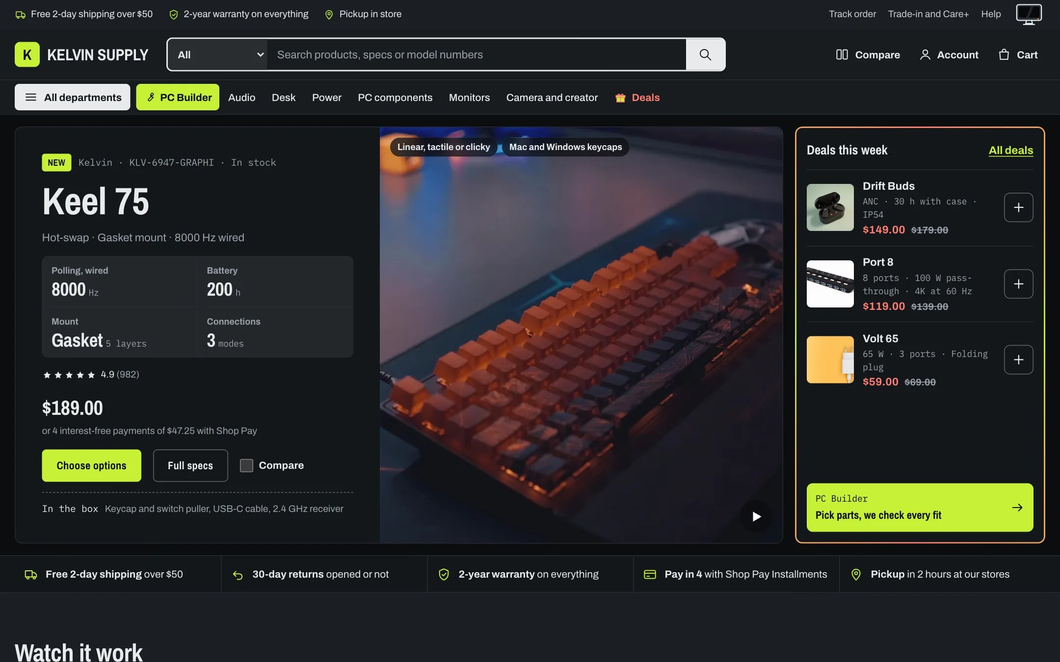
The home page in dark mode
- the shopper’s own choice from the switch, saved on their device (used only while the switch is shown);
- otherwise Theme settings → Colors → Default color mode: Auto (follows the device), which is the default, Light or Dark.
- screen on, with a green power light, is light mode;
- powered off, with an amber standby light, is dark mode.
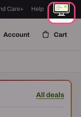
Light mode: the screen is on
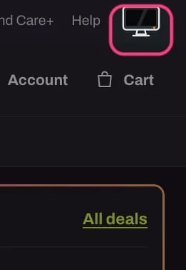
Dark mode: the screen is off and the standby light is amber
Hide the switch. Untick Theme settings → Colors → Show the color mode switch. Then:
- the monitor leaves the utility bar and the password page;
- every visitor gets the Default color mode (with Auto, the mode of their device), including shoppers who picked a mode earlier: their saved choice is ignored while the switch is hidden, so nobody is left stuck in a mode they cannot change;
- on phones under 750 px the utility bar is hidden, since the switch is all it shows there. Tablets and desktops keep the bar with its perks and links.
- Store logo: add a light version in Theme settings → Logo → Logo for dark mode. It is used only when Logo is set too. A text logo needs nothing: it takes the text color of each mode.
- Brand and press logos: the Logo blocks of the Brands section and the Quote blocks of the Press section each have a Logo for dark mode. Kelvin never recolors a logo.
- Password page: with Dark top bar on, the Password page uses Logo for dark mode.
- Photos and films are the same in both modes. Product photos with a transparent background sit on the card’s own backdrop in both modes; photos on a white background show as bright tiles in dark mode.
1
Use the switch in the preview
Click the monitor in the utility bar of the editor’s preview. Your pick is saved in your browser, just like a shopper’s, so it also applies when you visit your store in the same browser. Click it again to go back.
2
Or change the default for a moment
Set Theme settings → Colors → Default color mode to Dark, look through your pages, then set it back. If the change seems to do nothing, your own saved pick wins: click the monitor until it shows the default mode, which clears your pick.
3
Look at the places that use other schemes
The header and footer (Card), the utility bar, Vertical films and PC Builder entry (Stage), any Signal band, a product page, the cart drawer and the mega menu.
4
Outside the editor
Add ?theme=dark or ?theme=light to the end of any store address (or &theme=dark when the address already has a question mark) to see that page in one mode without saving anything.
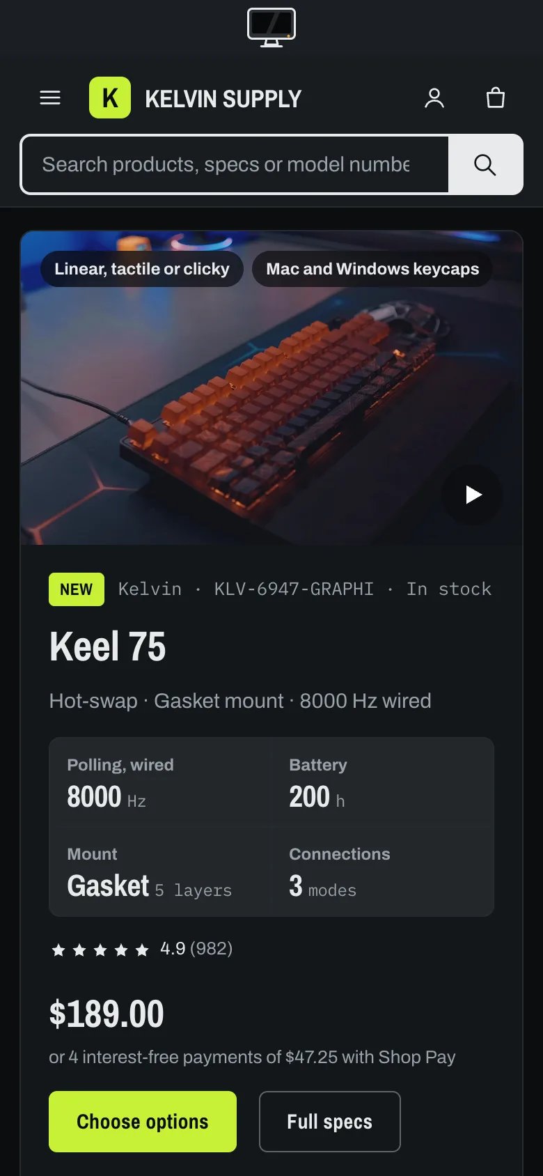
Dark mode on a phone: the monitor sits alone in the utility bar
- Start from a near-black page, such as the default #0B0D0F, rather than pure black, and make Dark mode: cards and panels one step lighter (#13161A) so cards stand off the page.
- Use an off-white text (#E8EBED) and a softer secondary text (#9AA2A9), and keep text at a contrast of at least 4.5 to 1 against both the background and the cards.
- Lighten links, sale prices and errors for dark mode: the light-mode link green #3B6B0A and sale red #B42318 are too dark on near-black, which is why their dark partners are lime and #FF7B6E.
- Keep Dark mode: lines subtle (#262B31): they should separate, not draw boxes.
- A bright accent such as lime can stay the same in both modes; check Text on accent in each.
- Keep Stage lighter than the page in dark mode, as it is by default, so the dark bands still read as a stage.
- Background gradient is used in light mode only.
The checkout and Shopify’s customer account pages are not part of the theme. They keep their own colors, set in the Shopify admin. On phones, the browser’s address bar takes the Bench background, light or dark following the device setting.
In the theme editor
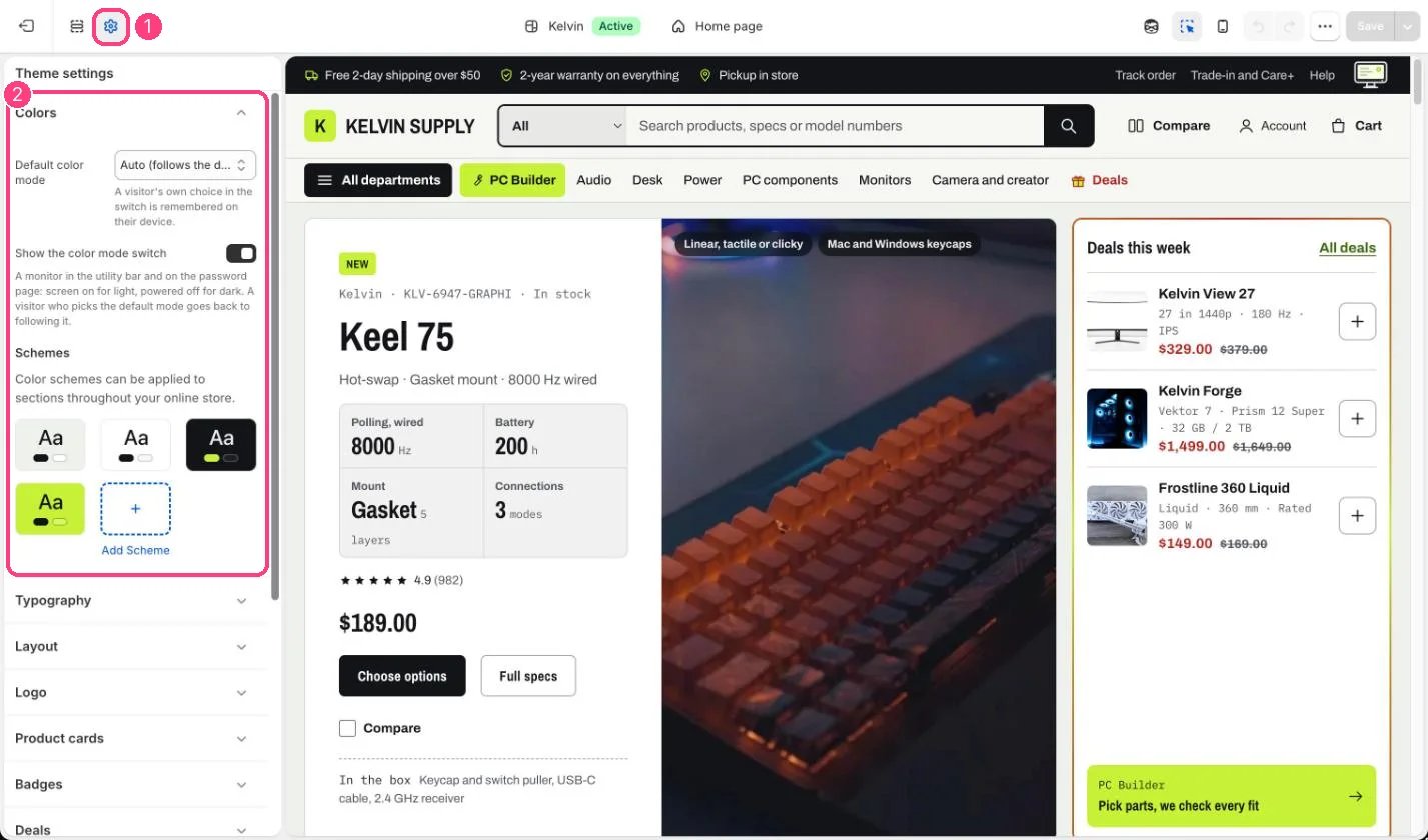
Default color mode, the monitor switch and the color schemes: 1 Theme settings · 2 Colors
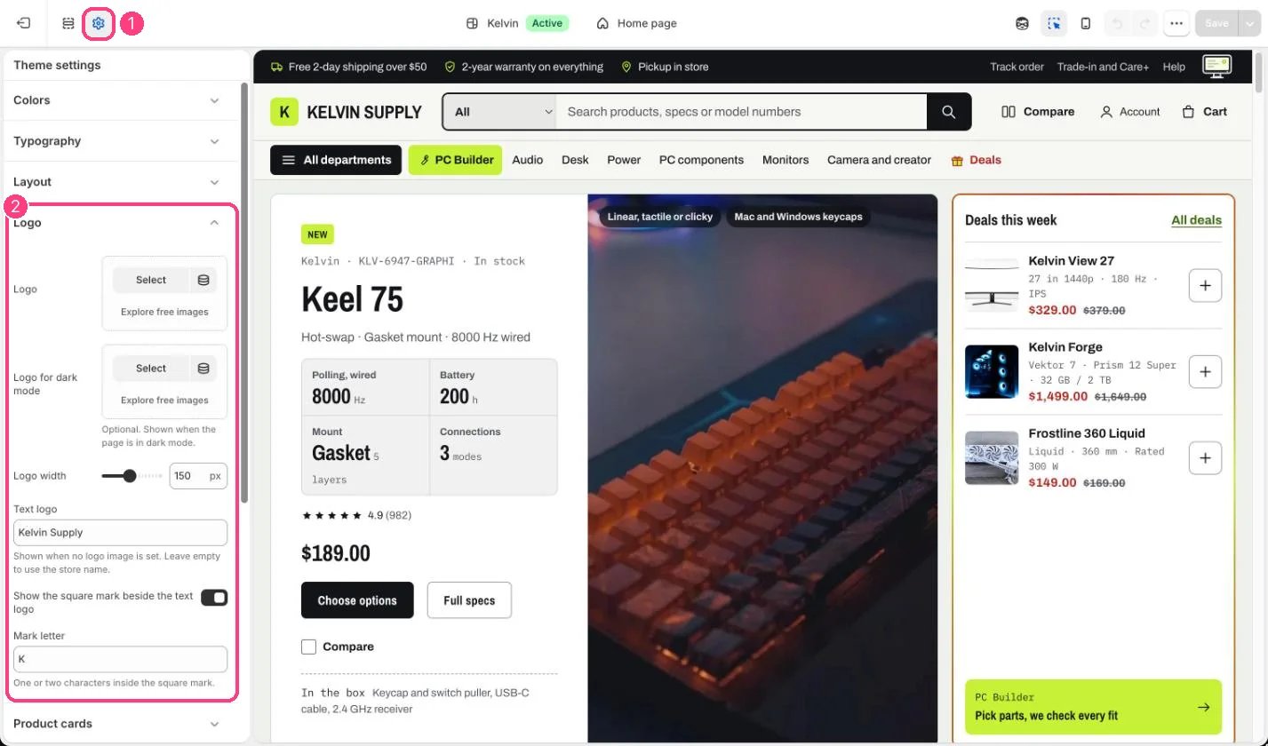
The logo for dark mode: 1 Theme settings · 2 Logo