
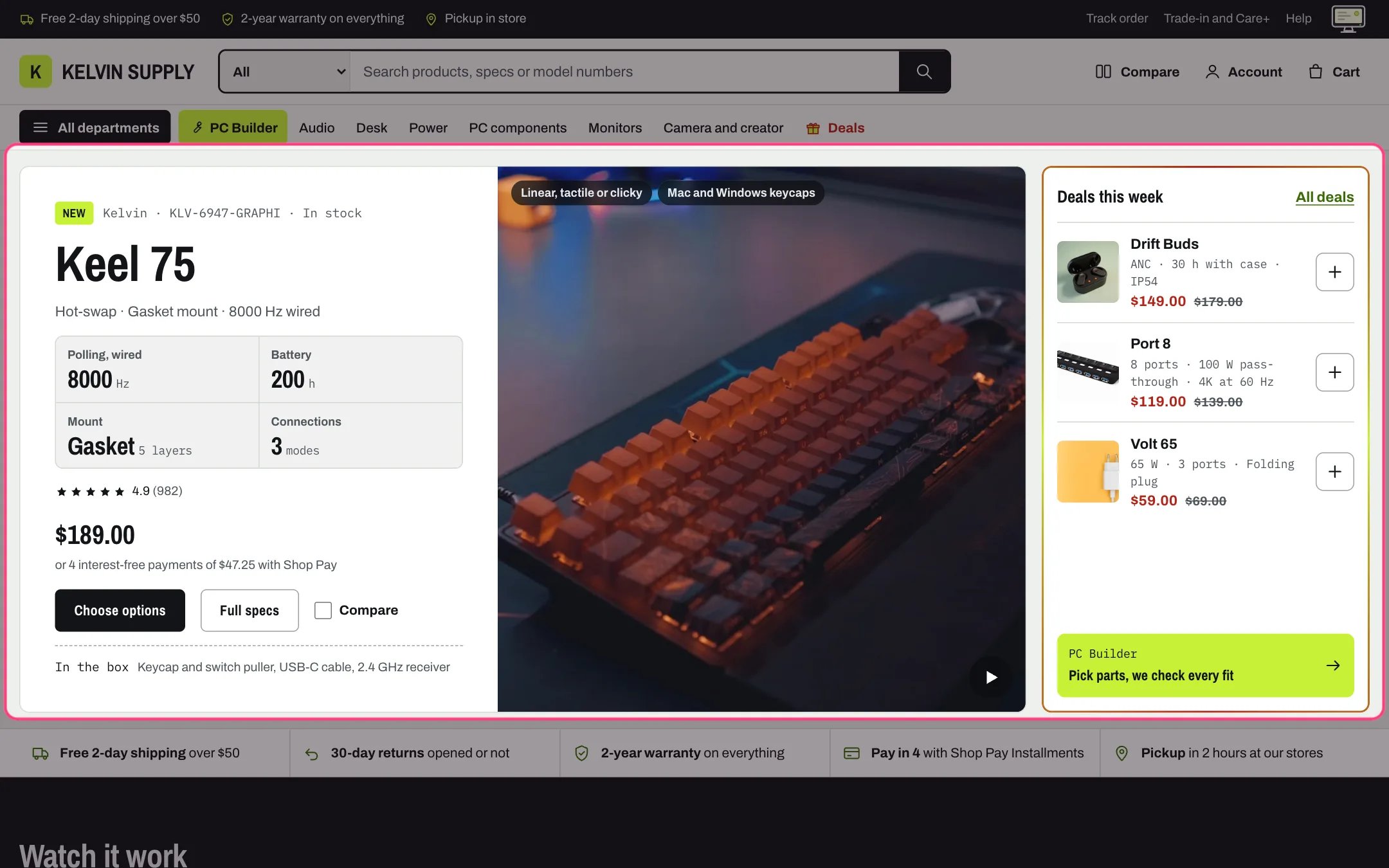
Hero, highlighted with the demo content
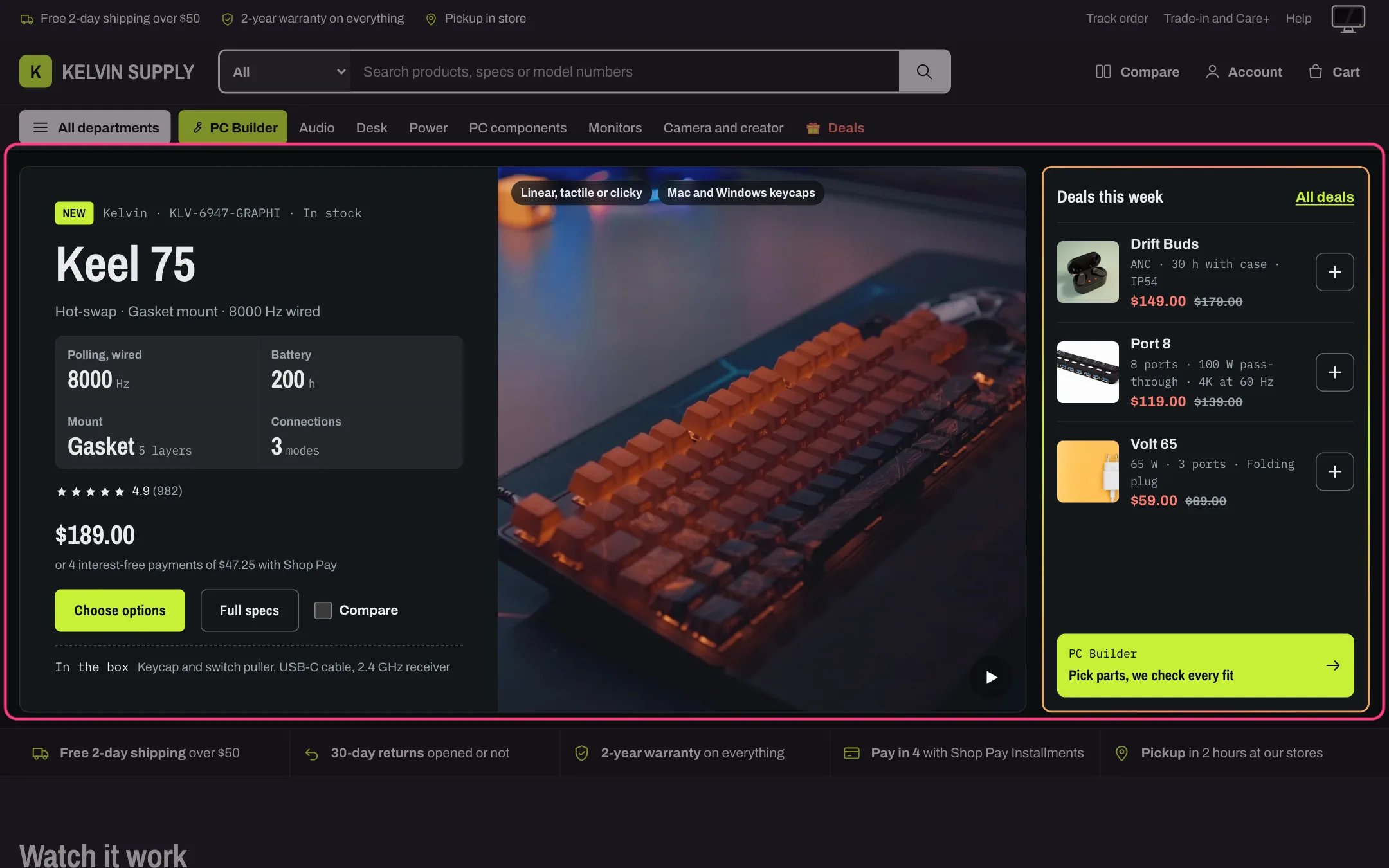
Hero in dark mode
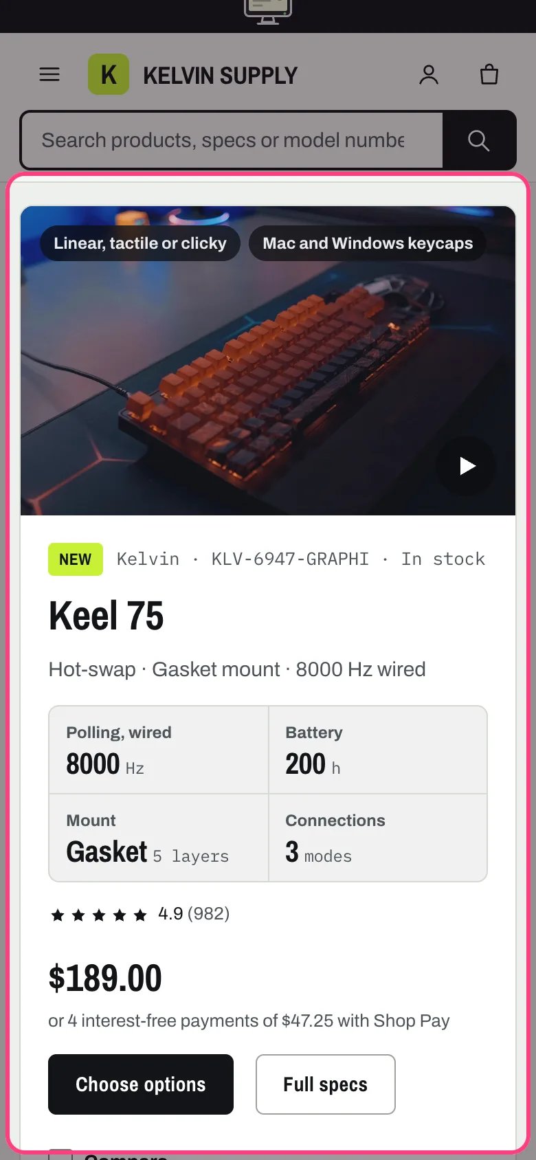
Hero on a phone
Where to find it
First section of the Home page template on a fresh install. In the theme editor choose Home page in the page selector, then select Hero. It can be added to other templates with Add section, but its heading is the page’s main heading, so use one Hero per page and only on a page without another title.How it works
- The copy side shows the chosen product: a label (the Label text, or the product’s own badges such as a sale percentage), the vendor when Show vendor is on, the SKU and a stock word (In stock, Pre-order or Sold out), the heading, the subheading, the spec readouts, the star rating, the price and the buttons.
- The heading is the page’s main heading. Left empty, Heading uses the product title, and Subheading uses the product’s specs.summary metafield.
- Spec readouts sit in a grid of two columns. Each Spec readout block shows its Label, Value and Unit; with a Specs metafield key such as battery_life, the product’s metafield of that key in the specs namespace replaces the Value. A readout with no value is left out.
- Stars show only when a reviews app writes the reviews.rating and reviews.rating_count metafields. Kelvin never invents a rating.
- Products with one variant get Add to cart. Products with variants get Choose options, which opens quick view when Quick view is on in Theme settings → Product cards, or the product page. Full specs links to the product page, and a Compare checkbox shows when Compare checkbox is on in the same group and a Compare page is chosen in Theme settings → Compare.
- With Show what is in the box on, a line lists the product’s specs.in_the_box metafield.
- An uploaded Film plays muted and looped only while it is on screen, with a play and pause button in its corner. It never plays by itself for visitors who reduce motion or save data, and screens under 900 px wide get a smaller file. A YouTube or Vimeo link shows the poster and a play button; the player loads only after a click.
- Without a film the Poster image shows; without either, the product’s photo; without a product, a placeholder drawing. Tags on the film sit as small pills over its top corner.
- The deals rail lists the first three products of the Deals collection, each with photo, name, specs summary, price and a plus button (it adds products with one variant and opens the options of the others), then the Link label link to the collection and a link card. The rail carries the flowing deal border.
- Wider than 1180 px the rail sits beside the hero. From 750 to 1180 px it moves under it, in three columns. On phones the film sits above the copy and the deals stack.
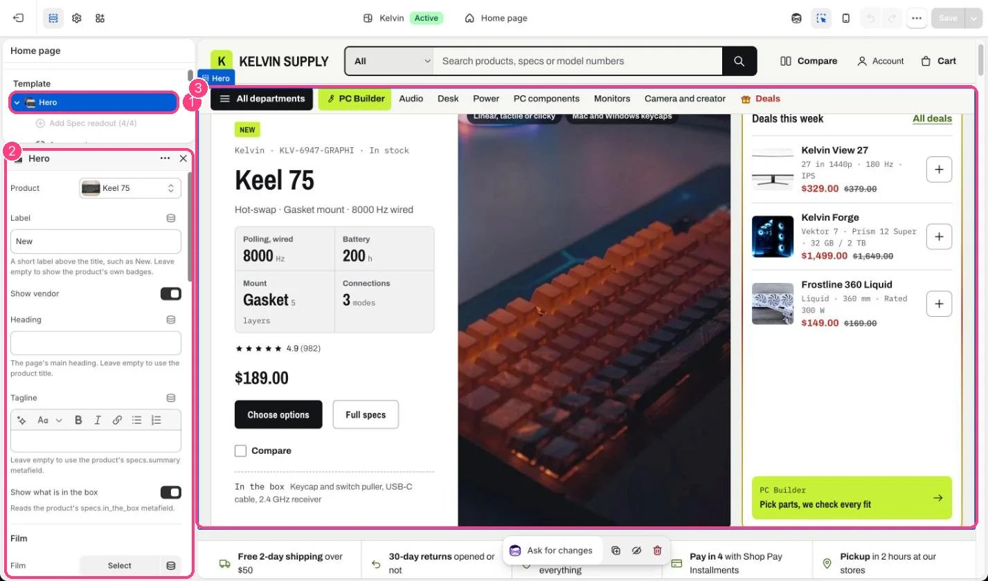
In the theme editor: 1 the section in the sidebar · 2 its settings · 3 the section in the preview
Edit it
- Choose the Product. Everything on the copy side follows it, including price, stock and buttons.
- Leave Heading empty to use the product title, or write a short line of about six words.
- Edit the Spec readout blocks (up to 4): pick the two or four numbers buyers compare, such as battery hours or weight. Fill Specs metafield key so the number is read from the product and stays right when you change it.
- Add a Film: a landscape clip of a few seconds, without sound, plus a Poster image with the same framing, at least 1600 px wide. On phones the film box is 16:10, so keep the subject in the middle.
- Tags on the film takes one short tag per line, such as the options the product comes in. Two or three read best.
- Choose a Deals collection for the rail. A smart collection with the condition Compare-at price is not empty fills itself with whatever is on sale. Turn off Show the deals rail to give the product the full width.
- The link card under the deals shows Link card label and Link card text. Link card link defaults to the PC Builder page chosen in Theme settings → PC Builder; empty Link card text hides the card.
Settings
Film
Deals rail
Colors
Blocks
Up to 4 blocks. Add a block with Add block under the section in the sidebar; drag blocks to reorder them.Spec readout
On install no product or collection is chosen: the hero shows Your featured product with a prompt, and the rail shows example rows. The four Spec readout blocks (Polling rate, Battery, Connection and Layout) have no Value and read the specs metafields polling_rate, battery_life, connectivity and layout, so each one shows only once the chosen product has that metafield. Pick a product and a collection, and edit or delete the readouts, before you launch.A Pay in 4 line under the price (or 4 interest-free payments of a quarter of the price with Shop Pay) shows only when Show the Pay in 4 line is on in Theme settings → Product cards, Shop Pay is one of your payment methods, the shopper sees your store currency and the price reaches the Pay in 4 minimum price set there. It is off on install: turn it on only if Shop Pay Installments is active on your store. Shopify decides real eligibility at checkout.The deal border is explained in Deal highlights.