Kelvin’s collection and search pages show the filters you set up in Search & Discovery, Shopify’s free app. Shopify does the filtering and Kelvin draws it: the theme never hides or reorders products in the browser, so counts and results always match your catalog. This guide covers the filters, then sorting, grid or list view, pagination, promo tiles and the collection navigation chips. 1. Install the app. Install Search & Discovery from the Shopify App Store. It is made by Shopify and free. Filters you add there appear on the Collection page and on the Products tab of Search results. 2. Store your specs in metafields. In Settings → Custom data → Products, add a definition for each spec shoppers should filter by: namespace specs, one key per spec, type Single line text (or List of single line text when a product has several values). Then fill the values on each product. Spell values the same way everywhere: each distinct value becomes its own checkbox, so AM5 and Socket AM5 would show twice. The demo store uses these:
Fill a spec once and several features use it. The PC Builder reads keys such as specs.socket and specs.memory_type for its checks, and the keys listed in Spec rows (Theme settings, Product cards) show on product cards and in compare tables.
3. Add the filters. In Shopify admin open Apps → Search & Discovery → Filters, choose Add filter, pick the source and type the label shoppers see. The order in the app is the order on the page. A good order for a tech store:
  1. Availability
  2. Price
  3. Brand (the product vendor)
  4. Product type
  5. Color (the variant option)
  6. Socket (specs.socket)
  7. Memory type (specs.memory_type)
  8. Form factor (specs.form_factor)
  9. Video memory (specs.vram)
  10. Wattage (specs.wattage)
  11. Water resistance (specs.water_resistance)
Each collection only shows the filters and values its own products have, so a Processors collection offers Socket but not Video memory. True or false metafields can be filters too; they show as a short list of checkboxes like the others. 4. Give colors swatches. Link your Color option to Shopify’s color values (set the product’s category, then connect the Color option to its Color metafield and give each value a color or an image). Then, in Search & Discovery, set the Color filter to show swatches. Kelvin draws each value with a round color dot, or a small image when the value has one; without swatches the values show as text. Filters set to show images get a small image beside each value in the same way. 5. Check the theme editor. In the Collection section (Collections, Default collection) and the Search results section (Search), keep Enable filtering on and set Filter groups open on load (default 3). Price is always shown, and any group with an active filter opens by itself.
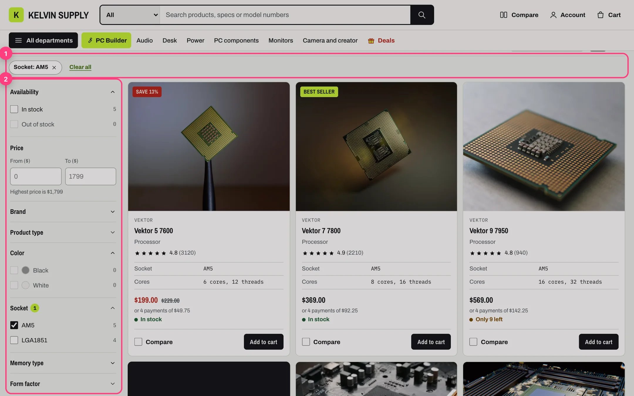
A collection page on desktop with the Socket: AM5 filter chip and the filter sidebar

On desktop the filters sit in a sidebar (2) and the active filters show as chips above the products (1).

How filters behave for shoppers.
  • Screens wider than 900 px show the filters in a sidebar that stays in view while the products scroll. On narrower screens a Filters button with the number of active filters opens a drawer with Clear all and Show 12 products, the live count.
  • Price is two boxes, From and To, in the store currency, with the highest price noted under them. It applies when the shopper leaves the box or presses Enter.
  • Every other filter is a list of checkboxes with product counts. Values with no matching products are greyed out and cannot be ticked.
  • Each change updates the products, counts and filters in place without reloading, and the page address follows, so a filtered page can be bookmarked or shared.
  • Active filters show as chips above the products, such as Socket: AM5 or Price: $100 to $300. Each chip removes its filter; Clear all removes them all and keeps the current sort.
  • Without scripts the filters still work: an Apply filters button appears, and on narrow screens the filters show above the products.
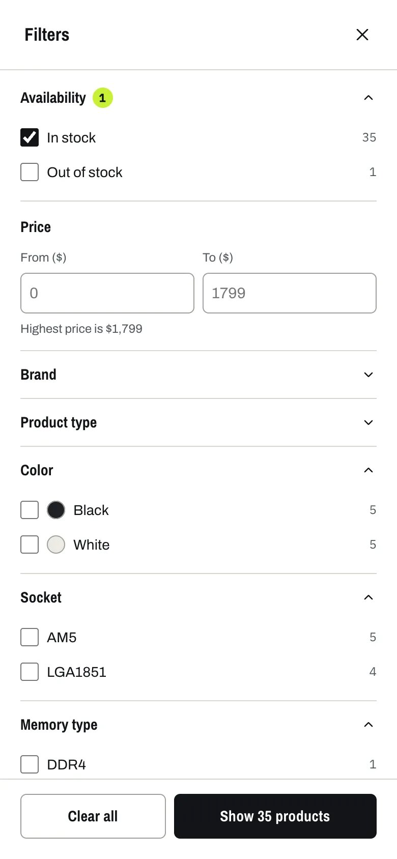
The filter drawer on a phone with In stock ticked, color swatches and the Socket and Memory type filters

On phones the filters open in a drawer; the button at the bottom shows how many products match.
Sorting. The Sort by menu lists Shopify’s own options. On collections: Featured (the collection’s own order, set in Products → Collections), Best selling, Alphabetically A-Z and Z-A, Price low to high and high to low, and Date old to new and new to old. On search: Relevance and Price. Turn it off with Enable sorting. Grid or list view. The two buttons beside Sort by switch between the grid and a list where each product is a wide row with its spec rows, price and buttons side by side, which suits comparing parts. The shopper’s choice is remembered on their device. Set the starting view with Default view, or turn the buttons off with Show grid and list view toggle. On phones products are compact rows in either view.
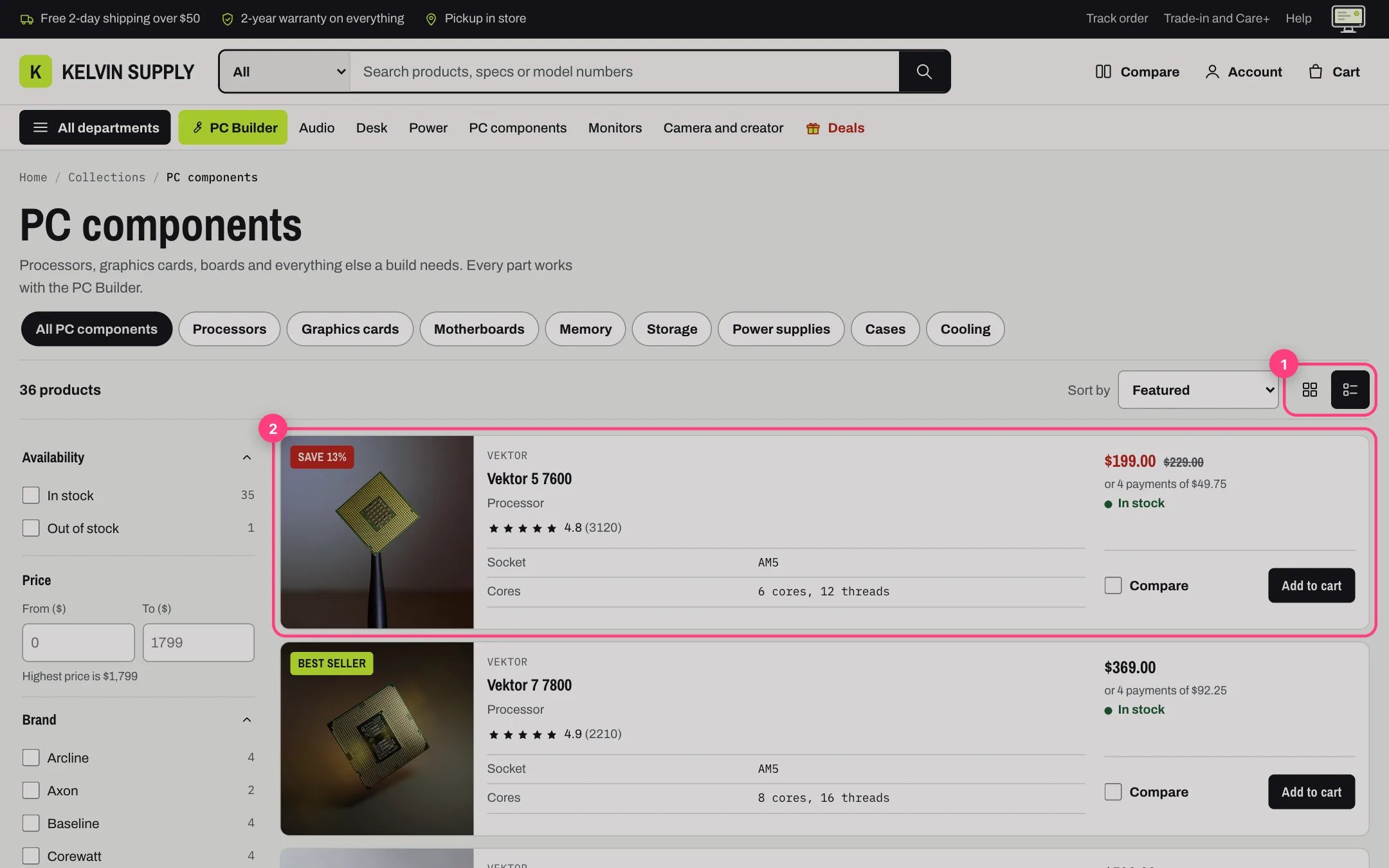
A collection in list view with each product as a row

List view: the view buttons (1) and a product shown as a row with its specs and price (2).

Load more, infinite scroll or page numbers. Choose Pagination in the section:
  • Load more button (the default): Showing 24 of 51, a progress bar and a Load more button that adds the next page under the current one.
  • Infinite scroll: the next page loads as the shopper nears the end, four times, then the Load more button takes over.
  • Numbered pages: previous and next arrows with page numbers.
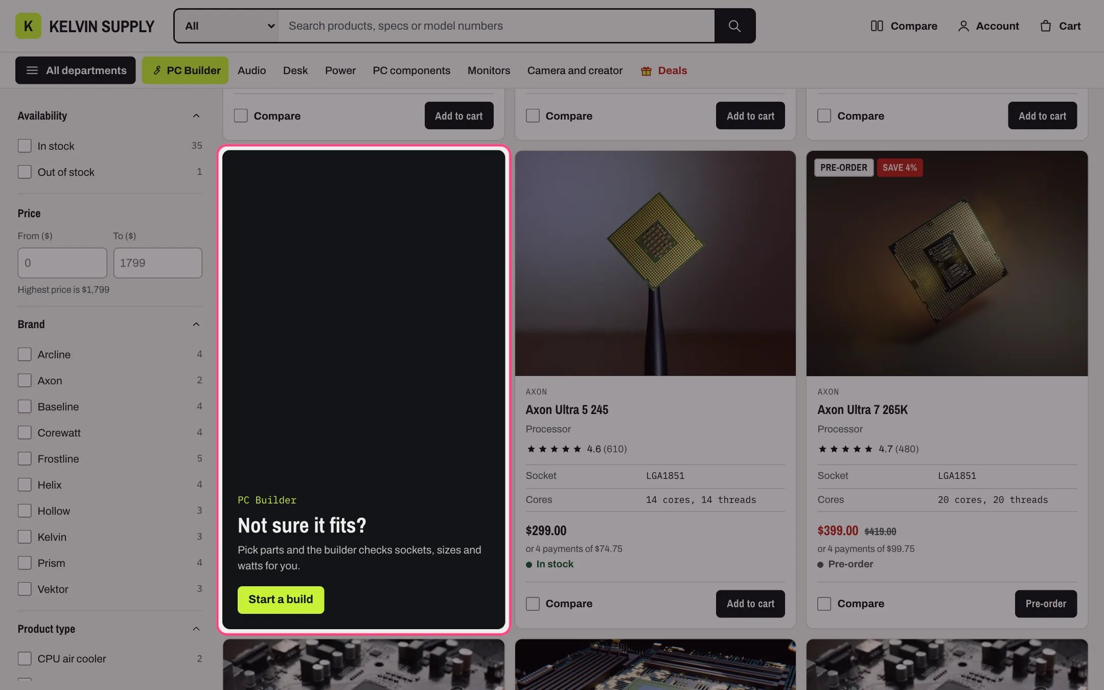
With the first two, the numbered links stay in the page for search engines and for shoppers without scripts. Products per page sets the page size (8 to 48). Promo tiles. A promo tile is a contrasting card in the grid, with a kicker, heading, text and a button, and an optional image, that links anywhere: the PC Builder, a deal, a buying guide. Collections ship without any. In the theme editor open Collections → Default collection → Collection, select Add block, then Promo tile (up to 3), and set Grid position, Kicker, Heading, Text, Link, Link label and Image. Tick Mark as a deal for the sale-red and lime flowing border.
A promo tile in the product grid inviting shoppers to start a PC build

A promo tile at grid position 4.

Promo tiles show on the first page of the grid view only, not in list view or on later pages. A position past the last product on the page puts the tile at the end. They apply to every collection that uses the template; for a tile on one collection, create an alternate collection template and assign it to that collection. Collection navigation chips. Chips under the collection title let shoppers hop between related collections. Build a menu in Online Store → Navigation with departments as top-level links (PC components) and their collections nested under them (Processors, Graphics cards, Memory), then choose it as Collection navigation. On a department or any collection inside it, the chips show All PC components followed by that department’s collections, with the current one filled in. On other collections they show the menu’s top-level links. Chips that do not fit scroll sideways. The setting is empty on install.
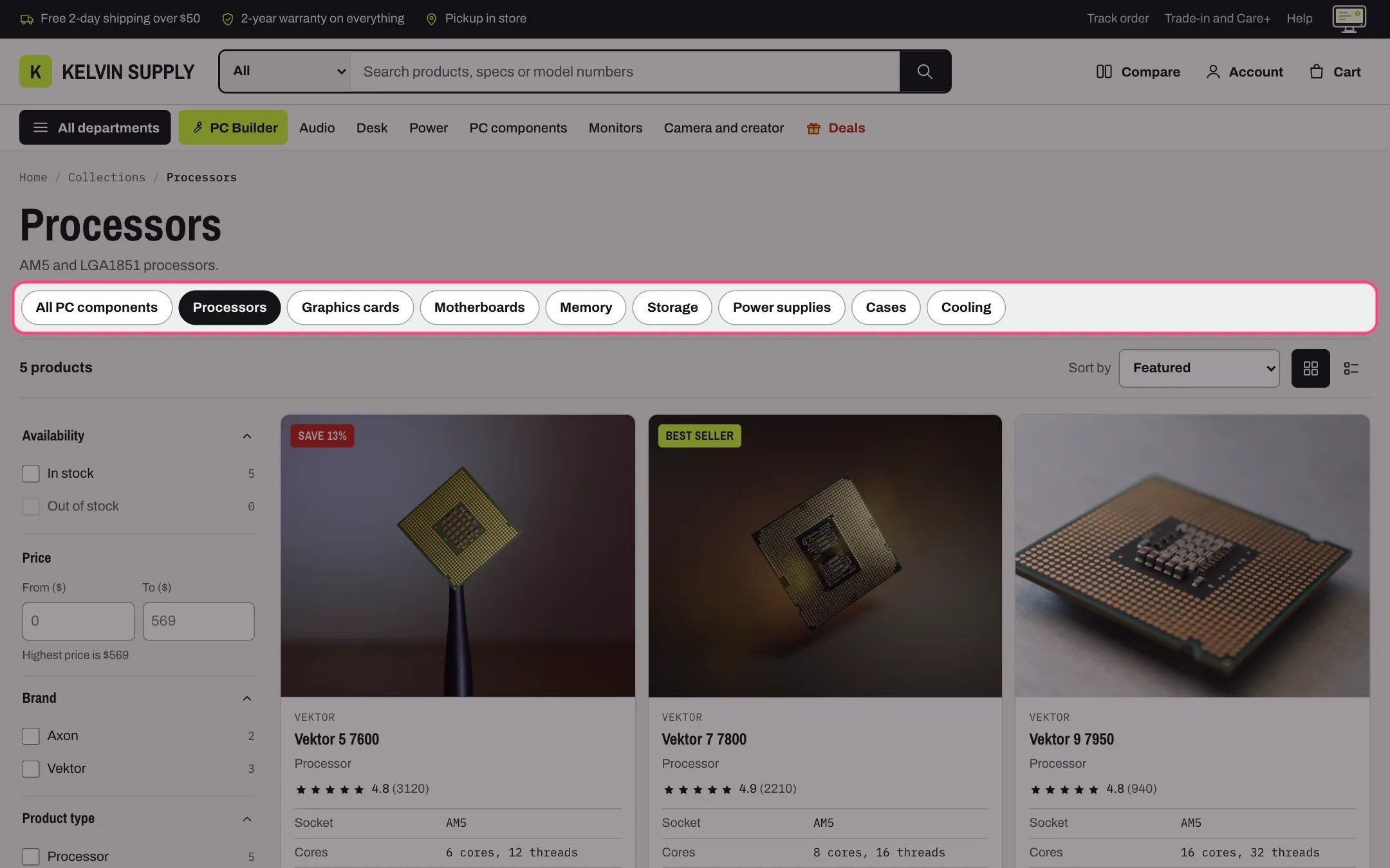
Collection navigation chips on the Processors collection

On Processors the chips show the PC components department, with Processors selected.
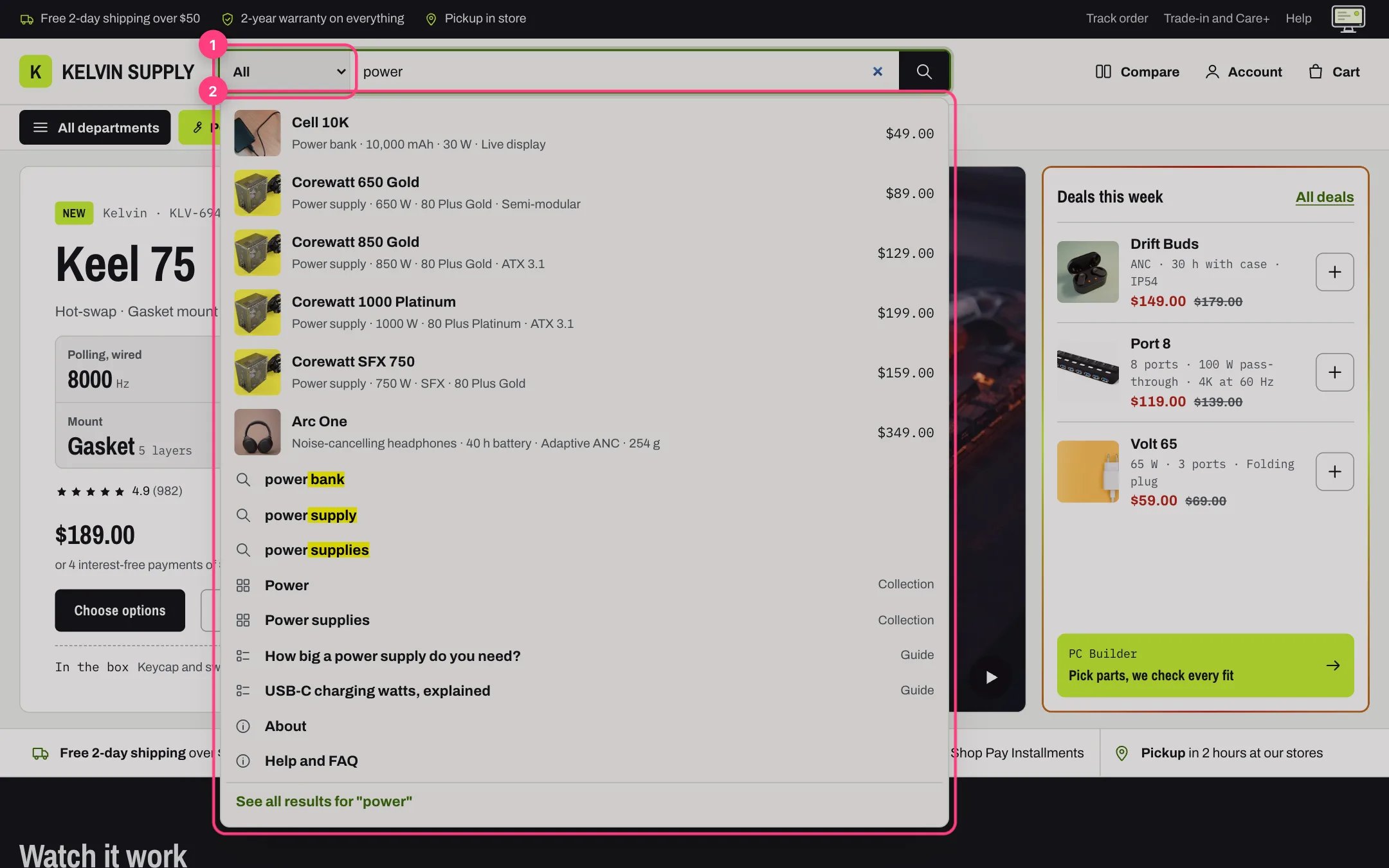
Department search in the header. The header search can start with a department choice listing the product types in Department choices (Theme settings, Search). The setting is empty on install, so the choice stays hidden until you fill it; the demo store uses Graphics card, Processor, Motherboard, Monitor, Power supply. A choice runs the search with Shopify’s product type filter, so keep Product type among your filters and spell each department exactly as the product type on your products. The choice shows on screens 750 px and wider. See Search suggestions.
The header search with the department choice and suggestions for power

The department choice (1) and the suggestions as the shopper types (2).

Filters, sorting and the grid or list view apply to products only: the Guides and Pages tabs on the search page have none. Filter labels and their order come from Search & Discovery; Kelvin has no setting for them. When Enable filtering is off, or a collection has no filters, the sidebar and the Filters button are hidden and the products take the full width.

In the theme editor
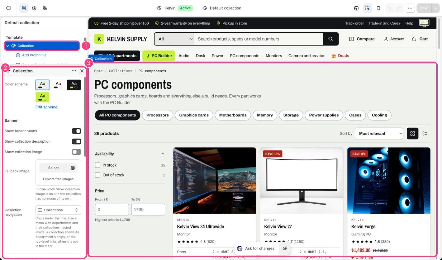
Collection in the theme editor

Filtering, sorting, view and collection navigation: 1 Collection · 2 its settings · 3 the preview
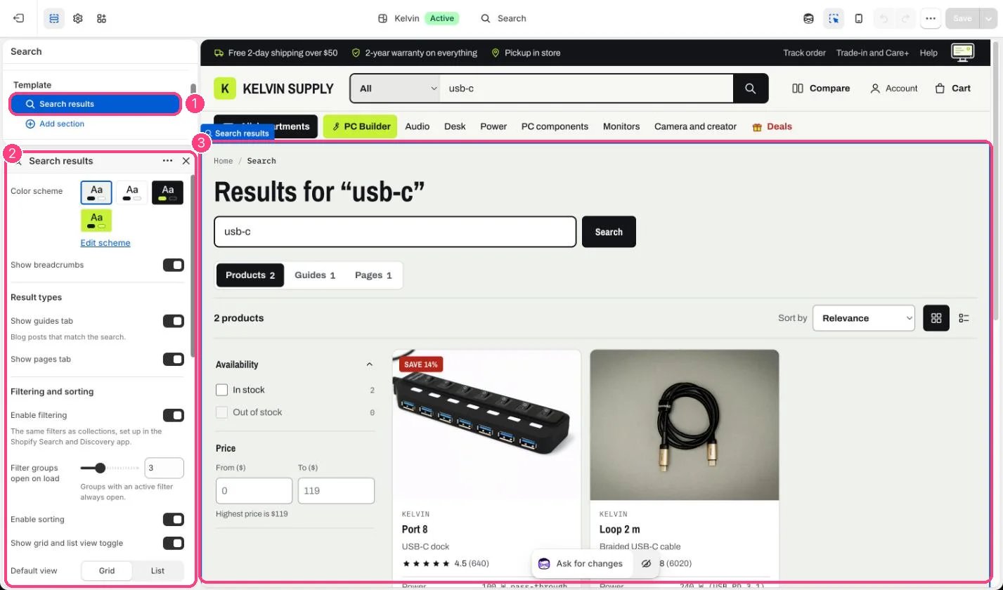
Search results in the theme editor

The same choices for search: 1 Search results · 2 its settings · 3 the preview