
specs namespace, and reads one list, Theme settings → Product cards → Spec rows, to know which specs to show, in which order and under which label.
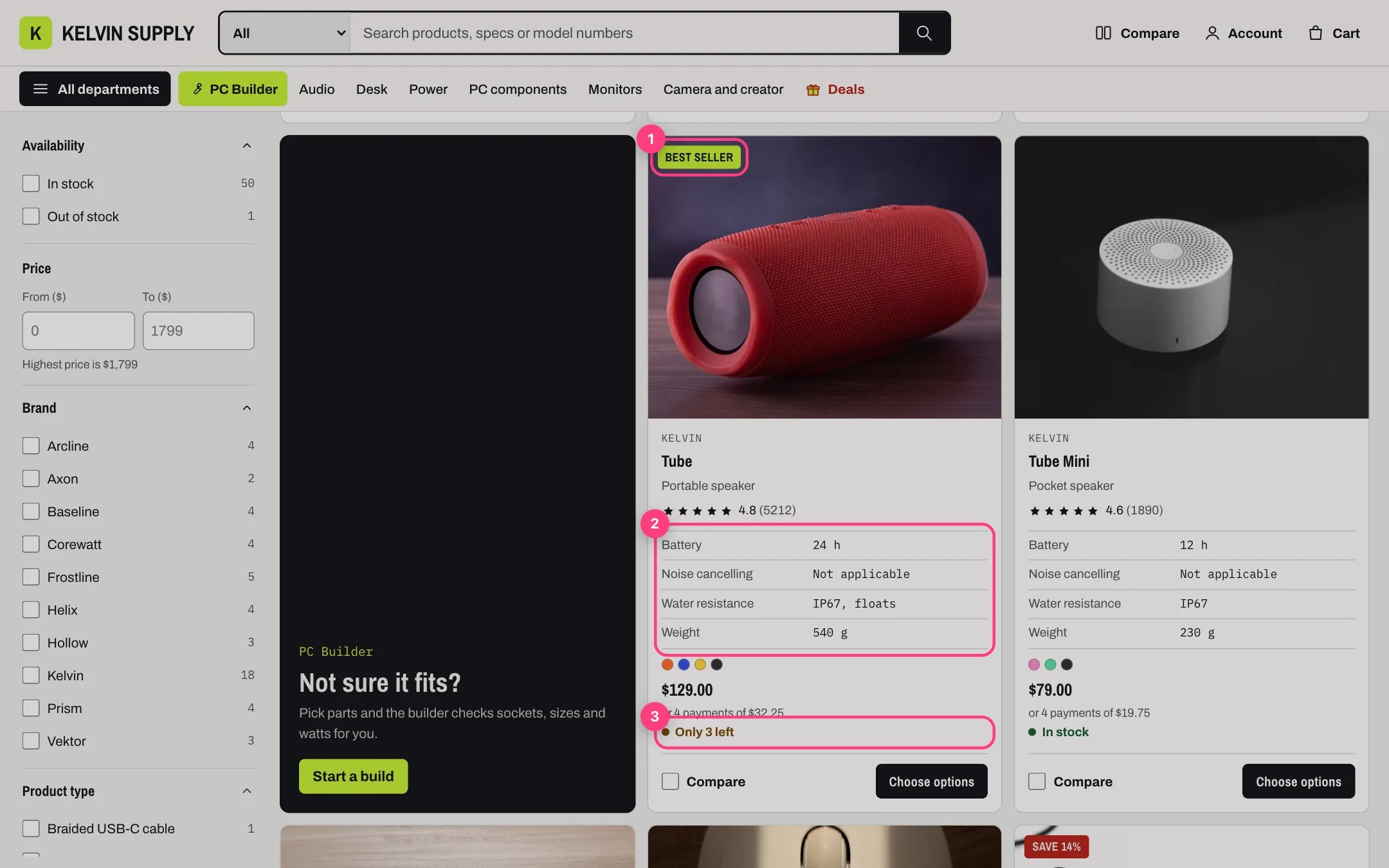
A card on the demo: the Best seller badge (1), four spec rows (2) and the stock line (3)
battery_life | Battery. The key is the part after specs. in the metafield’s namespace and key. The order of the lines is the order specs appear everywhere. A line without a label shows the key itself, and empty lines are skipped.
Kelvin ships with this list, a good start for a tech store:
Keep the keys you use, delete the ones you never will, and add your own lines in the same form. Each kind of product only fills its own keys, so a pair of headphones and a graphics card each show their own specs from the same list.
2. Create the metafield definitions. In Shopify admin open Settings → Custom data → Products and choose Add definition for each key:
- Name: the label, for example Battery.
- Namespace and key:
specs.battery_life, exactly as in the list (lowercase, with underscores). - Type: Single line text, one value. List of single line text works too; Kelvin joins the values with commas.
40 h, 65 W, 8000 Hz) and use the same unit and spelling on every product: the compare page reads the first number in a value to mark the best one, and filters list every distinct spelling as its own choice.
4. Choose how many rows a card shows. Spec rows on cards, in the same group, takes 0 to 6 (4 on install). A card shows the first specs of the list that the product has, skipping the ones it lacks. Under 750 px cards show the first two, so put the spec that matters most for each kind of product first among its keys. 0 shows no spec rows on cards.
Where else the list is used.
- Product page. The Key specs block of Product information shows the first specs the product has (Specs to show, 2 to 8, 4 on install). The Below: specifications block shows all of them in a table, with Brand (the vendor), Model (the SKU) and the unit price.
- Quick view shows the first six, and the Featured product section has its own Key specs block.
- Compare page and the home page’s Compare picker. Each spec that any compared product has becomes a row. The compare section’s Higher is better and Lower is better settings list the keys whose best value is marked Best.
- PC Builder. The parts lists show these specs, and
socketandform_factoralso feed the builder’s compatibility checks on processors and motherboards. See PC Builder. - Filters. Collection and search pages show the filters you add in the Search & Discovery app, and any of these metafields can be one. See Filters with Search & Discovery.
specs.specifications, and type one Label: value per line. These lines show only in the product page’s specifications table, after the listed specs.
When a product has none. Nothing is drawn: no empty box and no dashes on its card, no Key specs, and no specifications table unless specs.specifications has lines. On the compare page the product’s cell in a spec row shows a dash, read as Not listed by screen readers, and a row only appears when at least one compared product has that spec.
In the theme editor
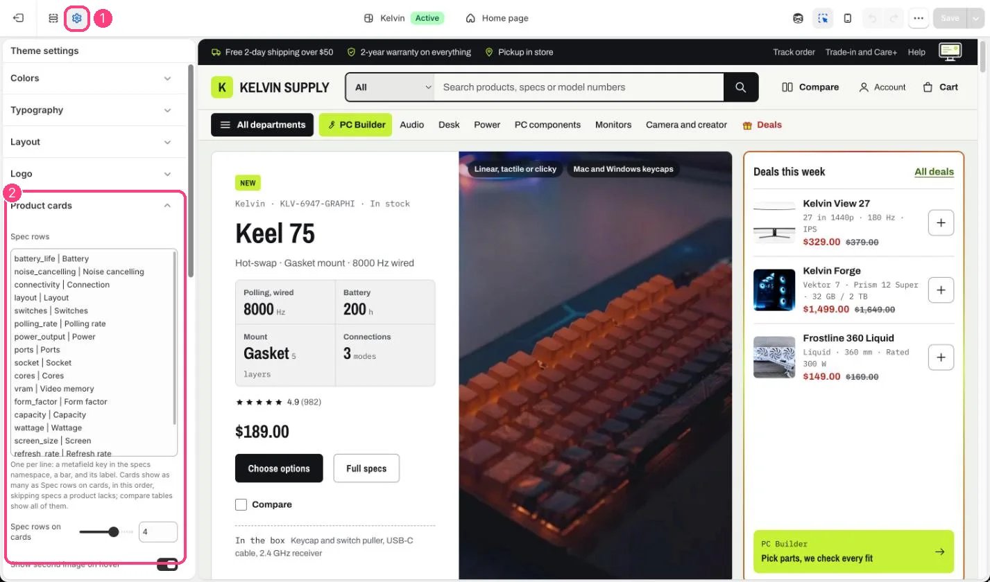
Spec rows and how many show on cards: 1 Theme settings · 2 Product cards