
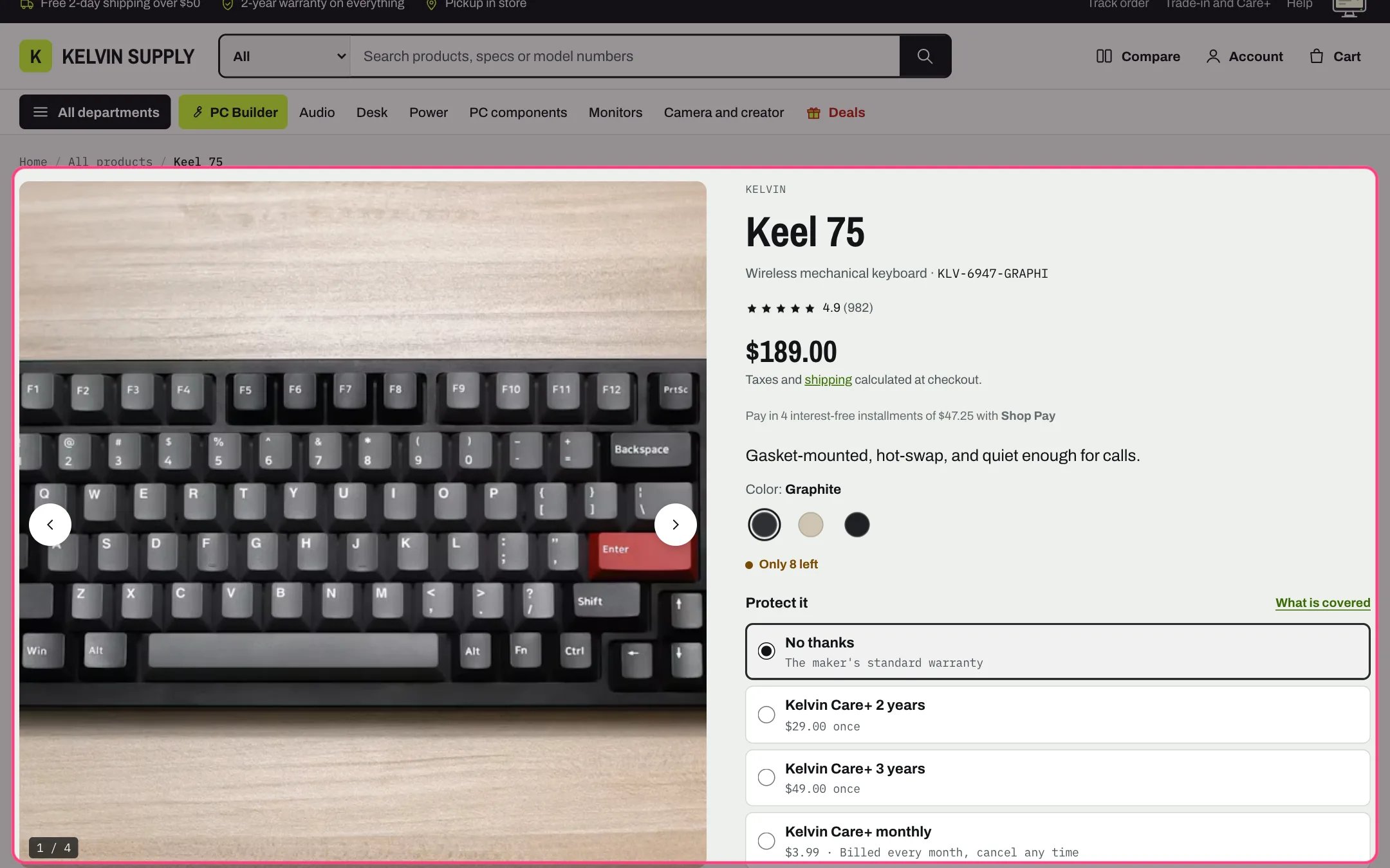
Product information, highlighted with the demo content
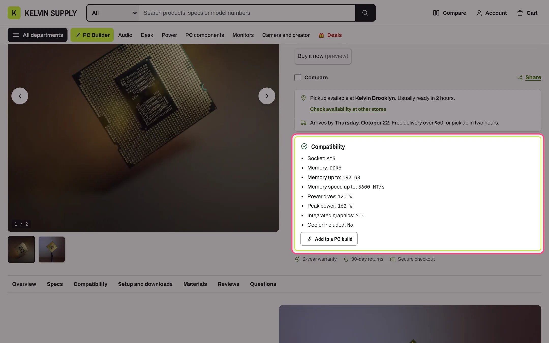
The PC compatibility box on a PC part, with Add to a PC build
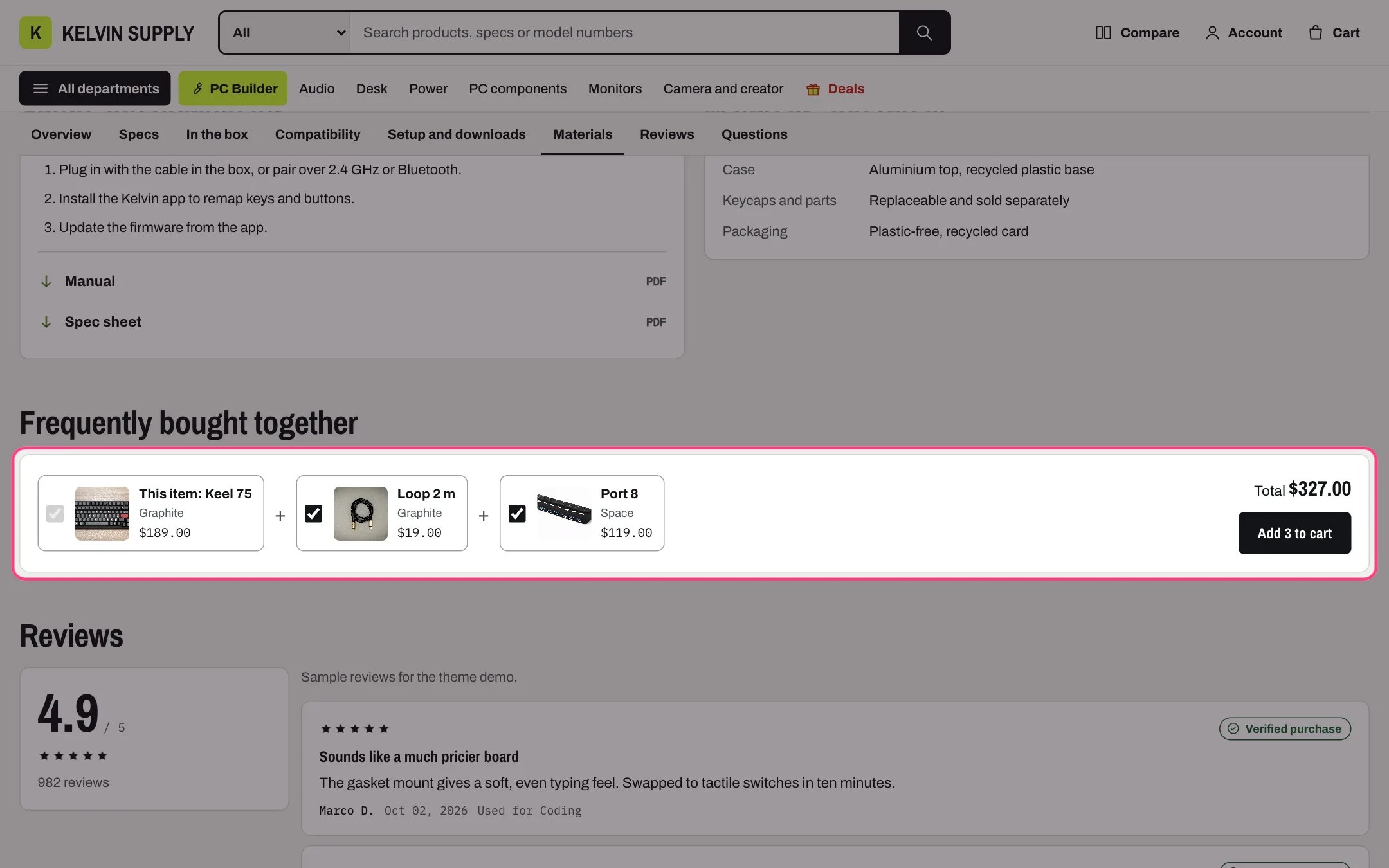
Below: bought together, with the complementary products from Search & Discovery
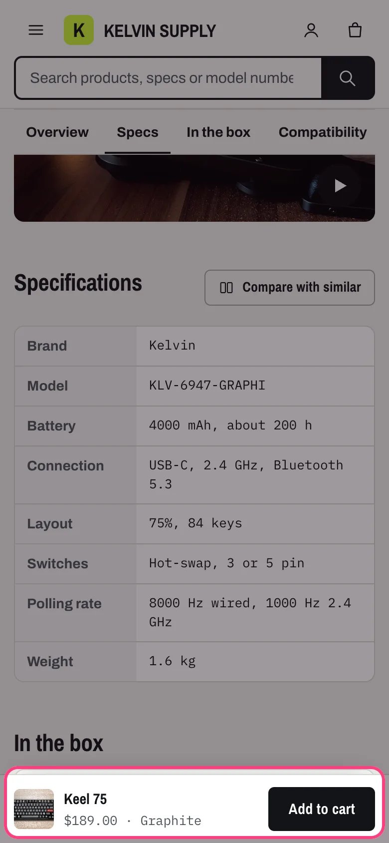
The sticky add to cart bar on a phone, after the main button scrolls away
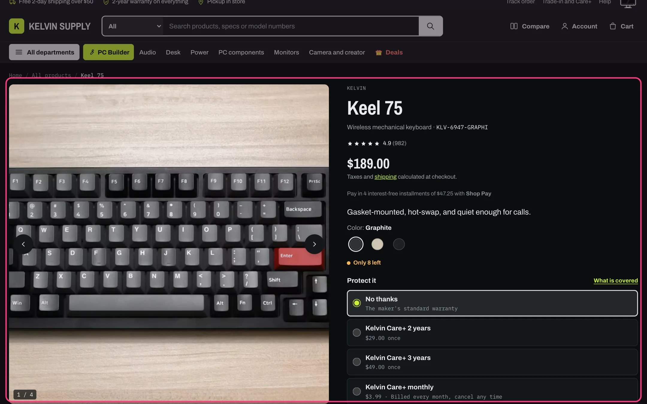
Product information in dark mode
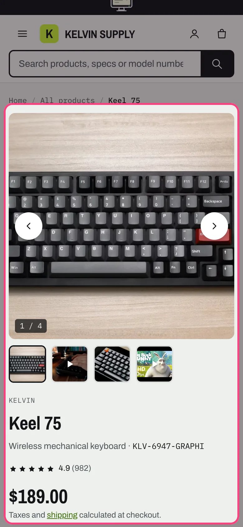
Product information on a phone
Where to find it
Every product that uses the default product template, with Related products and Recently viewed under it. In the theme editor choose Products, then Default product, and select Product information. The gift-card product template uses the same section with gift card blocks and no sticky bar; assign it to your gift card product in the admin.How it works
- Block types named Below: (page navigation, overview, specifications, in the box, works with, setup and manuals, materials, bought together, reviews, questions and question) always appear under the gallery and buy box, in their list order. Every other block type appears in the buy box. App blocks and Custom Liquid go wherever the block above them went, so an app block placed right after Below: reviews sits beside the score.
- The gallery opens on the selected variant’s media and follows the variant. Thumbnails, previous and next buttons, a counter, swiping on touch screens and the left and right arrow keys move through it, and photos open in a lightbox while Zoom photos in a lightbox is on. Wider than 900 px, the gallery stays in view while the buy box scrolls; narrower, it sits above the buy box.
- Shopify videos either play muted on a loop while on screen, with a pause button and never for visitors who reduce motion or save data, or play with controls. YouTube and Vimeo videos load only after a click and stop when the shopper moves to another slide. 3D models use Shopify’s model viewer, with a View in your space button on devices that support it.
- Choosing an option updates the price, badges, SKU, stock, purchase options, add button, back in stock form, pickup, compatibility box and sticky bar without reloading, and adds ?variant= to the address. Sold-out values stay selectable and are marked; a combination you do not sell shows Unavailable. Option values that have Shopify swatches show as color swatches.
- Stock follows real inventory only: Sold out, Pre-order, Only 3 left at or below Theme settings → Product cards → Show low stock at or below (10 on install), or In stock. Pre-order products (tagged with the Pre-order tag from Theme settings → Badges, or tracked at zero stock while selling continues) get a Pre-order button, the incoming date when Shopify has one, and a Pre-order line property in the cart.
- Size and fit guide, Key specs, Protection plans, Purchase options, Gift card recipient, PC compatibility and Back in stock alert print nothing on products without their data, so one template serves every product. Protection plans and the quantity hide while the chosen variant is sold out, and Back in stock alert shows only then.
- On gift cards, the Gift card recipient fields sit inside the buy buttons, above the quantity and add button: a Send it to someone as a gift checkbox, then the recipient’s email, an optional name, a message of up to 200 characters and an optional send date up to 90 days ahead. The email and date are checked before the gift card is added, each error shows under its own field, and what the shopper typed stays when they pick another amount.
- Delivery estimate is off on install. With a Shipping cutoff it counts down to it in your store’s time zone (Order in the next 2 h 10 min and it ships today), refreshes every 30 seconds, and with Business days in transit adds an arrival date that skips weekends. It does not know public holidays.
- With Details layout set to Sections with a navigation bar, an On this page bar sticks under the header, links only the parts below that have content, and marks the one in view. Tabs turns overview, specifications, in the box, works with, setup, materials and questions into tabs from 750 px wide and collapsible rows on phones, first one open; bought together and reviews stay as their own sections.
- Below: bought together lists complementary products from the Search and Discovery app with checkboxes, a running total and one add button, with this product always included. When a product has none set, it can ask Shopify for suggestions instead. It hides on sold-out products and gift cards.
- The sticky add to cart bar (photo, name, price, chosen options and the add button) appears on phones and desktop once the main add button scrolls off the top of the screen. It submits the main form, so the protection plan, purchase option and quantity still apply, and the page adds room at the bottom so the bar never covers content.
- Every product page includes the product’s structured data from Shopify (JSON-LD), which search engines read for rich product results.
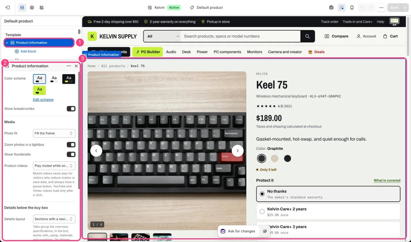
In the theme editor: 1 the section in the sidebar · 2 its settings · 3 the section in the preview
Edit it
- Drag blocks to reorder the buy box and the parts below it. Keep a Buy buttons block: the sticky bar appears only when the section has one.
- Under Media, Photo fit is Show the whole photo on install, so every photo shows in full on the square stage. Fill the frame fills the stage and crops photos that are not square.
- Fill the product metafields in the specs namespace to fill the page: highlights (overview), specifications and materials (one Label: value per line), in_the_box and compatibility (lists), setup (one step per line), manual and spec_sheet (files) and size_chart. The spec rows used by the table, Key specs and product cards are listed once in Theme settings → Product cards → Spec rows.
- In Buy buttons choose the Quantity selector (Minus and plus buttons or Number box) and whether to Show dynamic checkout button. Both product templates have Gift card recipient on install; on gift cards its fields show inside Buy buttons, wherever the Gift card recipient block sits.
- To turn on the delivery line, open Delivery estimate and fill Text, Shipping cutoff (24-hour time such as 15:00) and Business days in transit. Tick Ship on weekends only if you ship on Saturday and Sunday.
- For PC parts, tag the product with the Parts tag from Theme settings → PC Builder (pc-part on install) and choose the PC Builder page there. PC compatibility then lists the specs the builder checks and shows Add to a PC build.
- Choose Details layout: Sections with a navigation bar suits long pages with many parts, Tabs keeps the page short. Add Below: question blocks for questions you answer often; they become collapsible rows under Below: questions.
- Set up protection plans, pickup and reviews with the guides Care+ protection plans, Pickup in store and Product reviews and Verified purchase.
- Add a reviews app or any other app from Add block → Apps, right after the block it belongs with.
Settings
Media
Details below the buy box
Sticky add to cart
Blocks
Add a block with Add block under the section in the sidebar; drag blocks to reorder them.App blocks
Blocks from apps you have installed, such as reviews or subscriptions. Click Add block and choose one from the Apps tab; its settings come from the app.Vendor (up to 1)
Title (up to 1)
No settings: add or remove it, and drag it into place.Type and SKU (up to 1)
Rating (up to 1)
Price (up to 1)
Shop Pay Installments (up to 1)
Description (up to 1)
No settings: add or remove it, and drag it into place.Variant picker (up to 1)
Size and fit guide (up to 1)
Purchase options (up to 1)
Gift card recipient (up to 1)
Stock (up to 1)
Key specs (up to 1)
Protection plans (up to 1)
Buy buttons (up to 1)
Back in stock alert (up to 1)
Compare and share (up to 1)
Pickup availability (up to 1)
Delivery estimate (up to 1)
PC compatibility (up to 1)
Trust badges (up to 2)
Warranty badge
Returns badge
Checkout badge
Extra badge
Text
Custom Liquid
Below: page navigation (up to 1)
Below: overview (up to 1)
Below: specifications (up to 1)
Below: in the box (up to 1)
Below: works with (up to 1)
Below: setup and manuals (up to 1)
Below: materials (up to 1)
Below: bought together (up to 1)
Below: reviews (up to 1)
Below: questions (up to 1)
Below: question
Most blocks can be added once; Trust badges twice; Text, Custom Liquid, Below: question and app blocks as often as you need.The Trust badges block has a Warranty badge, Returns badge, Checkout badge and Extra badge, each with an Icon and a Text. On the default product template the texts read Describe your warranty, Describe your returns and Secure checkout, and the Extra badge is empty. Replace the first two with your real warranty and returns terms. A badge with no text is hidden.Back in stock alert and the Ask a question form send contact form emails with the product, a link and the tag back-in-stock or product-question. Kelvin does not email the shopper later: you reply yourself or from your email tool.The Rating block shows stars only from the reviews.rating and reviews.rating_count metafields a reviews app writes. The Compare box (Compare and share) and Compare with similar (Below: specifications) show only when Theme settings → Compare → Compare page is set.