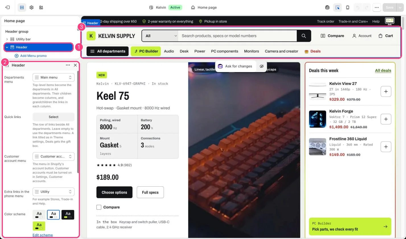
On desktop, Kelvin’s header has two rows: the logo, search, account and cart on top, and a department row with All departments, the PC Builder link and your quick links underneath. On phones, the departments and quick links move into a menu drawer. Menus are built in Content → Menus (in older admins, Online Store → Navigation). 1. Build the main menu in three levels. Edit Main menu:
  • top-level items are the departments, such as Audio, Desk, Power and PC components;
  • their children are the columns of each department, such as Headphones, Earbuds and Speakers; each column heading is a link too;
  • the grandchildren are the links in each column, such as All headphones or Noise cancelling.
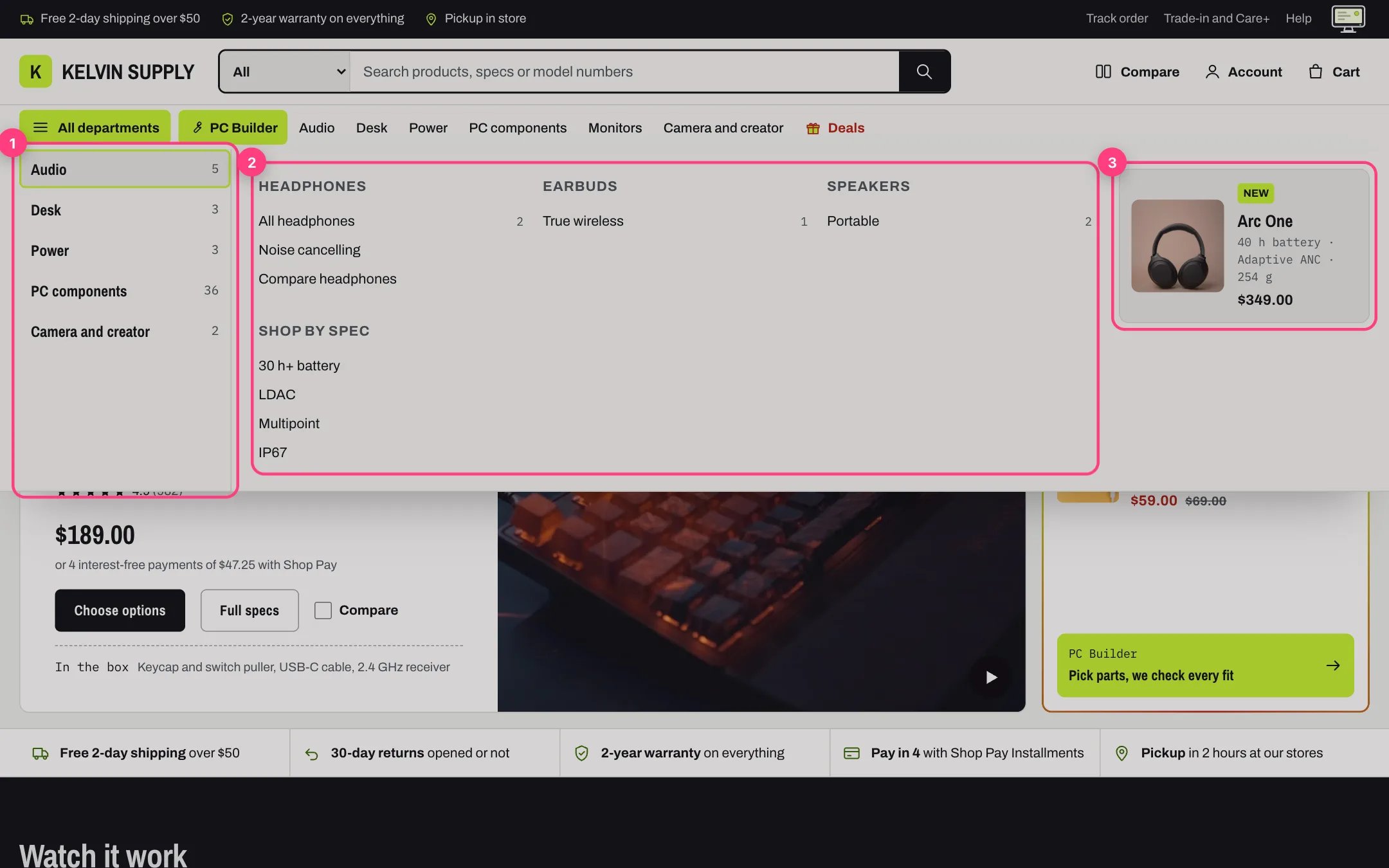
Link items to collections where you can: a collection link shows its number of products beside it in the mega menu and the phone menu. Then choose the menu in the Header section under Main menu (your store’s Main menu is chosen on install). 2. How the mega menu works. All departments appears once at least one top-level item has child links. It opens on click, or after a short pause when a mouse rests on it. The departments are listed on the left; pointing at one or tabbing to it shows its columns on the right, three to a row. Top-level items without child links, such as Monitors or Deals, are left out of the panel; they show in the quick links row and the phone menu. Esc closes the panel and returns focus to the button, and clicking outside or tabbing out closes it too.
The departments mega menu

1 Departments · 2 Columns and their links · 3 Menu promo

3. Quick links. The row beside All departments. Choose a short one-level menu under Quick links, such as New, Deals, Monitors and Gift cards, or leave it empty to list the top-level items of the main menu. Only top-level links show in this row, and on tablets it scrolls sideways when it does not fit.
  • A link titled as in Theme settings → Deals → Deals menu item gets the gift box. See Deal highlights.
  • The PC Builder link comes first when Show the PC Builder link is on and a page is chosen in Theme settings → PC Builder. A quick link to the same page is skipped, so it never shows twice.
4. Menu promos. In the theme editor select Header and add a Menu promo block:
  • type the department’s title in Department, as in the menu (capitals do not matter), for example Audio;
  • choose a Product: the card takes its photo, title, price and the product’s specs.summary metafield as the spec line;
  • Image, Label (New by default), Heading, Spec line and Link replace those when filled in.
Each department shows one promo, the first block that matches it. Promos show beside the columns on screens wider than 1000 px; tablets and phones leave them out. To see a promo in the editor, open All departments in the preview and point at its department. 5. The phone menu. Under 750 px, the menu button at the start of the header opens a drawer from the side. It lists, in order:
  • the PC Builder link;
  • each department as a group that opens to Shop all and its columns. A column with links of its own opens in turn to Shop all and those links, the third level of the menu; a column without links is a plain link;
  • top-level items without child links as plain links, the Deals item with its gift box;
  • Compare, when a compare page is set in Theme settings → Compare;
  • the links of Extra links in the phone menu, such as Stores, Trade-in and Help;
  • the country and language selectors, when Show country and language selectors in the phone menu is on.
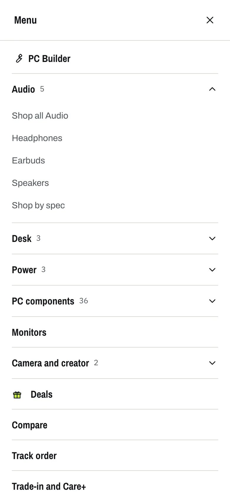
The phone menu

The phone menu with a department opened

6. Account menu. The account button is Shopify’s own account menu. Guests get Sign in with Shop; signed-in customers get the menu chosen under Customer account menu (customer-account-main-menu on install). Turn on customer accounts in Settings → Customer accounts. The button shows on every screen size; from 1000 px down it is an icon without its label. 7. Footer menus. In the Footer section, add a Menu block per column and choose a menu, for example Shop, Support and Company. Leave Heading empty to use the menu’s name. The footer takes up to six blocks (Menu, Text and one Email signup) and ends with a column for the country and language selectors. See Footer. 8. Utility links. In the Utility bar, Links shows a menu’s links at the end of the bar, such as Track order, Trade-in and Help. They hide from 1000 px down, so choose the same menu under Extra links in the phone menu. Other menus. A few sections take a menu of their own: Collection navigation in the Collection section (chips under the title), the Menu whose links show under the departments heading when a search finds nothing in Search results, the Department menu of the Collections list, Sub-links in the Departments section, and the Menu of the Page not found page.

In the theme editor

Header in the theme editor

1 Header, with Add Menu promo · 2 the main menu, quick links and account menu · 3 the header in the preview