
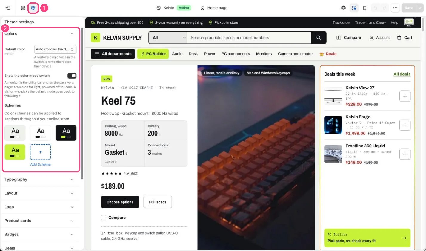
1 Theme settings (the gear icon) · 2 Colors, opened in the sidebar
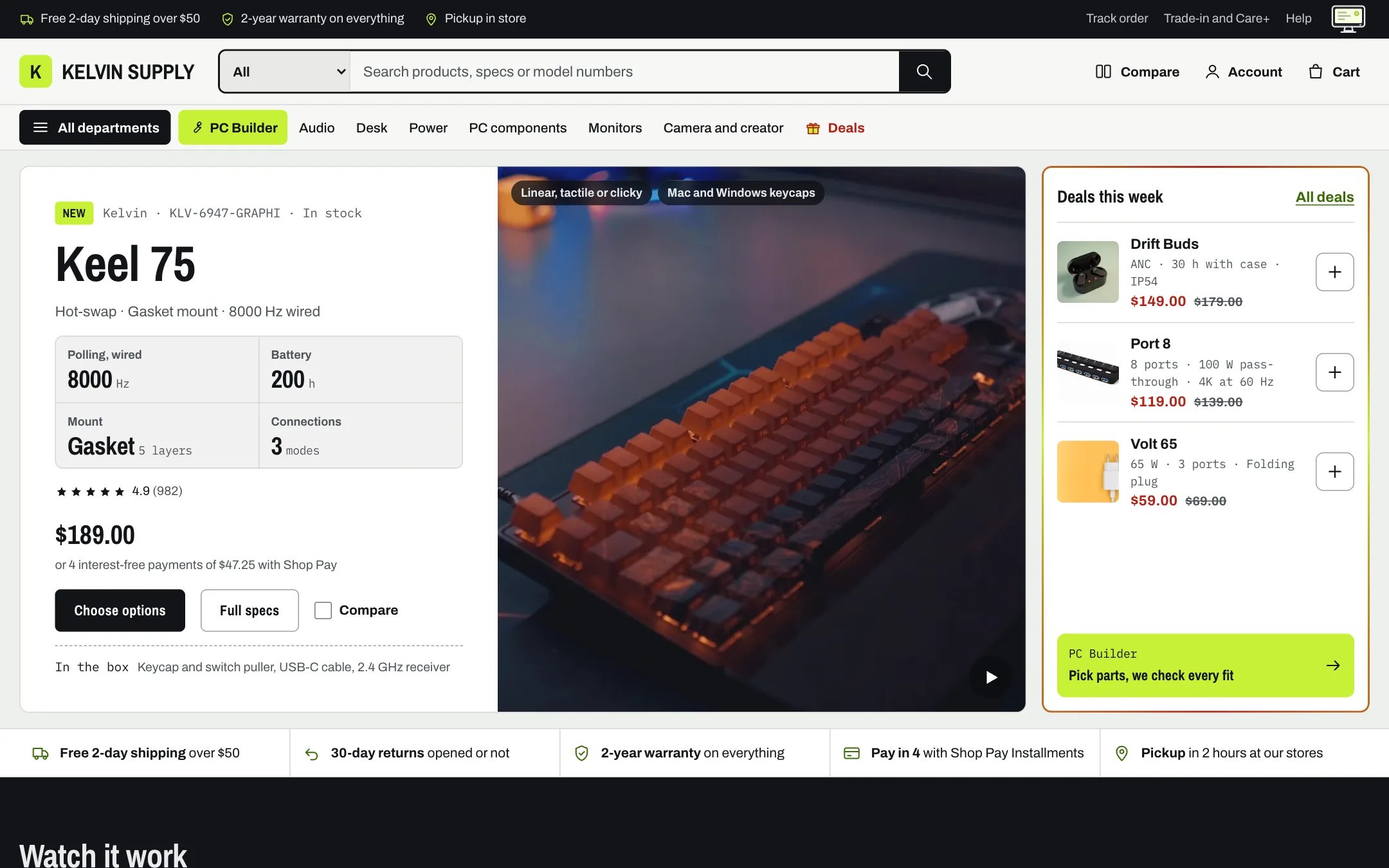
The demo in light mode: Bench for the page, Card for the header, Stage for the utility bar
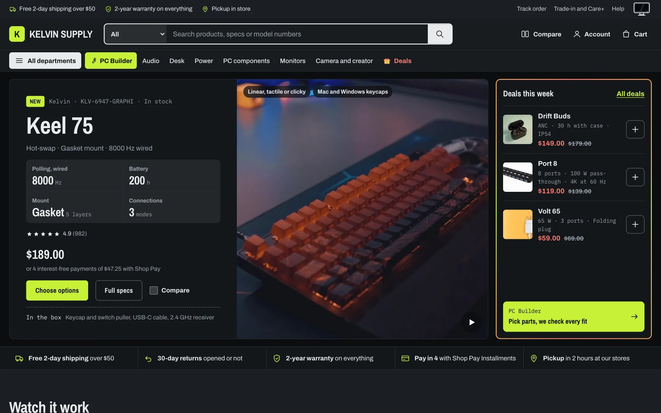
The same page in dark mode: every scheme switches to its dark palette
How it works
- Every scheme holds two palettes: Background through Sale and errors for light mode, and the matching Dark mode colors (Dark mode: background, Dark mode: text and so on) for dark mode. Each section picks one scheme with its Color scheme setting and changes palette with the store’s mode, so you never set a mode per section.
- Scheme 1, Bench, is the default for most sections: a pale grey-green page (#EEF0EC) with white cards and ink text (#121417) in light mode, and a near-black page (#0B0D0F) with #13161A cards and #E8EBED text in dark mode.
- Scheme 2, Card, is white in light mode and #13161A in dark mode. The header, footer, cart drawer, pop-ups and the slideshow use it.
- Scheme 3, Stage, is dark in both modes: #121417 in light mode and a slightly lighter #1A1F24 in dark mode, so it still stands out from the page. The utility bar, Vertical films and PC Builder entry use it.
- Scheme 4, Signal, is lime #C6F135 with ink text in both modes, for one loud band. No section uses it on install.
- The accent is lime #C6F135 in both modes. Links are #3B6B0A in light mode and lime in dark mode, and Sale and errors is #B42318 in light mode and #FF7B6E in dark mode.
- Default color mode decides the mode of a first visit: Auto (follows the device), the default, Light or Dark. The mode is set before the page paints, from the shopper’s saved choice (read only while the switch is shown) or else this setting. With Auto the store keeps following the device while the shopper has no saved choice.
- Show the color mode switch puts a monitor at the end of the utility bar and on the password page: screen on is light mode, powered off with an amber standby light is dark mode. There is no Auto button: picking the mode the default would show clears the shopper’s saved choice. With the switch hidden, saved choices are ignored and every visitor gets Default color mode; on phones the utility bar is hidden too, since the switch is all it holds there. See Light and dark mode.
- In-between shades (raised panels, stronger lines, hover tints and the backdrop behind product photos) are mixed from each palette. Most focus rings use Links, and stars use Text in light mode and Accent in dark mode. Background gradient applies in light mode only.
- The scheme previews in the theme editor show the light colors.
Edit it
- Change a color and its Dark mode partner together, for example Accent and Dark mode: accent, so both modes stay on brand.
- Keep Text on accent readable on Accent and Button label readable on Button in both palettes. Aim for a contrast of at least 4.5 to 1 for text.
- Give dark mode lighter Links and Sale and errors colors than light mode: dark greens and reds disappear on near-black.
- Use Signal for one band at most, such as a single offer or the newsletter.
- After a change, look at the home page, a product page, the cart drawer and the mega menu in both modes.
Settings
Color schemes
Each scheme holds these colors. Open a scheme under Color schemes to edit it, or add a scheme.